You may be wondering how to customize the look and feel of your website. Fortunately, Ghost provides a range of design settings that allow you to personalize your site's design to match your brand and personal preferences.
Each theme will have a range of options which can be found in the site settings under the design menu. The available options may differ between the themes, but they generally allow you to upload a logo, set a site icon, select an accent color, and more.
Using these design settings, you have the flexibility to create a unique and professional-looking website that reflects your brand and personality.
For further customization options, you can consider using code injection to add some custom styling or create a custom theme which can offer you endless possibilities.
Access design settings from Settings → Site → Design & branding. Click Customize to open the Design settings. Design settings are organized under several sections.
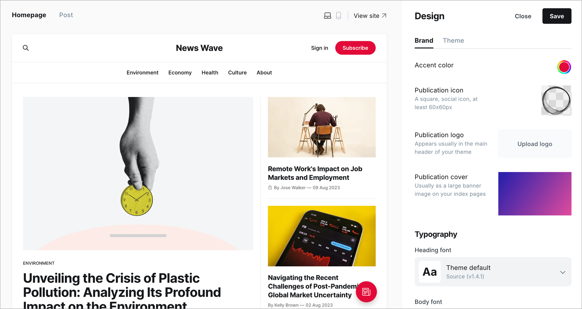
Brand
Accent color
The accent color is the primary color used in your site's theme (supported themes only). This includes links, buttons, and text colors.
Publication icon
This is a social icon that is used as the Favicon for your site. You'll also see this in the far corner when you're logged in to your publication. Publication icons must be square and at least 60px in size.
Publication logo
This is the primary logo for your brand and is displayed within your theme. Publication logos should have transparent backgrounds and be at least 600px x 72px in size.
Publication cover
A cover image is optional and used in some themes, usually as a large banner image on your index pages.
It’s recommended to use images with a minimum width of 1500px to ensure your cover image looks good on most devices.
Typography
Heading font
Select a custom font for headings used across your site. The font you select will be used for page and post title headings, and will be used when referencing headings within the body of your content.
Body font
Select a custom font to be used for the body of your site. The font you select will be used across the site for the content you publish, as well as other static text used within your theme.
Theme Settings
Site wide
Options available in this section will generally be reflected on all pages and posts of your site. Settings here are theme dependent, site wide design settings may not be available in all themes.
Homepage
Allows customisation of the site’s homepage. Settings here are theme dependent, homepage design settings may not be available in all themes.
Post
Allows customisation which will be applied to your posts. Settings here are theme dependent, post design settings may not be available in all themes.