Jump to a card
- Images
- Markdown
- HTML
- Gallery
- Divider
- Bookmark
- Email content
- Call to action
- Public preview
- Button
- Callout
- GIF
- Toggle
- Audio
- Video
- File
- Product
- Header
- Embeds
- Signup Card
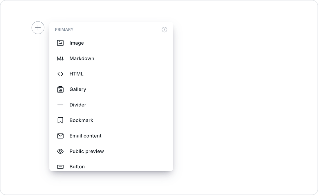
The Ghost editor includes rich media objects called Cards, which can be inserted into your content to add images, audio, video, data, and other interactive elements.
To launch the dynamic card menu, click the + button, or type / on a new line to search for a particular card.
Images
You can add images to your posts in many ways:
- Upload from your computer
- Click and drag an image into the browser
- Paste directly into the editor from your clipboard
- Insert using a URL
Once inserted you can blend images beautifully into your content at different sizes and add captions and alt tags. They can also be re-ordered easily using drag and drop (this applies to all dynamic cards in the editor).
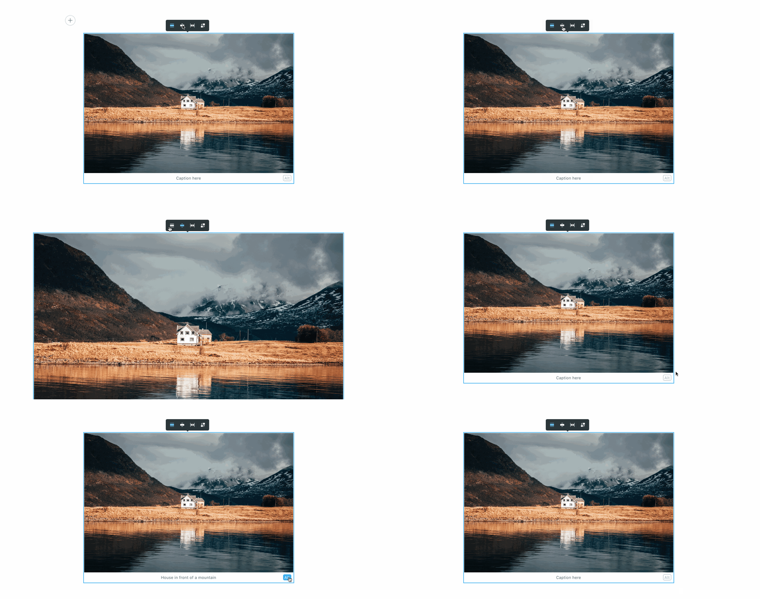
Uploaded images will be automatically optimized for the web with lossless compression, as well as make the image responsive which automatically adjusts the image size based on the viewer's device.
.JPEG, .PNG, .GIF and .WEBP filetypes.Markdown
Ghost automatically parses Markdown when typed directly into the editor, or you can use the Markdown card to create full posts in Markdown or use footnotes. Read more in the Markdown guide.

HTML
HTML cards provide a flexible way of adding code to your posts, which is useful for embedding external content such as forms, custom buttons, adding custom styling, and integrating with third-party tools. All you need to do is add a HTML card and paste or write your code.

You can also control who sees your HTML content using visibility settings, allowing you to create custom experiences for public visitors, free members, or paid members. These settings can be accessed via the 👁️ icon in the card toolbar.

Gallery
Ghost supports image galleries of up to 9 images at a time, all of which are responsively optimized.
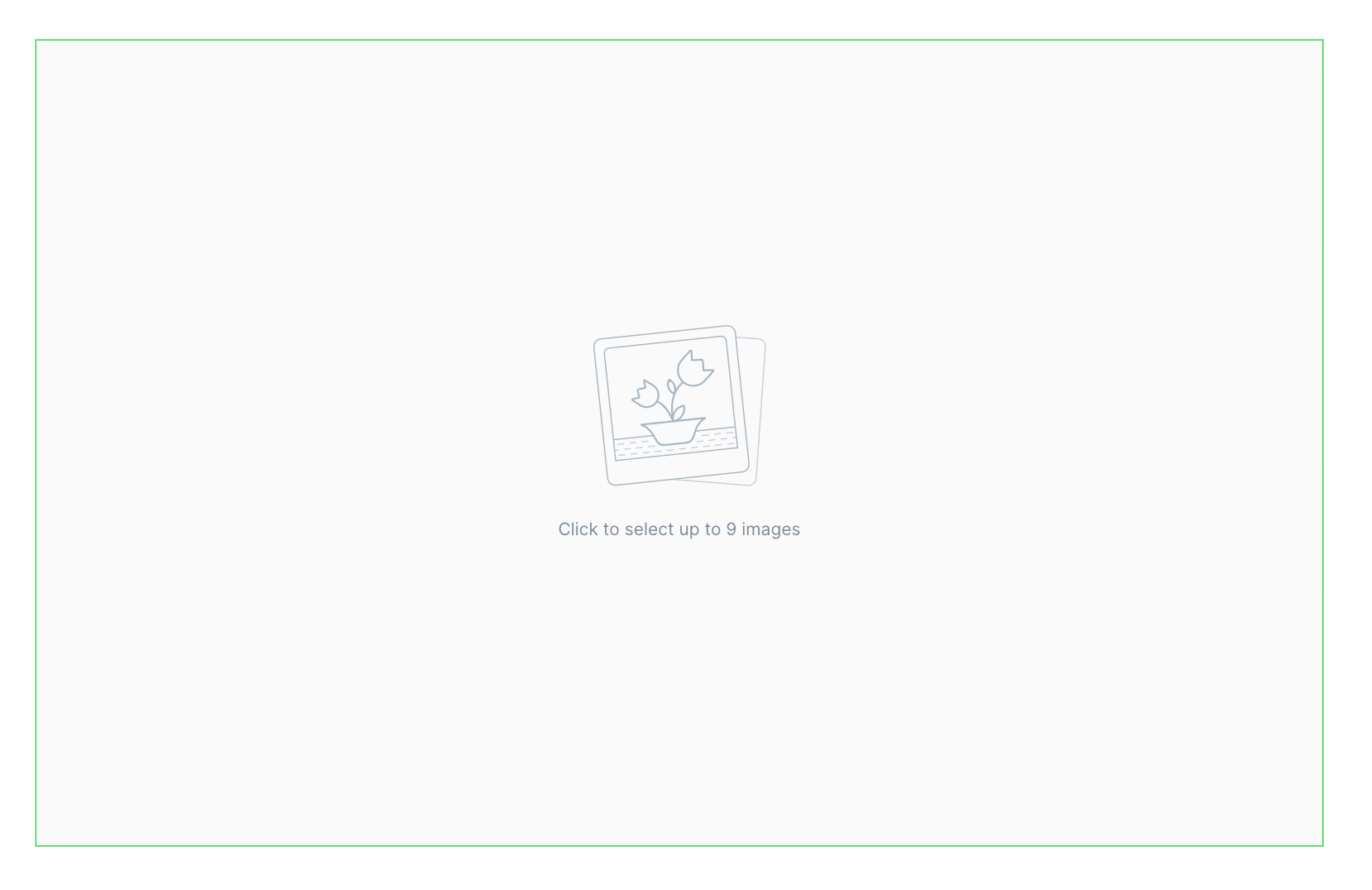
To add images to the gallery card, drag each image into the image uploader box or select multiple images from your file system. Once uploaded, images can be re-ordered using drag and drop.
Here's an example of a gallery 📸



Divider
Separate your content into distinct groups by inserting line breaks, using the Divider card.
Pro tip: Quickly add a divider by typing --- into a new line in the editor.
Bookmark
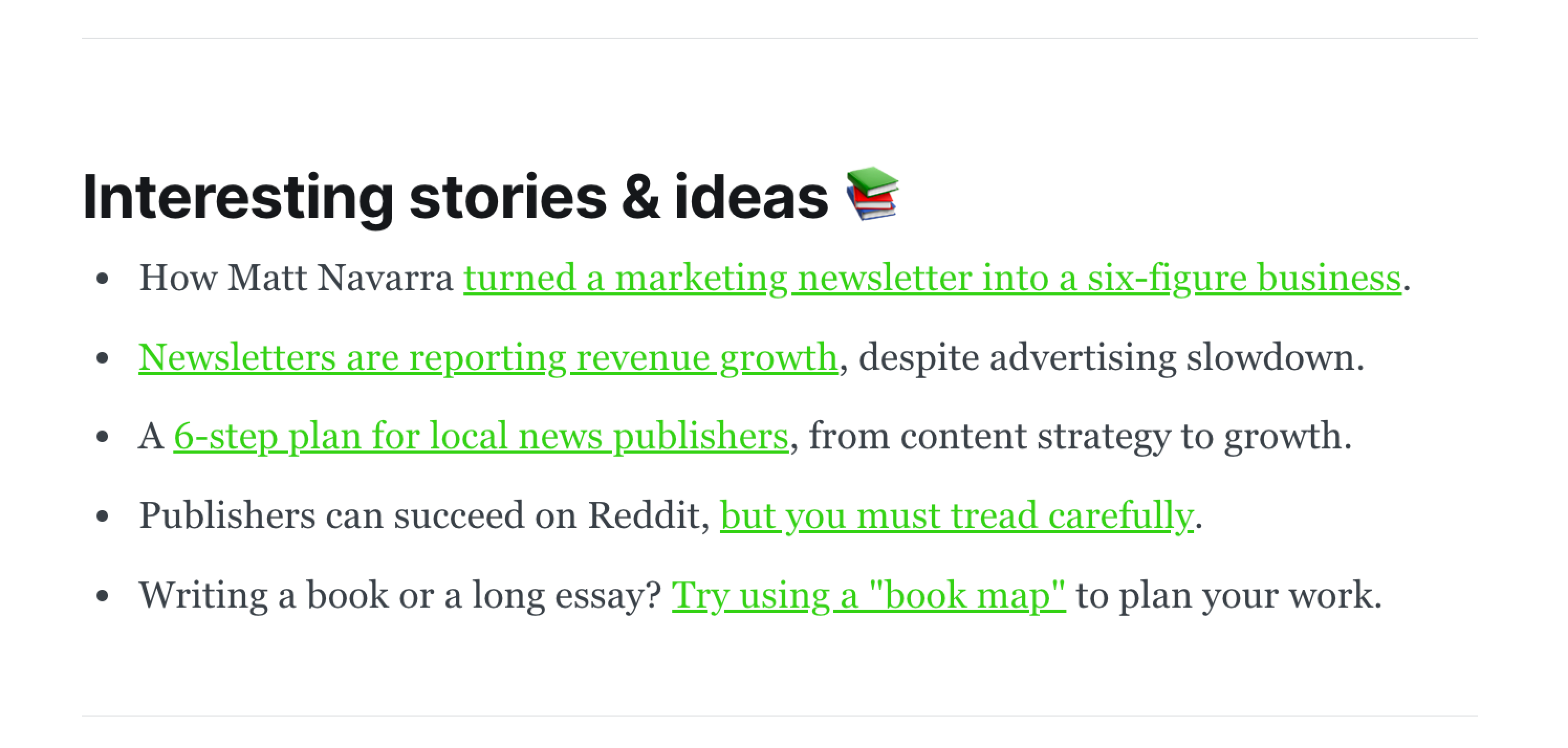
The bookmark card can be used to share a links to pages from around the web in a reader-friendly card design.
There are two ways to insert bookmark cards in the editor:
- Paste a link as the first thing in a blank paragraph – if no automatic embed is available, the editor will default to the bookmark card.
- Select the bookmark card from the (+) menu or by typing
/bookmarkon a new line and pasting your URL – or for a shortcut/bookmark {url}

Email content
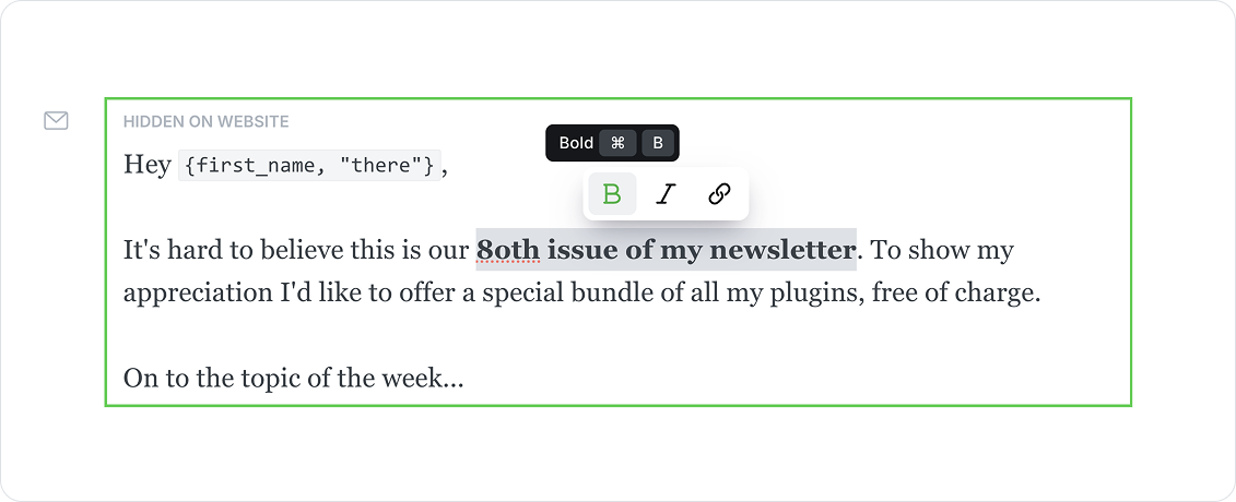
Email content cards allow you to personalize your email newsletters with specific content that doesn't appear in the published post.
By default, email cards are pre-filled with an optional greeting, which references the member's name using the first_name placeholder. If a member’s name is not provided, a custom fallback can be used.
Email cards support basic text formatting options, such as bolding, italicizing, and hyperlinking text.
Call to action
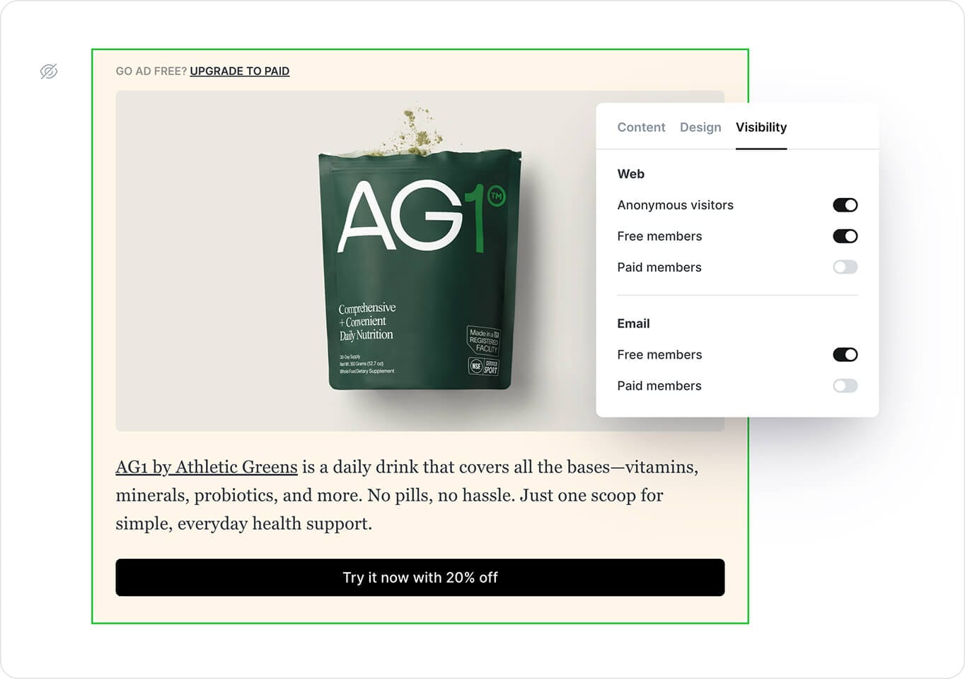
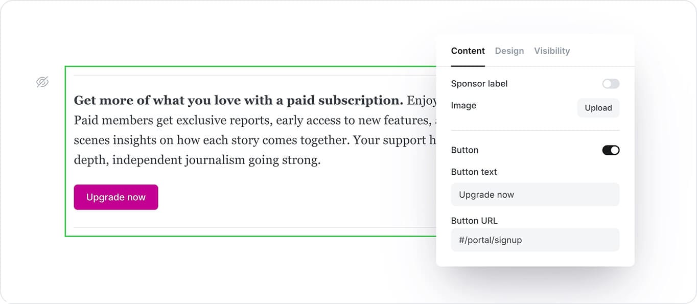
The Call to action card helps you promote a specific message to the right audience—whether that’s public visitors, free members, or paid members. You can choose to show it in your newsletter, on your website, or both.
It’s a flexible way to highlight sponsored content, announce something important, or guide readers to take action. Add an image, an optional sponsor label, and a button that links anywhere—from your signup page to an external site. You can also customize the background color, button style, link color, and image layout to suit your content.
Public preview
Public previews give you the flexibility to grow your paid audience, by giving general site visitors and free members a preview of paid-only content.
Public previews can be placed anywhere, with no limits on how much content is included before or after the divider.
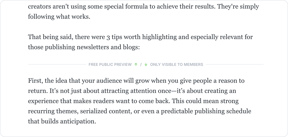
Read more about using public previews to include protected content in your posts.
Button
Add call-to-action buttons to your posts using button cards. Buttons can be center or left-aligned, including custom button text and a link to any URL.

Callout
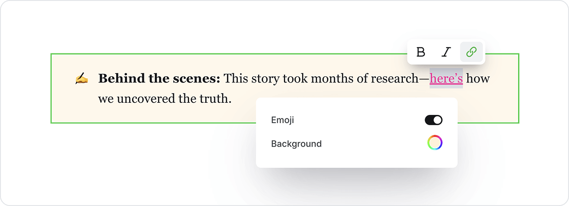
Callout cards allow you to add extra styling to important information on your posts and pages. Each callout card can include an emoji, text with styles and links, and a custom background color.
GIF
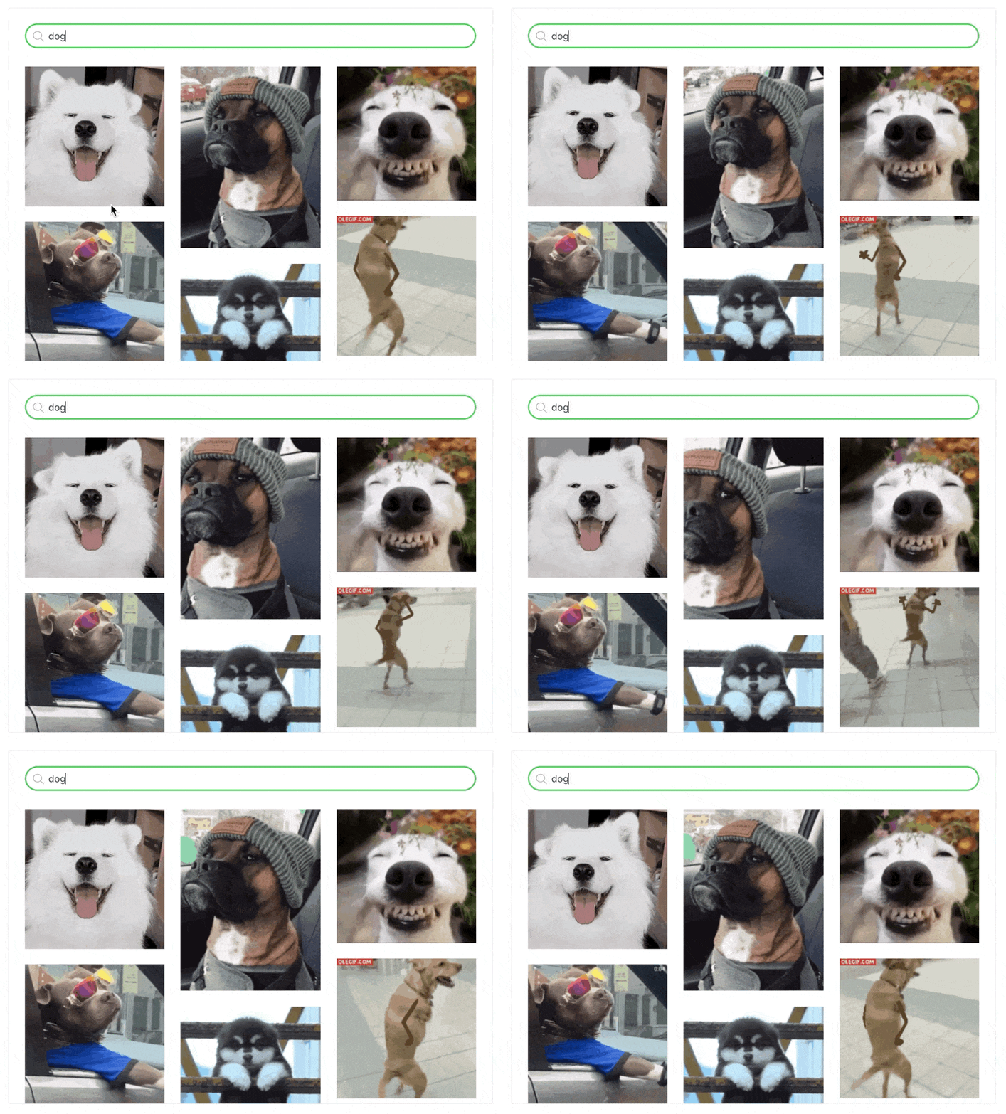
GIFs add movement to your content, and keep readers engaged.
To insert a GIF in the editor, select the GIF card from the card menu, and use the search bar to find the perfect animation to add flare to your content.
Toggle
Toggle cards allow you to create collapsible sections of text that include a custom header, and content that is hidden until expanded.

Toggles support bold, italicized, and hyperlinked text. To utilize the text formatting options, highlight any words or phrases within your toggle card, to set custom styles.
Here's an example:
What is Ghost?
Ghost is a powerful app for new-media creators to publish, share, and grow a business around their content. It comes with modern tools to build a website, publish content, send newsletters, and offer paid subscriptions to members.
Audio
Audio cards allow you to easily insert podcasts, interviews, and more, directly within your posts and pages.
To add audio to your content, select the audio card from the card menu, and select the audio file from your desktop to upload.
.mp3, .wav, and .ogg filetypes.Video
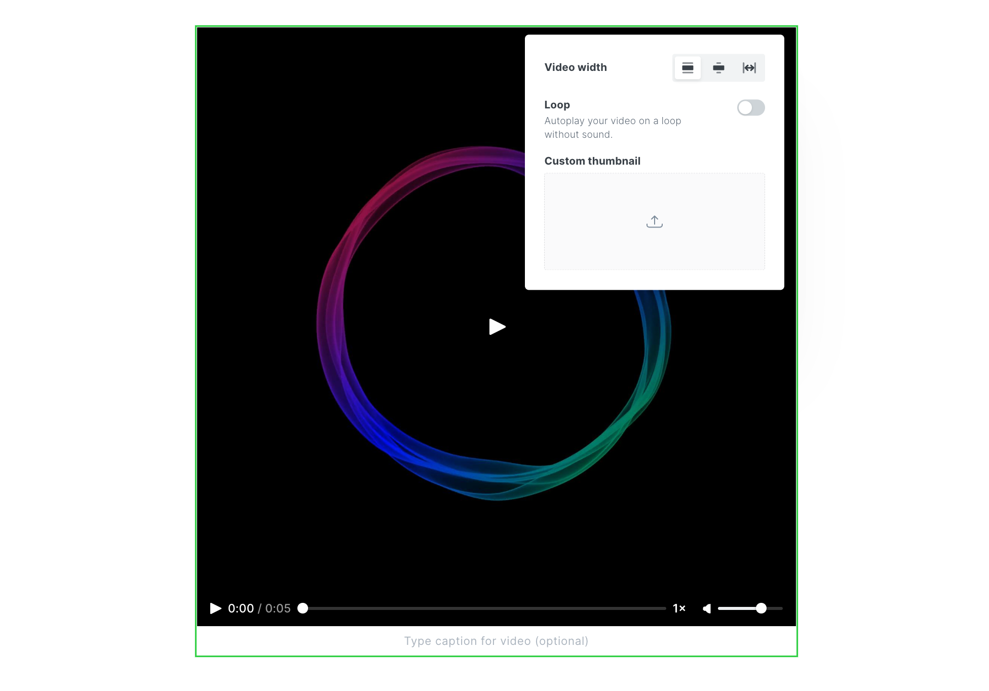
Add video content directly to your posts with the video card to share bonus content, screen recordings, demos, or clips from a full-length feature.
Once uploaded, your video is automatically rendered in a video player, and can be set to loop, have a custom thumbnail, and display in three widths.
.mp4, WebM, and .ogg filetypes.File
File upload cards can be used to share multiple types of content with your audience, for example:
- Share bonus downloadable content with paid members
- Include swipe files or templates for your readers to download
- Give members access to download an ebook you've created
Files display in your content with a custom name and caption, like this:
Product
Display products with custom content, including an image, description, button or rating, so you can add your favorite recommendations to any post.

Russell's Reserve – 6yr Rye
This rye is hot at first and then settles into a nice, soft finish. Vanilla, caramel, and that classic rye spice at the end.
Header
Insert a header card to create visual section dividers, that can support multiple layouts, custom images, headings, subheadings, text and calls to action:
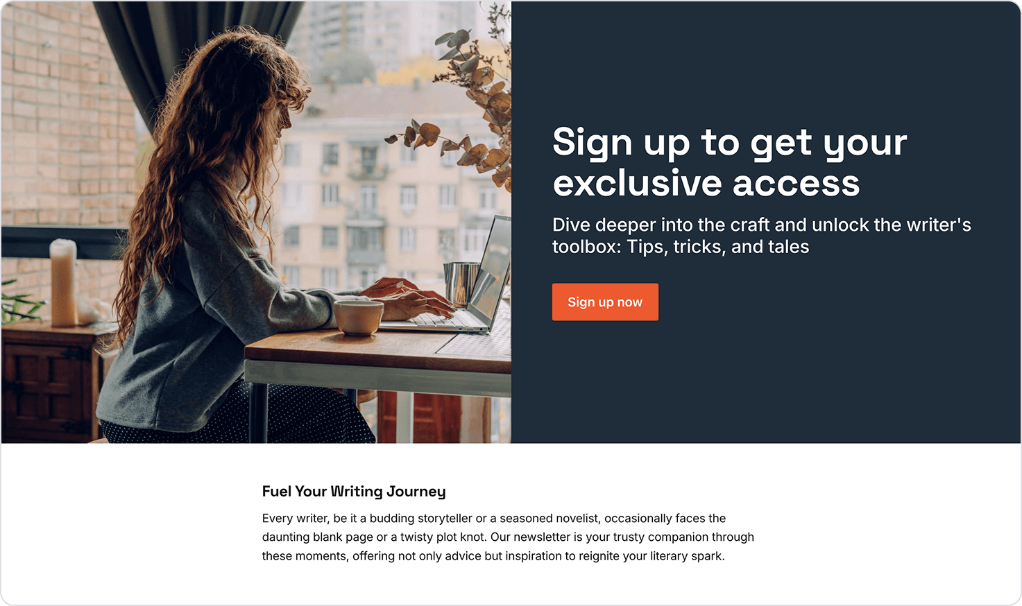
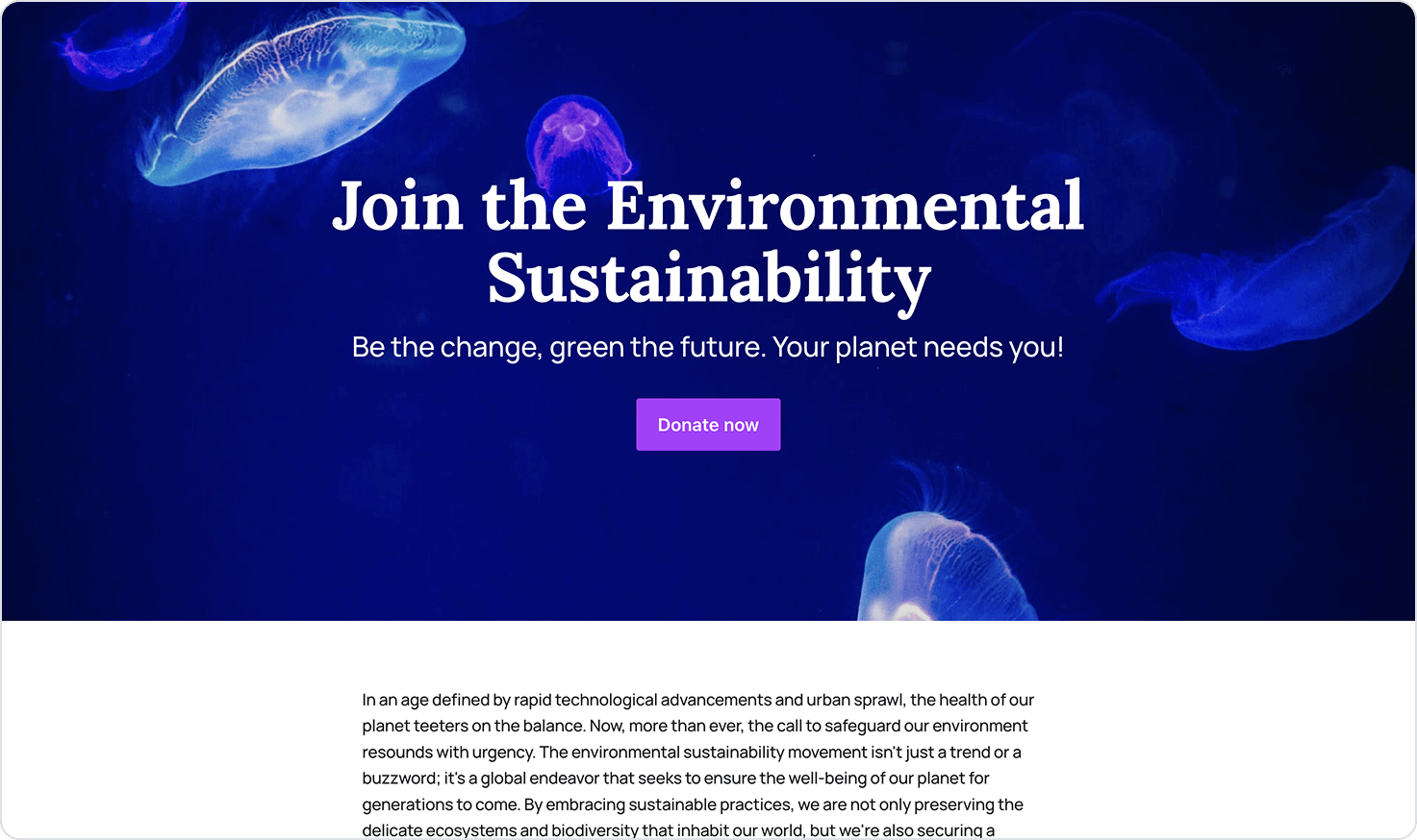
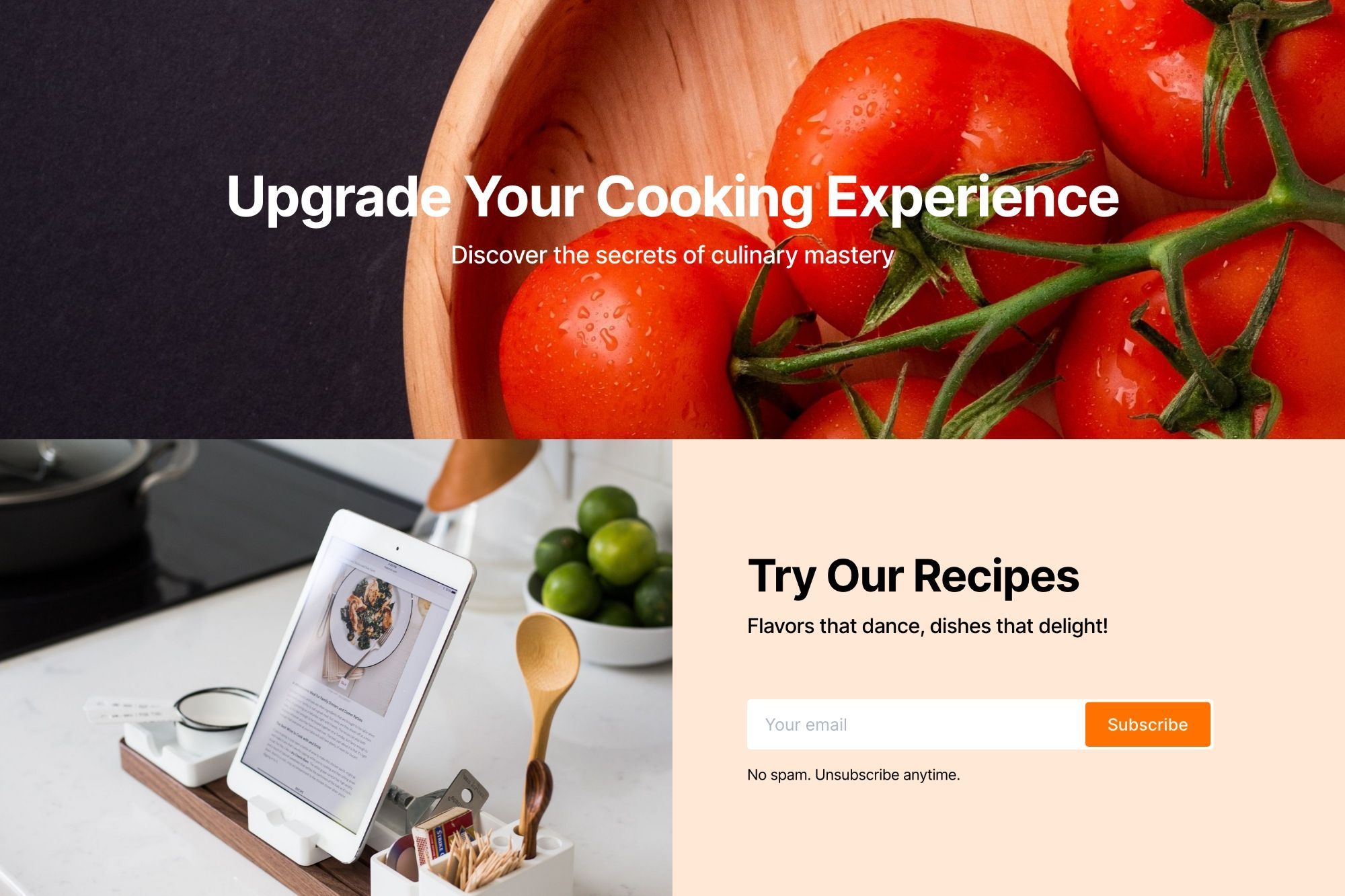
Full-width header cards are also stackable, allowing you to build dynamic landing pages.
Embeds
Many of the most popular tools for embedding rich media work directly with the Ghost editor — all you need to do is paste a URL to the content you're trying to embed directly into a new line of the editor — or you can use the embed options from the card menu.
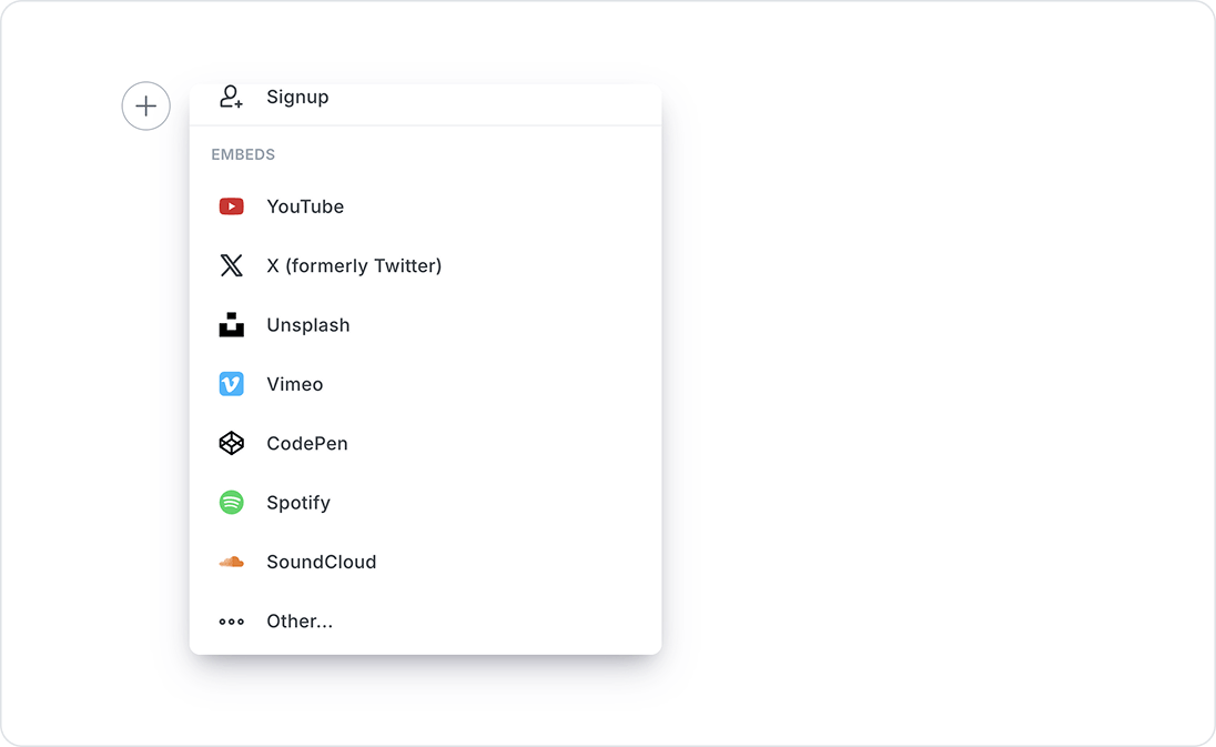
This means you can create embeds from popular tools like YouTube, Spotify, and SoundCloud in your posts by simply pasting a link!
Signup Card
The Signup card allows you to insert a custom signup form, directly within the content you create, without needing to code or leave the editor.
These cards can be used to attract membership on published posts, or custom landing pages, and include a variety of design options.
To add a Signup card within the editor, select the Signup card from the + card menu, or you can type / on a new line.
Click on any text within the card and start typing to edit the copy, then use the customizable card editor to choose your layout, alignment, background color or image, and button color and text.
You can also keep track of members using your signup card, by setting a label within the card design settings. The label you add will be applied to all members who signup via the signup card.
