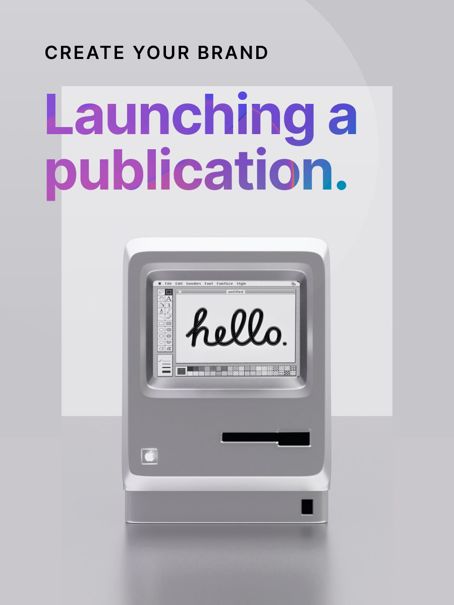
🍃 Crafting a new leaf
Constructing the perfect website and publication is always a tall order. Not only are you building a space that should feel like home to you and your team, but your site must also appeal to the fickle masses who may or may not be interested in what you're delivering. This week's newsletter is about crafting the quintessential web pages that reveal what you're all about, welcome new supporters, and help you maintain close contact with them. Let's go!
In this week's issue 📨
- Create the perfect About page
- Build a Welcome page your subscribers will love
- Contact page best practices
Was this email forwarded to you? Subscribe here!
Mad about you

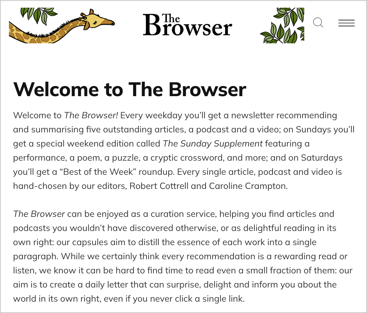
Summarizing your values, mission, hopes, and dreams in one place is no easy feat. A well-thought-out About page needs to impress new visitors while at the same time making your current subscribers feel good about who they've chosen to follow. How can you fit your exciting, and maybe even a little complicated, history in an easy-to-follow, delightfully designed space?
Lindsay Kolowich Cox from HubSpot walks us through creating the perfect About page that shows people who you are in the best way possible.
Your story
- Establish your mission by explaining what you are here to do and why people should care. Your About page should be more than a single mission statement, so declare your goals upfront to draw in subscribers. This ensures that your readers remember you long after they've left your website.
- Everyone has a story to tell, so what's yours? Even if you're just getting started, explain how you began and share your progress. If you've been in the business a while, talk about how you've grown. Sharing personal growth makes your publication more human.
- Showcase your "aha!" moments by sharing the big ideas or drastic life changes your publication was founded on. Don't be shy about revealing your intimate ups and downs. Readers love seeing themselves in your shoes to create a deeper connection with you and your work.
Your values
- Explain whom you serve by establishing your core customer. Not every site visitor will be your ideal audience, so be honest about what your publication provides. This helps readers understand if you align with their needs. Feel free to share examples of existing followers and success stories.
- Reveal how you've evolved since you began your publishing journey. If you've been in the business a while, talk about how you've improved and matured over the years. Sharing personal growth makes your publication feel more accessible and organic.
- Describe your values to establish a real human connection with potential subscribers. Readers want to know they're consuming valuable work created by people they can relate to. Describe who you are as a person, publication, or team. What's the big picture that drives you?
Your presentation
- Choose the best visuals representing you, your publication, and your niche. The colors you select or the photos you upload can make or break someone's perception of your brand. Avoid stock photos, hard-to-read fonts, and complicated color schemes.
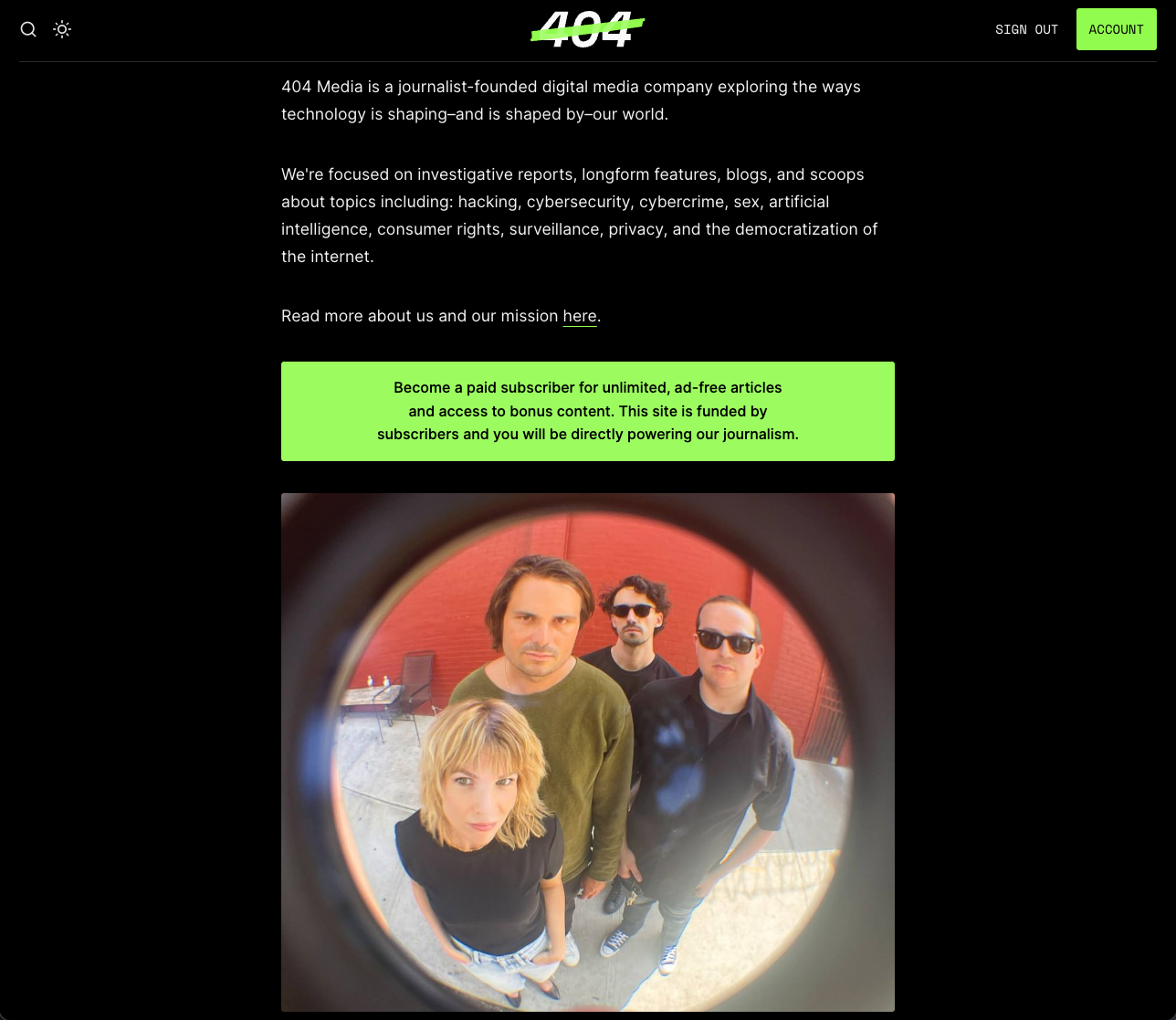
- Share photos of you and your staff to show your culture and overall vibe. (Hey, it's us!) Knowing that real humans are behind your publication makes readers more likely to join in on all the fun. If it's just you, include a family member (furry or otherwise) in your photo.
- Use different kinds of media outside the usual headshot, and consider using a video to tell your company story instead. If you want to go the more scientific route, insert a diagram, chart, map, or graph. Using a variety of media types cleanly and concisely definitely draws a crowd.
Your delivery
- Make it exciting by sharing interesting stories, fun facts, and personal anecdotes. You want your About page to be warm, inviting, and entertaining. Show off your personality and let loose a bit. Not every page of your publication has to be 100% business.
- Avoid long paragraphs and sentences that make your About page difficult for readers to consume. Try sticking to 3-4 line paragraphs and sentences under 20 words. It's nice to share detailed stories, but getting to the point is wise so a potential customer can get to your content.
- Check load times and page responsiveness so visitors don't click away when using their desktop or mobile web browser. You can check page speeds using tools like Google's PageSpeed Insights, and if your About page is loading too slowly, consider reducing the size of any media.
Interesting stories & ideas 📚
- The personhood data dilemma – Tech, Power & Media
- Making cooler and weirder things – NiemanLab
- Addressing news avoidance – Journalism.co.uk
- The first newsletter content house – Embedded
- Breaking down ChatGPT – Barking Up the Wrong Tree
You're welcome

Now that a reader knows what you're all about and has chosen to become a valued member, it's time to greet them with digital open arms. First impressions set the tone for the rest of the relationship, so how can you start things off on the right foot? With a welcoming Welcome page, of course!
Let's look at how you can build a Welcome page that will help introduce new subscribers to your irresistible brand and content.
‣ Set expectations by explaining the type of content (curated lists, original content, or questions) your audience should expect to receive, the frequency (daily, weekly, or monthly) they should see it in their inbox, and who (you or your team) will be sending it. Consider what your members should know right away.
‣ Inject your personality into your Welcome page to set the right tone for what's to come. Everything you do and create should reflect who you are. This gives readers a sense of consistency in your work and helps build trust in your content from day one. Try experimenting with fun emojis or gifs.
‣ Link your best content to serve your members the sweetest-tasting items you've created so far. This will give them a better sense of your style and deepen their relationship with your brand from the start. In turn, they'll be more likely to become paid members if they aren't already.
‣ Deliver lead magnets by placing them near the top of the page so new subscribers can easily find them. Hosting lead magnets directly on your site rather than including them in an email allows you to control the size of the download, the design of the page, and who has access to them.
‣ Get creative with your Welcome page by inviting readers to members-only social communities, offering discounts to paid subscriptions, asking for feedback, or answering common questions. The possibilities are endless. Your first impression style is totally up to you; just make it you.

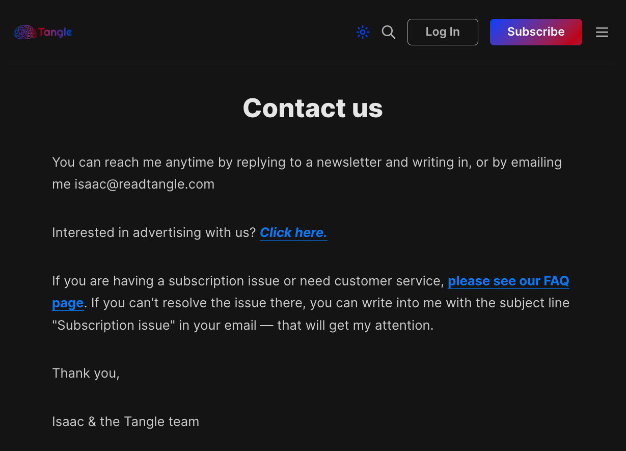
First contact

You've set the table with informative and inviting About and Welcome pages, but how do your new members connect with you? One of the worst things you can do as a publisher is make your supporters feel like you've ghosted them after they've given you their email address. That's why a Contact page is essential.
Webflow shares 10 Contact page best practices that can maximize your chances of gaining new subscribers while helping you keep existing ones.
#1 Make it easy to find by ensuring that your Contact page can be clicked from any part of your publication by placing the link in your footer or nav bar.
#2 Use simple vocabulary for the link, like "Contact Us" instead of "Say hello" or "Let's chat." More straightforward language is usually best.
#3 Provide multiple methods of communication like an email address, phone number, or any social media accounts for effortless connection.
#4 Design a simple contact form using integrations like Formspree or Tally so your readers have a nice template to use when communicating with you.
#5 Offer relevant details about your publication on your Contact page related to the content you create and the services you provide.
#6 Provide your address and a map if you have a physical location. This helps people find your business and increases their level of trust.
#7 Answer common questions directly from your Contact page or give a link to a FAQ page. This offers instant answers to common questions to save time.
#8 Clearly define your response times based on your availability during the week or weekend so your subscribers know when to expect a reply.
#9 Remove any unnecessary visual details to avoid distractions. Use generous white space, legible fonts, and simple language.
#10 Optimize and test your Contact page to ensure everything works correctly on both desktop and mobile. A broken Contact page doesn't help anyone!
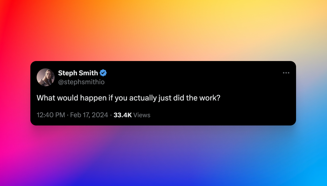
Curator's pick ✍️
Enjoy this newsletter? Forward to a friend or hit reply to share your thoughts. We don't bite! 👻
Want more how-tos? Search our library of tutorials and subscribe to our monthly "Build with Ghost" newsletter.
Join our Ghost Creator Community! Connect with like-minded people who create content professionally — apply here.