How to build a welcome page new subscribers love
Discover how a smart reception can grow your business.
First impressions often set the tone for the rest of the relationship. That’s why it’s important to smile, make eye content, and use positive body language when meeting someone for the first time.
But what about digital first impressions? How can you give new subscribers a memorable, positive experience so things start off on the right foot?
The answer is welcome pages. A welcome page is a landing page that introduces new subscribers to your brand and content. In this article, we’ll look at a few best practices for setting one up and giving your new readers a great experience.
Set expectations
The first thing a welcome page should do is set expectations for your audience. Over-communication is a benefit for publishers. Readers move fast online because information moves so quickly, so it’s common for subscribers to miss a detail or two about what they’ve signed up for.
When setting expectations, here are a few areas to include:
- The type of content subscribers will receive (curated lists, original content, questions, charts, etc.)
- The frequency of publishing (daily, weekly, monthly)
- Who will be sending the content (a single creator vs. a team)
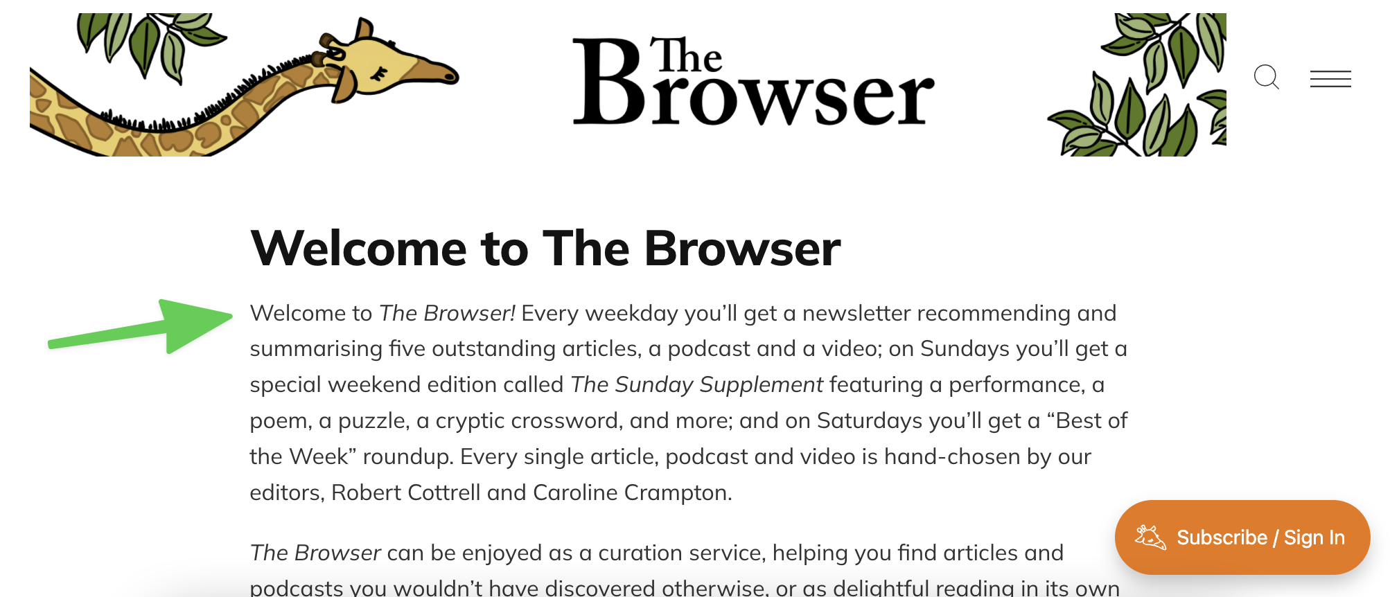
The Browser, a curation-focused newsletter, does an excellent job of this. In the first paragraph on their welcome page, new readers learn that they’ll be receiving a curated list (type) every weekday (frequency) made by their two editors (Robert and Caroline).
Of course, how you choose to communicate this information is up to you — which brings us to the next best practice.
Show personality
Welcome pages are an essential part of the onboarding process, but that doesn’t mean they have to be boring. A great page should set the expectations for the tone of the content. Do you publish serious, in-depth articles? Short, humor-filled summaries? Do you use a lot of images or none at all?
Whatever your style, your welcome page should reflect this and rely on similar elements to onboard new subscribers. This gives readers a sense of consistency in your work and can help build trust in your content from day one.
One example is our own Ghost Newsletter page. Our content utilizes images, humor, and opinions, so it was important to include elements along these lines.
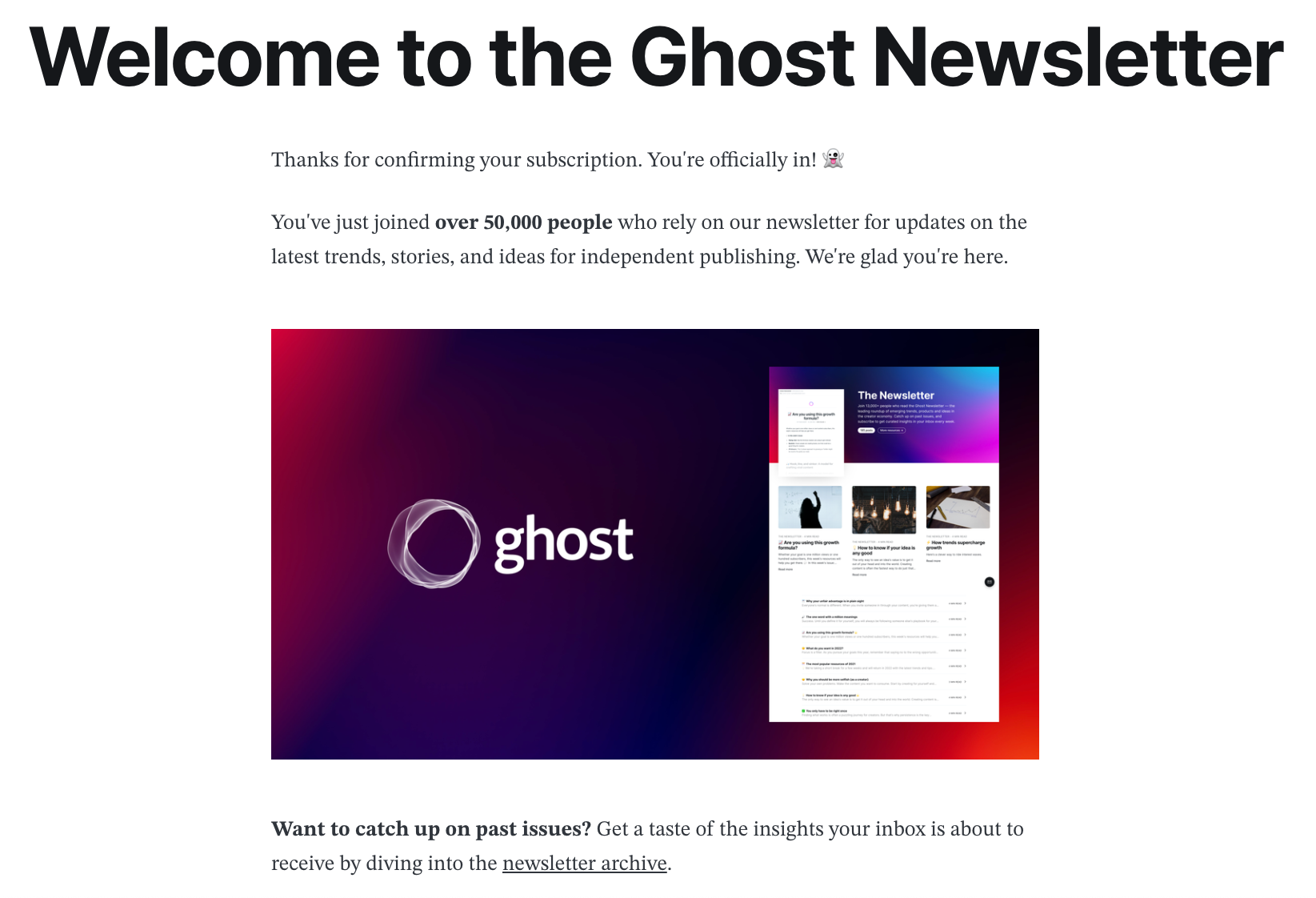
- An emoji or gif near the top of the page sets a lighter tone than what readers find in most business-related publications.
- As they scroll, new subscribers see images crafted specifically for this page.
- The section closes with links to some Ghost resources.
Every creator has a unique personality, and how you choose to show it is up to you. One of the best ways, across the board, is to give your new audience members a strategic taste of what you make.
Link to your best content
When a new subscriber lands on your welcome page, chances are they’ve only interacted with a few of your latest posts. Something they read or saw captured their interest enough to make them want to sign up to receive more.
One way you can immediately satisfy this desire is by curating links to a few of your best or most popular articles. This way, new readers can immediately dive in, which leads to a few benefits.
- Readers will get a better sense of your style and topic choices.
- They’ll deepen their trust and relationship with your brand.
- Readers who consume a large amount of free content are more likely to become paying members and supporters.
Deliver lead magnets
If you choose to use lead magnets as a means of growing your audience, welcome pages are a perfect place to house them. Ideally, these should be placed near the top of the page, so that new subscribers can find them quickly and easily.
By hosting this resource on your website, versus delivering it through email, you can control more aspects such as the size of the download, the design of the page, who can access it (logged in members vs. an email that can be forwarded to anyone), and much more.
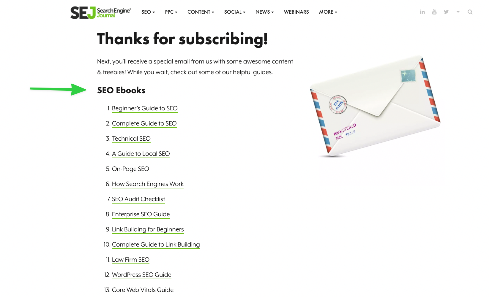
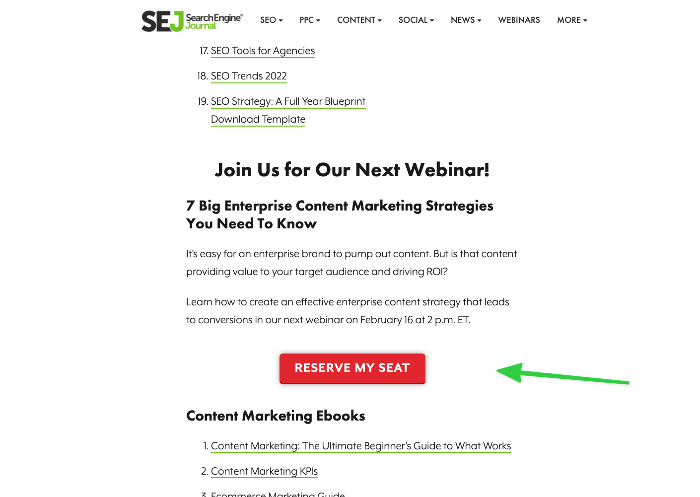
A perfect example of a welcome page with a collection of freebies is this one by Search Engine Journal. Every new subscriber gets access to over two dozen ebooks, which are all conveniently hosted on a single page, making it a resource they're sure to revisit.
Guide towards a next step
At their core, welcome pages are another type of landing page. This means they are the perfect tool to drive action towards a clearly defined next step.
A few things you might want new readers to do are:
- Join a private, members-only community.
- Use a discount code to upgrade to a paid membership.
- Answer a question that will help you know them better.
The options are endless, so it’s important to understand what actions will drive your business forward and guide readers towards those. For example, the Search Engine Journal page mentioned above offers new subscribers a seat in an upcoming webinar. The webinar is part of their marketing funnel and helps them turn their audience into revenue.
When deciding what to include on your welcome page, the best advice is to work backward.
Think about what your readers need to know, do, or have in order to support your business and make those available as soon as they subscribe. That’s the key to making a first impression that helps everyone win!


