👽 The UX-Files
Do you have a special eye for design? (Yes, we do think the purple couch pairs well with the cow print chair. 🐄) Having great style shows the outside world what your inner self stands for. This principle doesn't just apply to the home you live in or the clothes you wear; it also applies to the work that you do. This week's newsletter is all about creating great first impressions with UX design, what dark patterns to avoid, and using UX to discover who your audience is. Let's go!
In this week's issue 📨
- A guide to color symbolism
- Ten dark patterns to avoid in UX design
- Creating UX personas
Was this email forwarded to you? Subscribe here!
The psychology of color

Color symbolism is the emotional meaning we give to various colors. The color of something can influence our thoughts, feelings, and behaviors. When you see a red fire truck, a yellow sunflower, or an orange... orange, is it the object that invokes a particular emotion, or is it the color?
When it comes to UX, color symbolism is essential in creating UI elements and establishing brand communication. Design agency Ramotion breaks down how to use color psychology to improve your UX design and conversions.
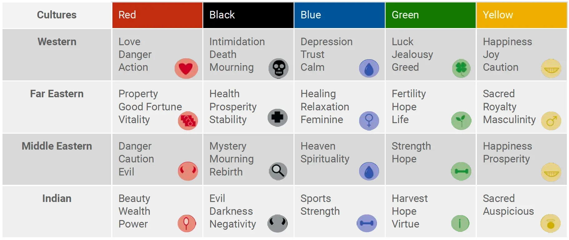
Why is color psychology critical for UX design?
- Color is emotional. Ask yourself what feelings you want to invoke from your customers and how you would like them to act on those sensations. Specific color preferences can allure or ward off a user's attention.
- Color is cultural. Before diving in on your favorite colors based on what they mean to you, consider who your audience is. Check the infographic above to review how the same colors are seen in different parts of the world.
- Color makes it memorable. Try a harmonious mix of warm and cool colors to prevent your users from being overwhelmed. You'll also want to consider color in different design elements like banners and infographics.
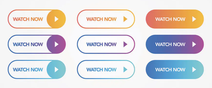
How does color impact conversions?
- Improve your CTAs (call to action) by changing the color of a button or giving buttons and links the same color. Try testing various color choices and combinations to see how your audience reacts.
- Brand image consistency that your readers can instantly recognize and feel good about is essential for growth. Your logo color scheme and your site's color palette should invoke solid and positive emotions for new and existing followers.
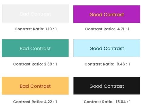
- Not everyone sees color the same way. Using appropriate color contrast can help people with colorblindness and other limitations. Keep the needs of all groups in mind when choosing your colors. Accessibility always!
What are some color design best practices?
- Create your own brand and style guidelines. When creating your publication's design, determine what colors you want to use to establish your brand identity and stick to them.
- Stay consistent with your color design throughout your publication so that the flow of your site is easy to follow. You want your readers to be immersed in your work, not distracted by your design.
- Use the 60-30-10 rule. You should dedicate 60% of space to one neutral color, 30% to the secondary, and 10% to the accent color. This rule is applied by almost every designer for an aesthetically pleasing color palette.
Interesting stories & ideas 📚
- Create a business that runs without you – Jodie Cook
- Readers, not subscribers – Josh Spector
- What's the future of search for publishers? – Media Makers Meet
- Build a culture that supports mental health – Harvard Business Review
- Millennial meme marketing must end – Embedded
The dark side of UX design

We've all had experiences with websites that seem innocent on the outside but are deceptive on the inside. "Are you sure that you're surely not sure about cancel-activating your subscription reactivation?" 😵💫 UX dark patterns are built to trick users into making choices they did not intend to make. Sometimes, these dark patterns can be honest mistakes, but most of the time, they're purposefully crafted to sow customer confusion.
So, how do you make sure you have the best intentions when it comes to design? UX designer and content writer Alexander Varela from Dodonut shares ten common dark patterns to avoid in UX.
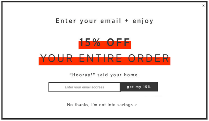
1. Confirmshaming is appealing to emotional blackmail to stop specific actions or to persuade your users to make a different choice. For example, carefully wording decline or cancel options that induce feelings of guilt or shame.
2. Creating fake urgency and FOMO for users who haven't visited your site in a while with phrases like "Your friends miss you" is emotional manipulation at its finest. If you have great content, your audience will always be present.
3. Nagging is when you don't accept "no" for an answer. Try not to include "Not now" or "Not yet" when it comes to choices that require a simple and permanent black-and-white answer.
4. Obstruction or sneaking is done by including a secondary action in the middle of a primary action, such as including hidden costs or items during the customer checkout process.
5. Disguising ads as wanted or expected content has been mastered by all social media platforms. This can cause the user to confuse ads with actual content, and most users end up viewing low-value content they're not interested in.
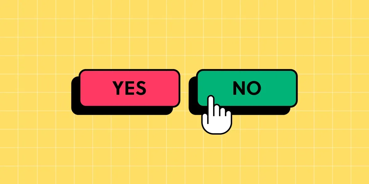
6. Intentional misdirection uses visuals to create the opposite of the desired or expected outcome. For instance, giving a ‘Cancel’ button two meanings: ‘confirm’ the cancellation or ‘cancel’ the cancellation.
7. Roach motel patterns and trick questions are used to get customers into situations they cannot escape. This can lead users to unnecessary purchases or make them subscribe to newsletters that are difficult to unsubscribe from.
8. Preselection is when a workflow makes an automatic decision that benefits the company and not the customer. This causes accidental purchases and unintended upgrades the user never officially agreed to.
9. Friend spam is a manipulation tactic that tricks users into giving specific permissions or access to their contacts, also known as "contact harvesting." This is often presented as beneficial for the user but is only for the benefit of the company.
10. Forced Continuity is a way for companies to start charging you subscription fees unexpectedly. They deceive you into giving billing information with the promise of free services, only to charge you later without the chance to opt out.

Get personal with personas

To dream up a user-friendly website, most UX designers will tell you that creating a "UX persona" is the first step to putting yourself in your users' shoes. These semi-fictional characters represent your target audience's wants, needs, and characteristics, enabling you to empathize and make better design decisions.
Althea Storm from HubSpot walks us through the benefits of UX personas and shares some tips on how to create them.
The benefits of UX personas:
- Personas help you understand your target customers. This allows you to discover your audience's natural preferences, attitudes, and challenges so you can empathize with their product participation.
- Personas help you make better product decisions. Knowing users' pain points, goals, and motivations enables you to implement changes that positively impact their experiences with you and your work.
- Personas help you retain users. You can create more user-friendly interfaces by understanding your audience's behavior and preferences. This is essential to staying on course and keeping your customers happy.
- Personas help you strategize. Through research, designers learn about their target audience's behaviors, needs, and pain points, making informed decisions on features, site hierarchy, color palettes, and other design elements.
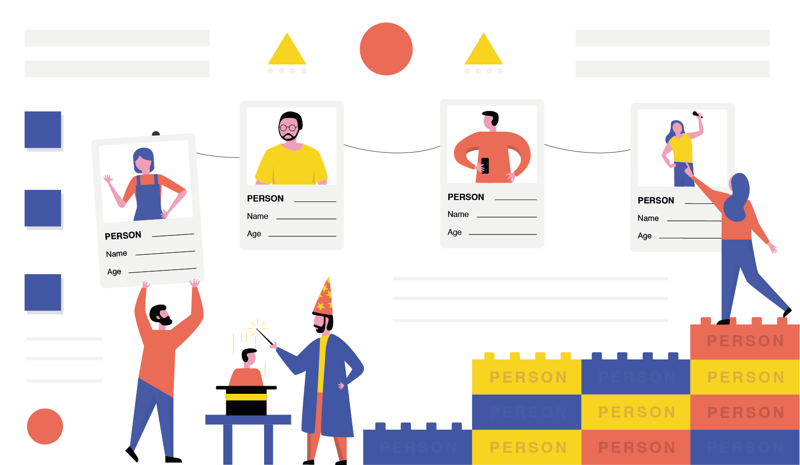
Tips for creating UX personas:
- Demographics shouldn't dominate. Your personas should be based on user behavior, goals, and motivations. Simply knowing the age and job title of your customers is not enough. You need to understand what's stopping them from subscribing.
- Don't create fake personas. Avoid creating a UX persona based solely on your own understanding of your work. This approach can result in a product that caters to only your needs rather than your users. Start gathering insights from your target audience through communication and connection.
- Keep an open mind. When researching your target audience, remind yourself that their experiences might differ from your own. Always remember that you are not the customer. Take a step back and let the insights of your users guide you.
- Encourage community. Create spaces, like a comments section or a Discord, where your users can connect to share their likes, dislikes, and anything in between. You may also want to reach out to peers in your field for advice and direction.
Curator's pick ✍️
Enjoy this newsletter? Forward to a friend or hit reply to share your thoughts. We don't bite! 👻
Want more how-tos? Search our library of tutorials and subscribe to our monthly "Build with Ghost" newsletter.
Join our Ghost Creator Community! Connect with like-minded people who create content professionally — apply here.


