🧑🎨 Designing your dreams
When brainstorming a bold look for your publication, the perfect images you see in your head may not always reach your screen. It's easy to think of fantastic design plans; the hard part is making them a reality, especially if you don't have all the know-how. This week's newsletter is about finding the right person for your dream design project, what design mistakes to avoid, and why the look of your posts is just as important as the words you write. Let's go!
In this week's issue 📨
- How to compose a design brief
- Making the right design decisions
- The importance of proper post format
Was this email forwarded to you? Subscribe here!
Keep it brief

Third-party designers and developers can assist with polishing your existing site, building a new one from scratch, or optimizing your setup to get the best results possible. Whether you're just getting started with your publication or you're ready for a revamp, it's crucial to have a good design brief handy so you don't hire the wrong person for the job.
Let's look at the proper way to create a vivid design brief so your project and who you've hired can start on the right foot.
Your overview
- It's always a good idea to start with a summary of your design goals and lay out all the problems you want to solve. Making your point clear and getting to it as soon as possible will help your developer quickly determine whether they're the best fit for your plan.
- Within your summary, be sure to set proper expectations, like your project budget and timeline. This will ensure that any expert reviewing your design brief knows if they're who you're looking for before they get too deep. Being transparent from the get-go is the best way to find the right person.
Your profile
- Include details about what your publication is all about and who your target audience is. This will give the person you hire a good idea of your content and if you'll mesh well together. You don't need to provide a full life biography; just give the key elements of your work.
- Freelancers tend to work for your business on a short-term basis, which means they'll need to absorb all of the relevant context as quickly as possible. Give a short introduction to your publication, a summary of your target audience, your site's URL, your publishing platform, and key stakeholders.
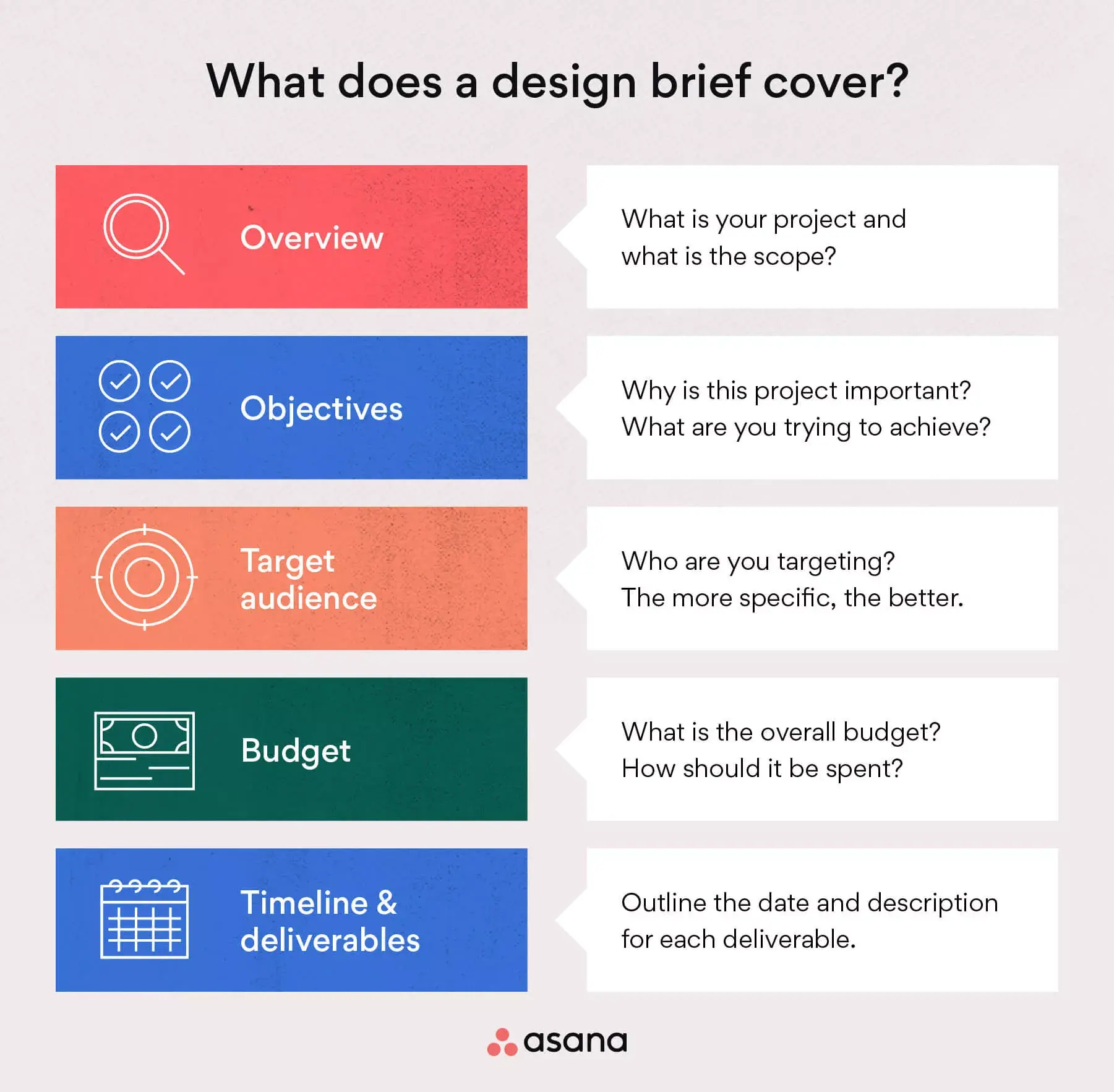
Your goals
- When embarking on your website design journey, outlining your objectives should always be a priority. If you don't know why you're looking for design help, then what does it all mean? If your desired achievements are clear to you, they'll be clear to your developer.
- Your design brief should summarize the purpose of your project (goals), break everything down into something measurable (objectives), and explain the actions you'd like to see your expert take to reach them (requirements). The more context you can give, the easier the hiring process will be.
Your outline
- Once you've provided all relevant and concise information upfront so that your designer knows whether or not they're the right resource, it's time to spell everything out. Creating an outline of your project that gives all of the intricate ingredients of your project is your final step.
- If you're a visual person, feel free to sketch out what you have in mind (Your drawings don't have to be perfect!) and find existing examples to use as reference materials. You can also share any design assets you already have in your toolbelt, like brand colors, logos, fonts, and images.
Interesting stories & ideas 📚
- Gen Z and Creator Marketing - HubSpot
- What makes a good website? - Ahrefs Blog
- X gets banned in Brazil – Platformer
- Ace subscriber onboarding - The Audiencers
- Delight in website design - Content Technologist
Intelligent design

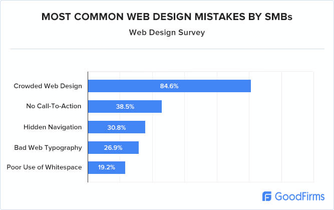
The design of your publication is more than just nice-looking pages. Your design decisions impact your website's performance, help you gain more subscribers, and influence your publication's overall credibility. No matter your niche, your target audience, or the size of your business, good web design can be one of your greatest weapons in the battle of conversions.
Alec Hanak, art director at Digital Silk, breaks down the essential elements of quality web design to help embolden your brand and avoid mistakes.
#1 Website accessibility supports users with hearing, cognitive, visual, or other disabilities, or solutions like screen reader and speech input software.
#2 Intuitive navigation, which uses clear language and provides links to important pages, allows users to quickly find the information they're looking for.
#3 To-the-point copy with easy-to-understand language increases usability by up to 58%, which can also positively impact bounce rates.
#4 Impactful visuals and a clean design can help capture a reader's attention, but be careful not to overdo it. Too many images can slow down your site.
#5 Call-to-action buttons invite your visitors to get more interactive. Good CTAs are clear and specific, so people know what they're clicking on.
#6 Page speed is one of the most critical factors of good website design. If your site is loading a bit slowly, try reducing the size of your images.
#7 Social proof is evidence that increases your credibility. Reviews from existing subscribers help showcase your trustworthiness and increase conversions.
#8 Consistency in your design choices helps make your brand recognizable and memorable. Set some detailed brand guidelines to keep you on course.
Laying it all out

Your publication's design choices won't always be about site layout and site speed; they're also about the format of your blog posts. Like it or not, your readers will often skim your posts to find the meat. Good post formatting makes things easier on the eyes and keeps attention spans in check. Your words matter, and how they're displayed on a screen matters just as much.
Tan Siew Ann, senior content writer at Semrush, shares some best practices for blog post formatting to increase your engagement.
‣ Summarize your post’s main idea using headings to indicate key discussion points, break your content into sections, and help members understand what they’ll learn. Readers can reference the post’s heading to get the gist of what the post is about so they can decide if reading the whole thing will be useful.
‣ Write short paragraphs and sentences (like we do in this newsletter 👋) to make your post easier to read and more visually appealing. Try stating only one point per sentence, avoid writing with fluff, and break up giant walls of text. Your content should always be concise and to the point.
‣ Feature significant points with bold formatting so your readers know what they should pay attention to. Bolding key points will help your followers quickly find what's important and keep their eyes on the screen. Just don't go overboard. If everything is in bold, nothing is important.
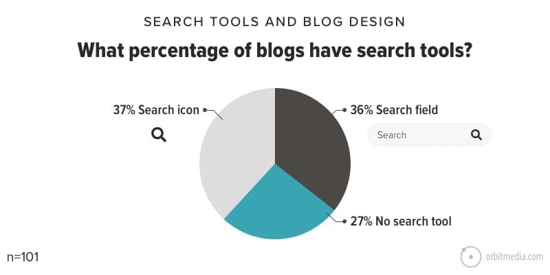
‣ Create lists to display related points succinctly, present information in the correct order, and add some visual variety to your posts. Presenting your info in list format helps readers keep track of their progress as they absorb all of the information. Try mixing it up by using bullets, numbers, and letters.
‣ Make complex ideas easier to understand using media and visuals like images, videos, charts, graphs, and diagrams. Elements like these can inject color and excitement into any post that may need some extra oomph. Visuals can also help explain and expand on any complicated concepts.
‣ Add more visual interest using block quotes to spotlight expert quotes in your blog post, buttons to highlight your CTAs, and banners to underline other relevant content. Doing all this while keeping your post's design choices very demure will help you maximize traffic and boost conversions.
Curator's pick ✍️
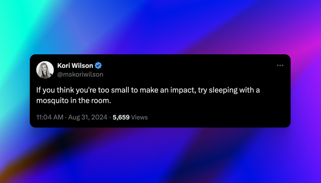
Enjoy this newsletter? Forward to a friend or hit reply to share your thoughts. We don't bite! 👻
Want more how-tos? Search our library of tutorials and subscribe to our monthly "Build with Ghost" newsletter.
Join our Ghost Creator Community! Connect with like-minded people who create content professionally — apply here.


