🧚♀️ Keep the creative spark alive
Welcome back to your weekly roundup of the top ideas and stories in the creator economy. We took a short break last Sunday as the Ghost team got together for our annual retreat (which means cool things are coming soon 🤫). We're excited to be back. Let's dive in 🏊♂️
💬 In this week's issue:
- Creativity — There is no such thing as perfect, and as creators, we can take comfort in that. Use these tips to stay inspired!
- Newsletter landing pages — Any successful newsletter starts with a solid signup page, so here's three mistakes you should avoid making with yours!
- Getting sponsorships — Looking to monetize a newsletter through ads or sponsors? Find out how the experts create a strong media kit.
Was this email forwarded to you? Subscribe here!
The pressure of staying inspired

Inspiration is everywhere. It's in the things we love, the work we admire, and the people we want to be. But recognizing the best inspiration for your creative work can be daunting. How do you stay inspired without getting tired? Writer Gina Chung spoke with Eva Recinos over at The Creative Independent on how she keeps her creative juices flowing. 🧃
It’s almost like we go around with these invisible or unconscious rule books in our heads, and it’s only until we see someone, quote unquote, breaking those rules that it occurs to us that we can do it a different way. That helps me a lot to take the pressure off of ideas or timelines or things like that. - Gina Chung
Finding your own groove within creative spaces is all about discovering what works best for you. Each person's process is unique to them, and once you find what sparks your inspiration, creating comes easy. Here's what can help:
- Make your creative work more concrete by doing proper research
- Find friends within your creative field that can provide emotional support
- Take a break from creating to discover other outlets that stretch your mind
- It's ok to start working on the next "thing" to find inspiration for your current "thing"
[What] also helps me is doing a form of art that doesn’t feel as high stakes as writing does. I feel like when we’re all growing up, we all play and dabble in various art forms without thinking about it. So many kids will just sit down with a bunch of crayons and just create something amazing and not feel any kind of precious way about it. It’s only when we get older and more self-conscious that we start to think, “Oh no, if this isn’t any good, I have to abandon it.” - Gina Chung
Knowledge is power, but knowledge can also be pressure. It can feel like the world's weight is on your shoulders when trying to find the right inspiration to create the perfect thing, but in the creative space, there's no such thing as "perfect". You are the only person who can define what's "right" for you. Just breathe! 🧘
Interesting stories & ideas 📚
- Make it about them, make it relatable & cut the fluff + 7 more copywriting tips from Neal O'Grady.
- How to build a resilient business in times of change and uncertainty by harnessing the power of liminal spaces.
- How newsletter publishers are expanding and diversifying beyond inbox-based revenue.
- The ultimate guide on the landscape of the creator economy in 2023.
- From first prompt to published page: How to create a landing page with ChatGPT.
Avoid these newsletter landing page mistakes

Newsletters are a big deal in the publishing world (to state the obvious). Whether your newsletter is your product, a method of distributing content, or a marketing channel, one thing is true: It all starts with a strong newsletter landing page.
Cory Brown studied over 200 newsletter landing pages and distilled the takeaways into the three biggest mistakes to avoid with your newsletter signup page:
#1 Lack of focus
The primary motivation for your newsletter signup page is to encourage visitors to enter an email address and consent to you sending emails to them. If your page lacks focus, is confusing, or has too much going on, visitors are more likely to leave without taking any action.
✅ Using minimal content to allow space for the most important things: your headline, image, call-to-action, and social proof.
✅ Using big headlines and giving your content space to breathe on the page.
✅ Making use of contrast.
#2 Too many interruptions
Have you ever visited a website only to be bombarded by popups, banners, and promotions? Bet you left the site pretty quickly after that, right? Your visitors and future newsletter subscribers are most likely to be turned off by the poor user experience, too.
Some marketers argue that popups increase conversion rates, but this is often because the popup is standing in for a poorly constructed landing page.
#3 Neglecting mobile
Many of your visitors will be on mobile devices, so it's important to make your signup page optimized for those visitors. If you've already avoided mistakes 1 & 2, you're off to a great start.
✅ Keep the page simple and uncluttered
✅ Page speed is more important than ever on mobile, so make sure your page is optimized.
How to sell newsletter ads

Many successful newsletters monetize using multiple revenue streams to make up their business model. We believe subscriptions are the most sustainable for long-term and predictable growth, but there are plenty of publications that also leverage ads and sponsorships to bolster revenue.
Selling newsletter ads can sound feel like a daunting task, though. Setting your newsletter up for ad revenue success involves figuring out where to place your ads in your content, setting your price, and finding strong advertising partners.
The Newsletter Operator shared a helpful article that explains how to make a media kit to sell ads for your newsletter, along with 20 examples of the best media kits and sponsorship pages for you to take inspiration from.
- Introduce your brand. Keep it short, sweet, and punchy!
- Share your numbers. Potential advertisers need to know how many people their ads will reach, so include your subscriber numbers as well as average open rates and CTR.
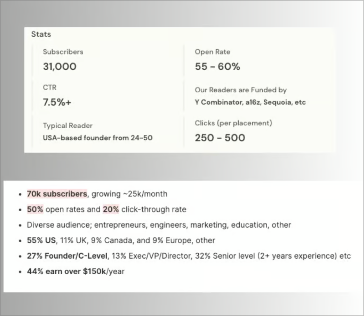
Other interesting stats to include: Average ad clicks per placement, how fast
your audience is growing, and audience demographics.
- Show impact. Include testimonials or tweets from your readers. This social proof helps demonstrate how much your readers love your work and therefore are more likely to engage with sponsored content.
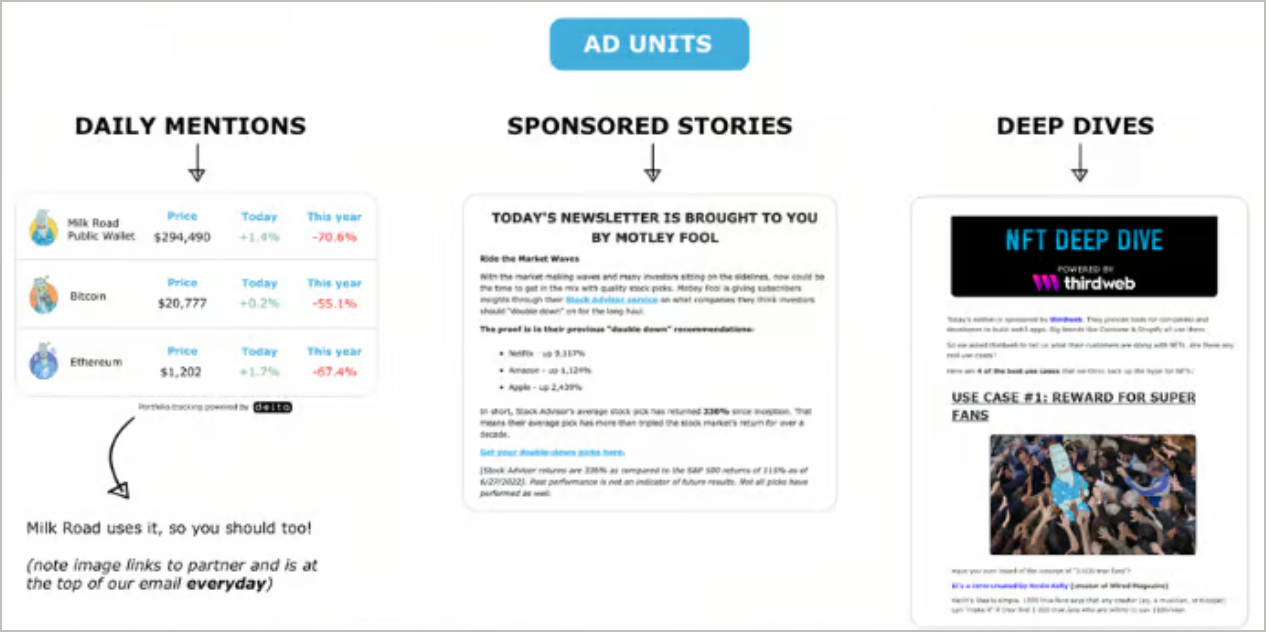
- Give examples. What does an ad or sponsored content segment look like in your newsletter? Show some examples so they can see what they're going to get.
- Ad pricing. Include a clear rate card explaining how much an ad placement will cost. Keep it simple and easy to understand.
- Case studies. Include examples of past sponsors, including how many clicks/conversions they received from running an ad in your newsletter.
Don't forget, your media kit can evolve and grow over time. If you don't have all of this information yet, you can add it later!
Curator's pick
Enjoy this newsletter?
Forward to a friend, sharing is caring.
Anything else? Hit reply to send us feedback or say hello. We don't bite!
Join an invite-only community! Connect with like-minded people who create content professionally — apply here.


