A publishers guide to content organization
Deciding how to structure your content doesn't need to be difficult.
Organizing content on your website effectively is important since it helps provide visitors with the best possible experience. This is especially true for publishers and content creators who are running content businesses.
Having a good site structure helps your visitors and search engines navigate your site, understand what your content is about, and gives your creative work space to stand out.
Structuring your content
There are no one size fits all rules to website content organization, but there are several best practices and examples you can follow, as we’ll outline in this resource.
A great place to start is to use your home page as a guide. This is one of the most important pages that a large majority of visitors use to navigate your website and its content. It’s the place where you can set the tone, share your latest or best work, and attract subscribers or sell premium memberships.
To illustrate this further, let’s look at some of the most popular types of website content organization that content creators using Ghost are making use of.
#1 Chronological posts
This is the most popular type of home page for publishers and a common home page structure that many Ghost themes make use of. A chronological content structure means that your newest posts are shown first.
The great thing about this method is that returning visitors can easily find your latest work, and new visitors can quickly get a sense of what your content is all about, simply by looking at a feed of your latest work.
A great example of this type of home page in action is Kevin Indig’s SEO blog and newsletter:
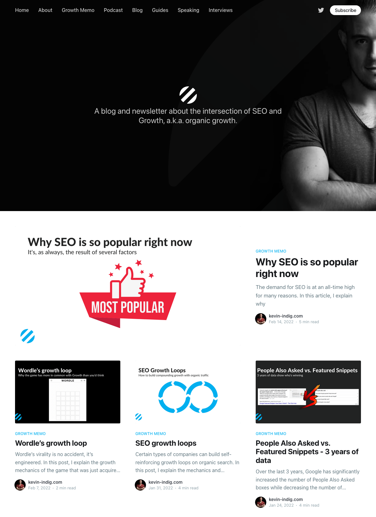
Using the Casper theme, Kevin’s home page offers a feed of content without other distractions, along with a clear method to subscribe to stay up to date with the latest content.
#2 Categorized content
The next home page style is to organize content by category, using tags. This is especially useful for publishers who have two or more distinct topics or types of content, and want to display them clearly when visitors hit their home page.
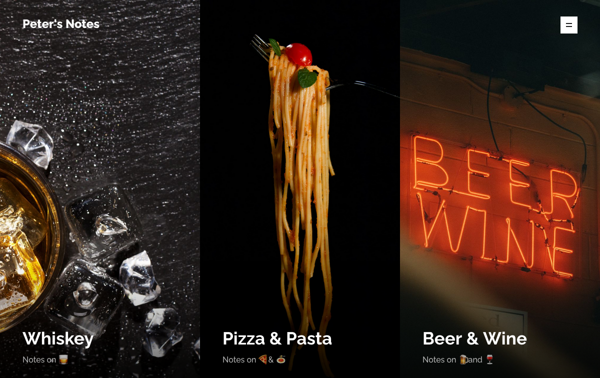
Using tag archives to categorize content
Tags in Ghost are a powerful tool for content organization, that allow you to quickly organize content by topic, or by type (e.g. articles, podcast episodes and newsletter issues).
Each new tag you create comes with an automatically generated tag archive. For example, if you have a tag of newsletter then you’ll find a content collection including all posts using this tag at: www.yoursite.com/tag/newsletter.
To make tag archives shareable and indexable for the search engines, edit the settings from the Tags menu.
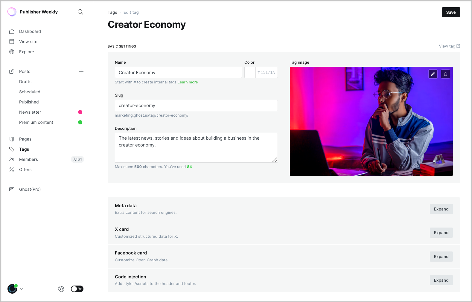
Tag archives can be added to your navigation as links, or featured on your home page using a theme that has been designed for this structure, such as Dope, Inros, and Genki.
#3 Featured posts with feed
The next type of home page combines a chronological feed with the addition of a featured post block. This is a great way to draw attention to your most popular work and get new visitors hooked, while still providing the latest posts in a feed.
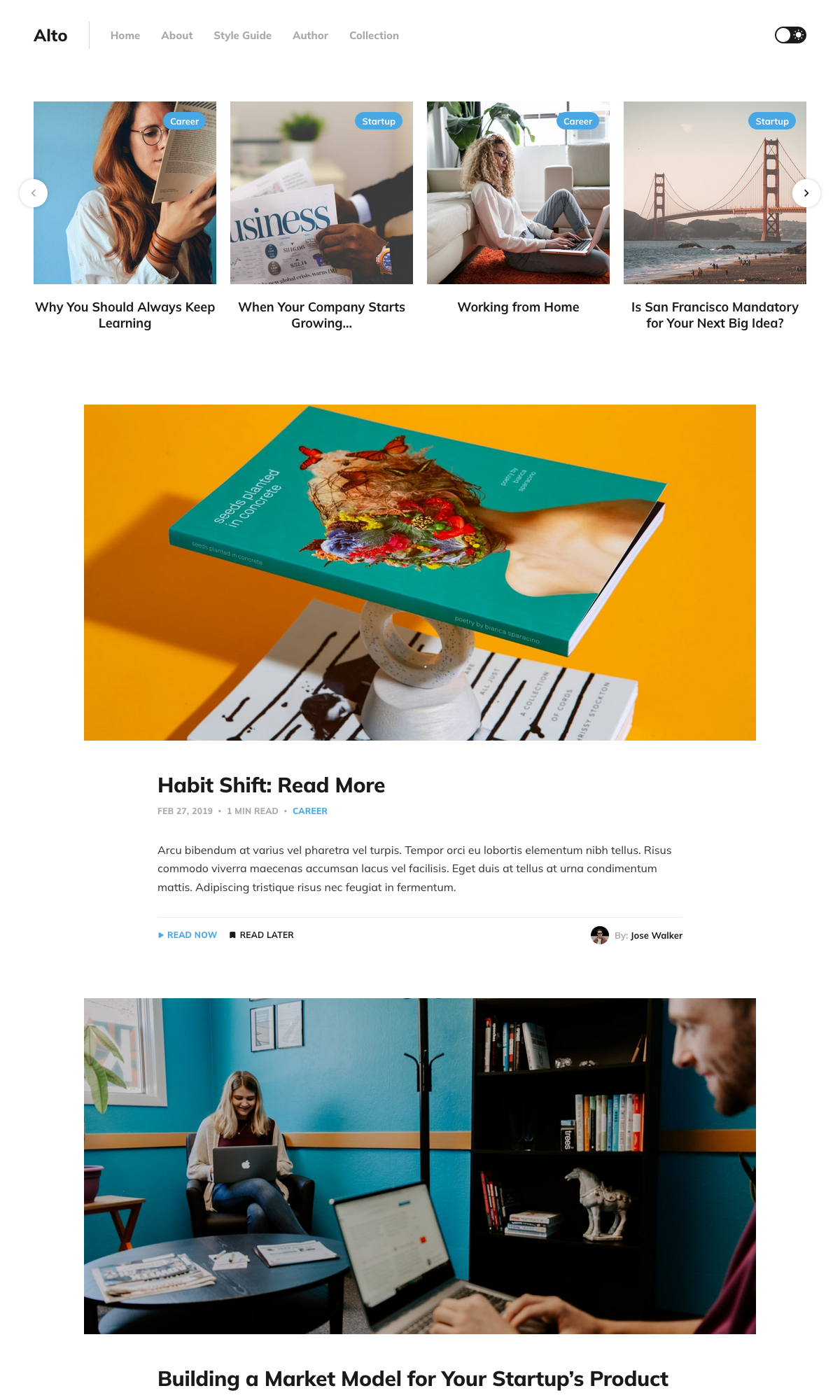
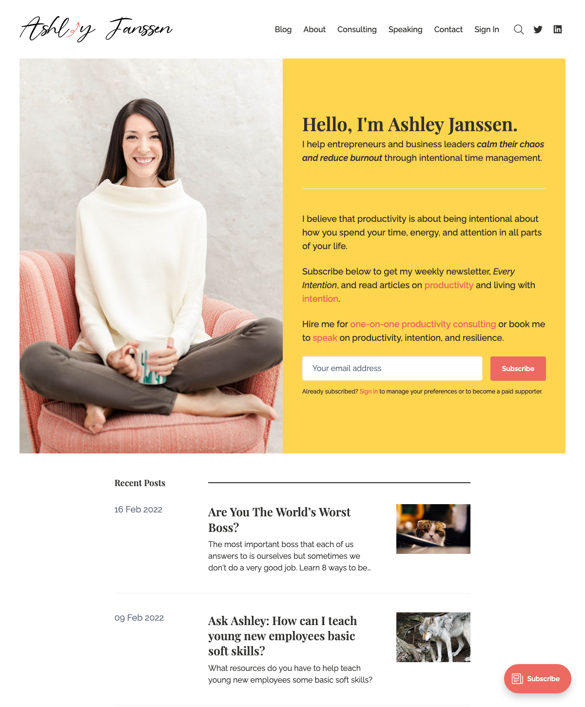
#4 Landing page with feed
This style of home page allows you to share some information about yourself or your publication, alongside a subscription form and a chronological feed of the latest content.
This structure is a great way to introduce your work, while also providing the latest content for visitors to browse.
For example, Ashley Janssen has used this structure to share information about what their content helps people do (helps business leaders calm their chaos), with a subscription form, followed by their latest posts.
Having this information on your home page is often still accompanied by an about page in your site’s navigation. Find out how to create a successful about page.
#5 Subscription focused
The final popular website structure is to focus on subscriptions, with a preview of the most latest issue, and a prominent subscription form.
This type of structure is most useful for newsletters that don’t have other types of content that need to be displayed on the home page, and want to focus on driving action towards turning new visitors into subscribers as quickly as possible.
The Bulletin and Digest themes are both designed for this use case and allow you to get started with this website content structure in a few clicks:

#6 Custom site structure
The previous five types of website content organization can be achieved using a pre-built theme that is ready to go. However, since Ghost themes are flexible, there’s pretty much no limits to what you can achieve if you decide to create a custom theme, or build a custom home page into your existing theme.
This is more of an advanced step, and definitely not advised if you’re just getting started. In the beginning, publishing frequently and growing your audience should be your main focus.
Here’s some examples of thriving independent publishers who have created a custom home page to structure their content in different ways:
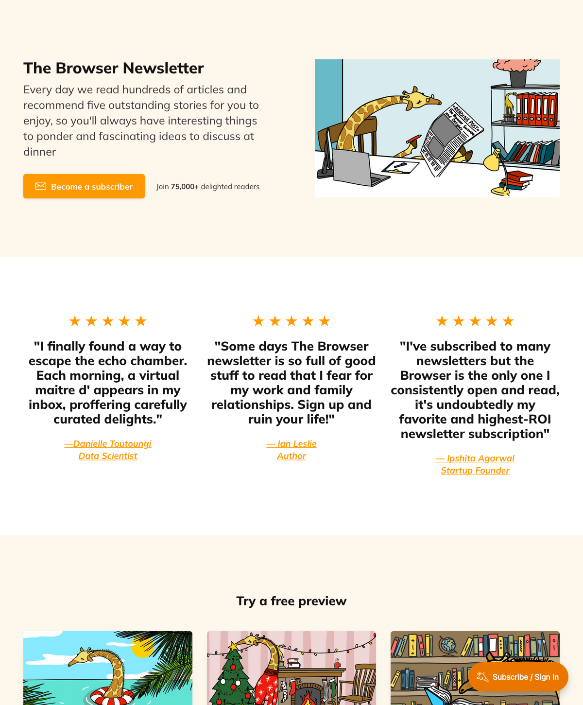
The Browser
This paid curated newsletter uses a subscription focused custom home page, with testimonials and a small selection of free previews:

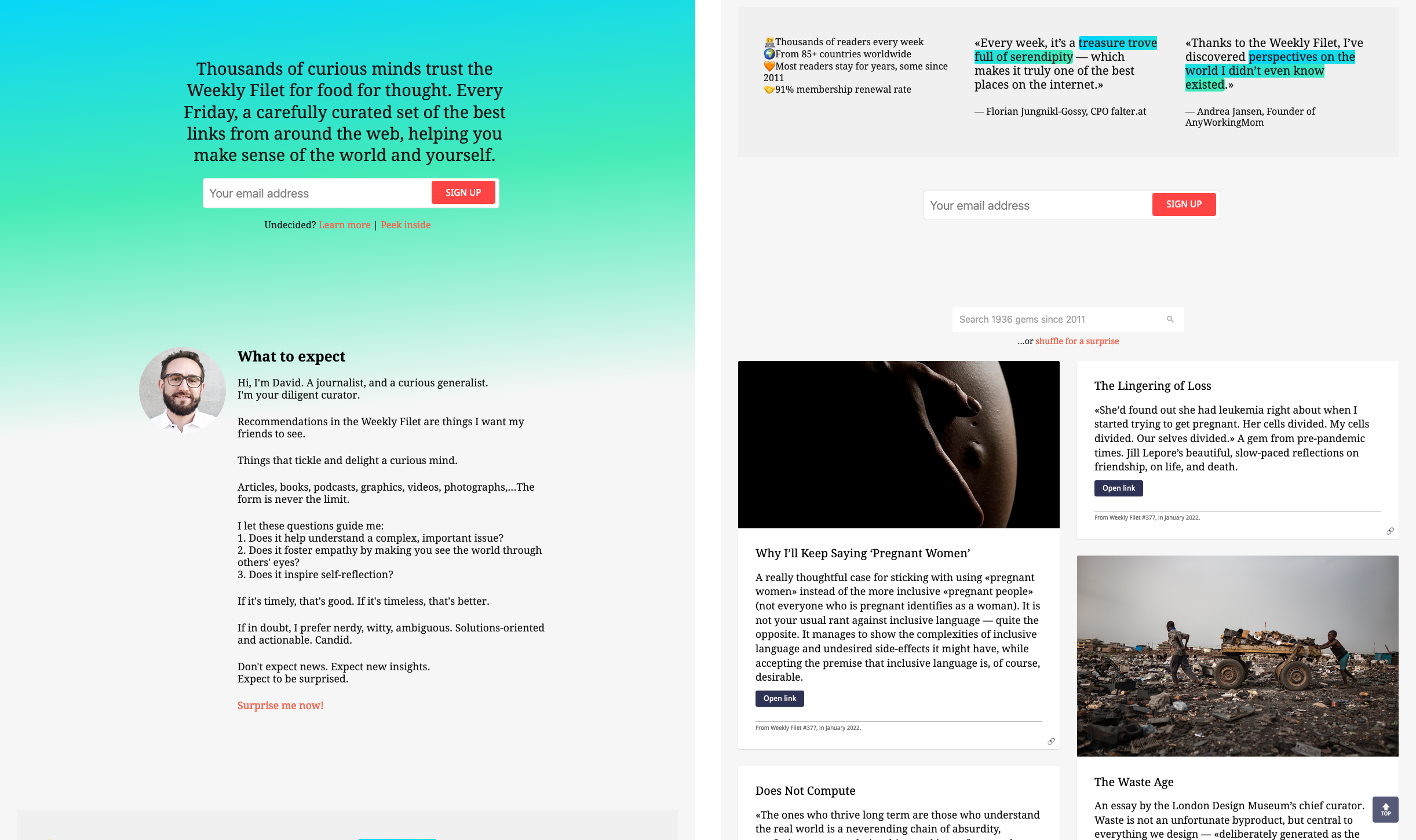
Weekly Filet
This publication uses a long scrolling home page that includes about information for both the publication content and the author, testimonials, and a feed of the latest content with a neat search function.
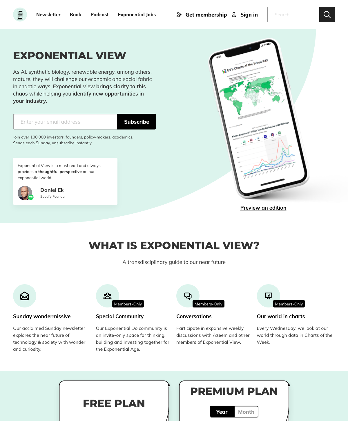
Exponential View
This paid publication uses a well thought out intro banner with subscription form, a features banner explaining what paid members get access to, and includes their pricing plans. There is a small link to preview an edition, but most of the content on this publication is behind a paywall, so it’s not heavily featured on the home page.
Picking the right content structure
Hopefully the examples above have given you some ideas about how you’d like to organize content on your website. There’s lots of different ways to do this and the best route for your publication will depend on you: your content, your audience, and your business model.
We’ll leave you with a few guiding principles to move forward:
- Choose the path of least resistance and keep it simple. Pick an existing theme, and get started.
- Pinpoint what type of publication you are so you can pick a content structure that works best for you. For example, are you primarily a newsletter, or a blog? Is your content free, paid or both? Different themes suit different types of publications.
- Don’t be afraid to experiment. What ever you decide, it’s not a final decision. You can change your theme or customize it at any time.


