How to build a custom homepage
A gorgeous hero section, engaging calls to action, stunning photography — learn how to build a custom homepage for your Ghost theme in this tutorial.
The flexibility of Ghost themes means it’s possible to add a custom homepage to your site using HTML, CSS, and Handlebars (Ghost’s templating language).
In this tutorial, you’ll learn how to build a custom homepage by adding a hero section that shares more context about your publication and introduces you to new visitors who land on your site.
Customizing your homepage requires editing code in your theme. While we’ll use Ghost’s default Casper theme as a starting point and walk you through the process, you’ll want to have downloaded a code editor and opened a local copy of your theme.
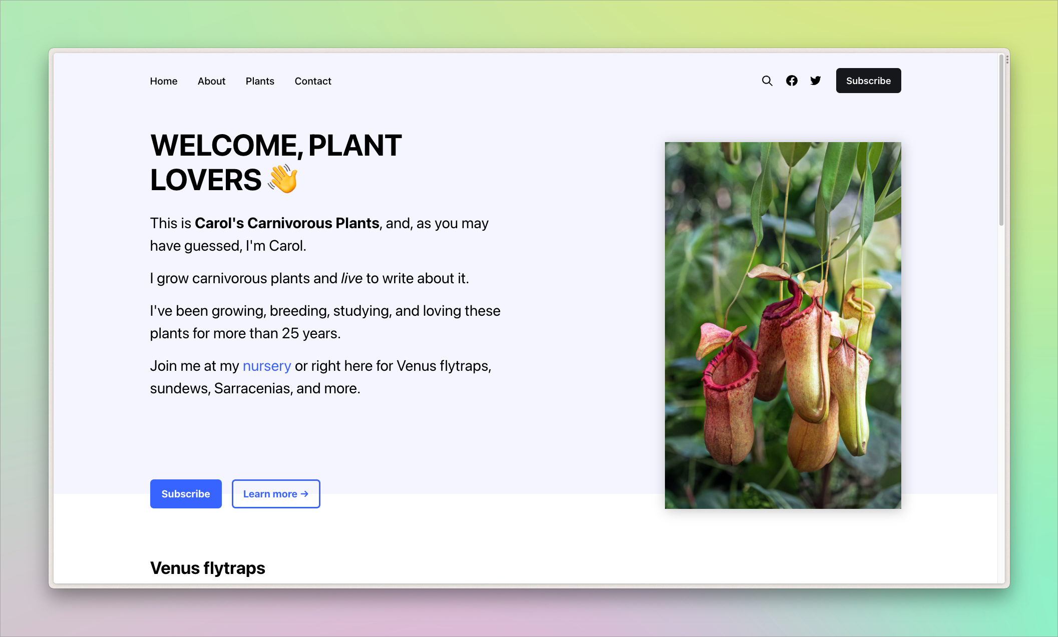
We’re going to build a custom home page for Carol. She owns a nursery that grows carnivorous plants like Venus flytraps and uses Ghost to promote her business and engage with her community.
Here’s a preview of the custom homepage we’re going to build:
Create the homepage template
Begin by opening your theme in a code editor. In the root folder, create a new file called home.hbs. Ghost recognizes home.hbs as a special file and will automatically use it as your custom homepage.
Every Ghost theme has a file called default.hbs. It’s where you put elements that you want to show up on every page like your metadata, navigation, and footer.
By adding {{!< default}} to the top of home.hbs, we tell Ghost to insert our custom content into the default template. Now, the custom homepage includes the theme's navbar, footer, and other default elements.
{{!< default}}home.hbsAdd a hero section
Let’s start adding in the custom content for the hero section, which introduces Carol and her business. It also has two call-to-action buttons and the publication’s feature image.

The code for this section is below. Lines that begin with {{! are comments that explain what the code is doing. Adapt the content to suit your publication.
<section class="p-outer">
<div class="p-inner p-hero">
<div class="p-hero-left">
<div>
<h1>Welcome, Plant Lovers 👋</h1>
<p>This is <strong>Carol's Carnivorous Plants</strong>, and, as you may have guessed, I'm Carol.</p>
<p>I grow carnivorous plants and <em>live</em>to write about it.</p>
<p>I've been growing, breeding, studying, and loving these plants for more than 25 years.</p>
<p>Join me at my <a href="https://plantsbycarol.com"> nursery</a> or right here for Venus flytraps, sundews, Sarracenias, and more.</p>
</div>
<div class="p-hero-buttons">
{{! Launches the Ghost membership portal }}
<button data-portal="signup">Subscribe</button>
{{! Link to an about page }}
<a href="/about/">Learn more →</a>
</div>
</div>
<div class="p-hero-right">
{{! Loads the your cover image as defined in Ghost admin }}
<img src="{{img_url @site.cover_image size="l"}}" alt="Pitcher plants" />
</div>
</div>
</section>Bring in the posts
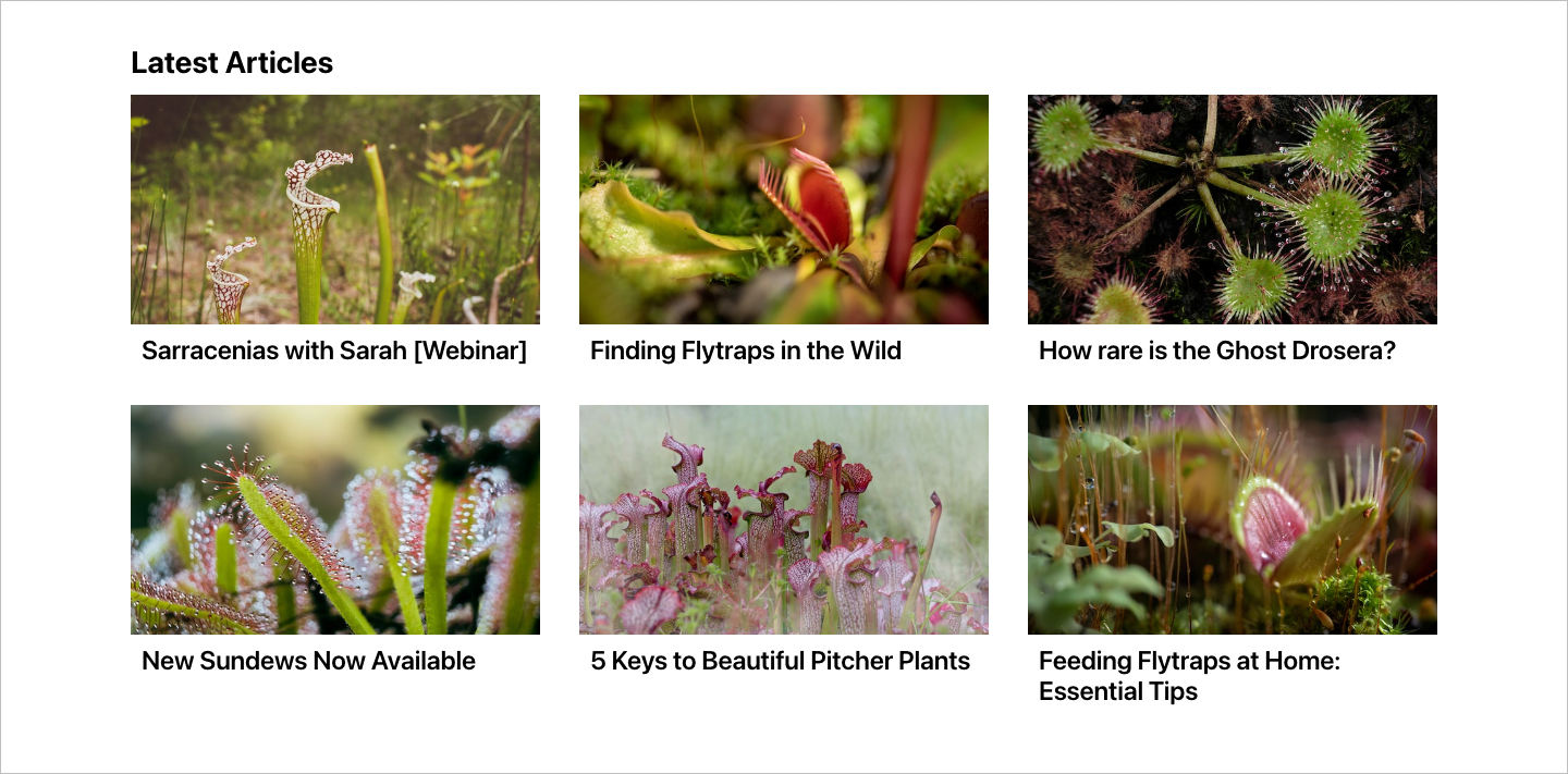
Now that we have Carol’s hero section, it’s time to bring in her posts. This section features up to 25 of the most recent posts. (You can configure the number of posts in your theme’s package.json file, under the posts_per_page property.)
Our design showcases the post’s feature image and title:
And here’s the code for this section:
<section class="p-outer">
    <div class="p-inner">
        <h2>Latest Articles</h2>
        <div class="p-posts-grid">
            {{! Use the foreach helper to loop through available posts }}
            {{#foreach posts}}
            <article class="p-post-card">
                {{! Use the img_url helper to bring in the post's feature image. }}
                <img src="{{img_url feature_image size="m"}}" alt="{{feature_image_alt}}" />
                <h3><a href="{{url}}">{{title}}</a></h3>
            </article>
            {{/foreach}}
        </div>
    </div>
</section>
Putting it all together
Now it’s time to combine the hero and posts sections and wrap everything in a <main> tag. The entire code is below.
{{!< default}}
<main id="main">
<section class="p-outer">
<div class="p-inner p-hero">
<div class="p-hero-left">
<div>
<h1>Welcome, Plant Lovers 👋</h1>
<p>This is <strong>Carol's Carnivorous Plants</strong>, and, as you may have guessed, I'm Carol.</p>
<p>I grow carnivorous plants and <em>live</em>to write about it.</p>
<p>I've been growing, breeding, studying, and loving these plants for more than 25 years.</p>
<p>Join me at my <a href="https://plantsbycarol.com"> nursery</a> or right here for Venus flytraps, sundews, Sarracenias, and more.</p>
</div>
<div class="p-hero-buttons">
{{! Launches the Ghost membership portal }}
<button data-portal="signup">Subscribe</button>
{{! Link to an about page }}
<a href="/about/">Learn more →</a>
</div>
</div>
<div class="p-hero-right">
{{! Loads the your cover image as defined in Ghost admin }}
<img src="{{img_url @site.cover_image size="l"}}" alt="Pitcher plants" />
</div>
</div>
</section>
<section class="p-outer">
<div class="p-inner">
<h2>Latest Articles</h2>
<div class="p-posts-grid">
{{! Use the foreach helper to loop through available posts }}
{{#foreach posts}}
<article class="p-post-card">
{{! Use the img_url helper to bring in the post's feature image. }}
<img src="{{img_url feature_image size="m"}}" alt="{{feature_image_alt}}" />
<h3><a href="{{url}}">{{title}}</a></h3>
</article>
{{/foreach}}
</div>
</div>
</section>
</main>Your custom home.hbs file is done!
A style for the ages
While the content is in place, it’s in need of some style. Let’s add some CSS styling to ensure everything displays properly.
Create a new CSS file called home.css. Add it to the folder where you have your other CSS files. With Casper, that's in assets/css. Copy the styles below and add them to the new file.
/* These styles override the Casper navbar defaults */
.home-template * {
  color: #000;
}

.home-template.has-cover .gh-head-button {
  color: #fff;
  background-color: var(--color-darkgrey);
}

/* Define the size of the sections */
.p-outer {
  padding: 14vmin max(4vmin, 20px) 0;
}

.p-outer:first-of-type {
  background-color: rgb(55 99 255 / 0.06); /* Light background color of hero section */
}

.p-inner {
  max-width: 1200px; /* Defines the max width of your content */
  margin-inline: auto; /* Centers the content */
}

/* Hero section */
.p-hero {
  display: grid;
  grid-template-columns: 1fr;
  gap: 3.2vmin;
}

.p-hero-left {
  display: flex;
  flex-direction: column;
  justify-content: space-between; /* Ensures buttons are at the bottom of the container */
}

.p-hero-right img {
  width: 100%;
  max-height: 300px;
  object-fit: cover; /* Fills the container with the image */
  transform: translateY(24px); /* Move the image slightly to create an offset effect */
}

.p-hero h1 {
  text-transform: uppercase;
}

.p-hero p {
  font-size: 24px;
  line-height: 1.5;
}

.p-hero p + p {
  margin-top: 1.6rem;
}

.p-hero-left a {
  color: var(--ghost-accent-color); /* Color links with the Ghost accent color defined in Admin */
}

.p-hero-buttons {
  display: flex;
  gap: 1.6rem;
  margin-block-start: 8vmin;
}

.p-hero-buttons button,
.p-hero-buttons a {
  display: inline-flex;
  align-items: center;
  padding: 8px 16px;
  font-size: 1.6rem;
  font-weight: 700;
  color: #fff;
  letter-spacing: -0.005em;
  background-color: var(--ghost-accent-color);
  border: 3px solid var(--ghost-accent-color);
  border-radius: 6px;
}

.p-hero-buttons a {
  color: var(--ghost-accent-color);
  background-color: transparent;
  border: 3px solid;
  transition: all 0.2s;
}

.p-hero-buttons a:hover {
  color: #fff;
  background-color: var(--ghost-accent-color);
  border-color: var(--ghost-accent-color);
}

/* Posts */
.p-post-container {
  margin-block: 10.2vmin;
  margin-inline: auto;
}

.p-post-container h2 {
  text-transform: uppercase;
}

.p-posts-grid {
  display: grid;
  grid-template-columns: repeat(auto-fit, minmax(300px, 1fr)); /* Define a post grid, where cards can be minimum 300px and maximum the size of the column */
  gap: 4vmin;
}

.p-post-card img {
  width: 100%;
  max-height: 500px;
  aspect-ratio: 16 / 9; /* All images will have an HD image ratio */
  object-fit: cover;
}

.p-post-card h3 {
  padding-inline: 10px;
  margin-block: 10px 0;
}

.p-post-card a:hover {
  color: var(--ghost-accent-color);
}

/* Change layout at larger viewport sizes */
@media (min-width: 768px) {
  .p-hero {
    grid-template-columns: 1fr 1fr; /* Hero section has 2 columns */
  }

  .p-hero-buttons {
    transform: translateY(50%); /* Offset buttons */
  }

  .p-hero-right img {
    max-height: none;
    aspect-ratio: 1 / 1; /* Make the image a square */
    filter: drop-shadow(2px 3px 10px rgb(0 0 0 / 0.25)); /* Add a shadow*/
    object-fit: contain; /* But also ensure it's not cropped */
    object-position: right; /* Position image to far right */
  }
}
Incorporate your new CSS file into your theme's build step. With Casper, add an import statement in screen.css.
@import "home.css"
Run your build command to generate your CSS file. If you're modifying an official Ghost theme, use the command npm run zip. Upload your new theme files to check out your customized homepage ✨
Bonus: Making sections
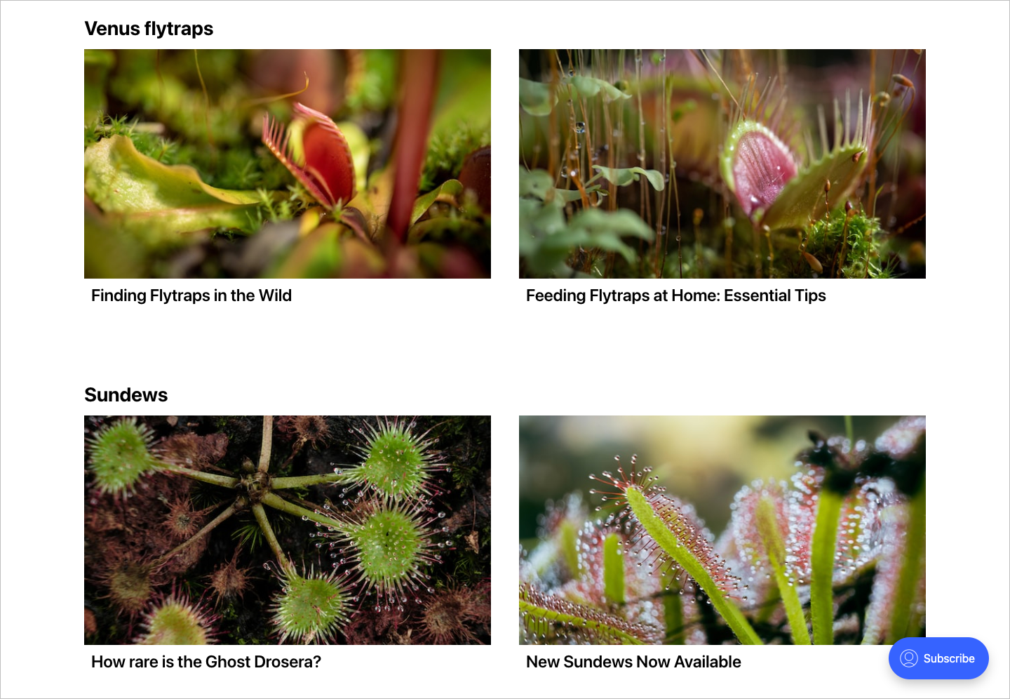
Carol’s excited about her site so far, but she thinks her visitors might benefit if her homepage was broken out by plant types. Having separate sections will help them find what they’re looking for more quickly. Let’s help Carol create some sections!
We can update our existing code to create these sections using Ghost’s powerful {{#get}} helper. Not only does the get helper get posts, as the name implies, but it can also filter which posts it gets.
In our case, we’ll filter our posts based on their primary tags. For this to work, all posts must be tagged accordingly. For example, for a Venus flytrap section, Venus flytrap posts must have “Venus flytrap” as their first tag in the post editor.
Here’s what this section of code looks like:
{{! First section}}
    <section class="p-outer">
        <div class="p-inner">
            <h2>Venus flytraps</h2>
            <div class="p-posts-grid">
                {{! Use the get helper to fetch posts }}
                {{#get "posts" filter="primary_tag:venus-flytrap" limit="6" }}
                    {{! Use the foreach helper to loop through available posts }}
                    {{#foreach posts}}
                        <article class="p-post-card">
                            {{! Use the img_url helper to bring in the post's feature image. }}
                            <img src="{{img_url feature_image size="m"}}" alt="{{feature_image_alt}}" />
                            <h3><a href="{{url}}">{{title}}</a></h3>
                        </article>
                    {{/foreach}}
                {{/get}}
            </div>
        </div>
    </section>
After bringing in the two other sections and updating home.hbs, here’s what the entire file looks like:
{{!< default}}
<main id="main">
<section class="p-outer">
<div class="p-inner p-hero">
<div class="p-hero-left">
<div>
<h1>Welcome, Plant Lovers 👋</h1>
<p>This is <strong>Carol's Carnivorous Plants</strong>, and, as you may have guessed, I'm Carol.</p>
<p>I grow carnivorous plants and <em>live</em>to write about it.</p>
<p>I've been growing, breeding, studying, and loving these plants for more than 25 years.</p>
<p>Join me at my <a href="https://plantsbycarol.com"> nursery</a> or right here for Venus flytraps, sundews, Sarracenias, and more.</p>
</div>
<div class="p-hero-buttons">
{{! Launches the Ghost membership portal }}
<button data-portal="signup">Subscribe</button>
{{! Link to an about page }}
<a href="/about/">Learn more →</a>
</div>
</div>
<div class="p-hero-right">
{{! Loads the your cover image as defined in Ghost admin }}
<img src="{{img_url @site.cover_image size="l"}}" alt="Pitcher plants" />
</div>
</div>
</section>
{{! First section}}
<section class="p-outer">
<div class="p-inner">
<h2>Venus flytraps</h2>
<div class="p-posts-grid">
{{! Use the get helper to fetch posts }}
{{#get "posts" filter="primary_tag:venus-flytrap" limit="6" }}
{{! Use the foreach helper to loop through available posts }}
{{#foreach posts}}
<article class="p-post-card">
{{! Use the img_url helper to bring in the post's feature image. }}
<img src="{{img_url feature_image size="m"}}" alt="{{feature_image_alt}}" />
<h3><a href="{{url}}">{{title}}</a></h3>
</article>
{{/foreach}}
{{/get}}
</div>
</div>
</section>
{{! Second section }}
<section class="p-outer">
<div class="p-inner">
<h2>Sundews</h2>
<div class="p-posts-grid">
{{! Use the get helper to fetch posts }}
{{#get "posts" filter="primary_tag:sundew" limit="6" }}
{{! Use the foreach helper to loop through available posts }}
{{#foreach posts}}
<article class="p-post-card">
{{! Use the img_url helper to bring in the post's feature image. }}
<img src="{{img_url feature_image size="m"}}" alt="{{feature_image_alt}}" />
<h3><a href="{{url}}">{{title}}</a></h3>
</article>
{{/foreach}}
{{/get}}
</div>
</div>
</section>
{{! Third section }}
<section class="p-outer">
<div class="p-inner">
<h2>Pitcher plants</h2>
<div class="p-posts-grid">
{{! Use the get helper to fetch posts }}
{{#get "posts" filter="primary_tag:pitcher-plant" limit="6" }}
{{! Use the foreach helper to loop through available posts }}
{{#foreach posts}}
<article class="p-post-card">
{{! Use the img_url helper to bring in the post's feature image. }}
<img src="{{img_url feature_image size="m"}}" alt="{{feature_image_alt}}" />
<h3><a href="{{url}}">{{title}}</a></h3>
</article>
{{/foreach}}
{{/get}}
</div>
</div>
</section>
</main>We can use the same CSS from the previous section. Zip up the styles and updated home.hbs file and upload your customized theme. Refreshing the browser shows our custom homepage — but now with sections 🌈
Summary
In this tutorial, we created a custom homepage. We began by creating a new file called home.hbs in the theme’s root directory. From there, we added code for a hero section that featured introductory copy and calls to action. After that, we looped through the most recent posts and added custom sections to the template.
Come show off your custom homepage over on the official Ghost Forum or ask any questions you had while following the tutorial. Our community is friendly and full of Ghost developers and creators just like you!
Additional resources
Because Ghost is open source, you can see how we build custom homepages for our official themes, a great resource for learning by example.
Find theme demos and the code for our custom homepages below:
Learn more about theme structure (and how the default and home files work) by checking out our theme docs.


