How to format a blog post: A complete guide for new writers
Smart formatting is the secret weapon of the most successful blogs, all it takes is these 5 steps.
You're reading this article because a myriad of factors came together in just the right way.
Whether it was the title, feature image, or keyword that led you here, you're reading this because our strategy succeeded.
Now, the real work begins: enticing you to actually read the article.
Most blog posts aren’t written for humans
Many blogs optimize for robots. The content is systematically pumped out in order to satisfy digital markers, not human eyes.
But this is changing.
Search engines are starting to take into account more factors around what makes written content, whether it’s a blog post or newsletter, not only accurate but reader-friendly.
Formatting is one of the most powerful factors at play.
Great formatting will help your content get read more often and more completely. It can also help it achieve higher search rankings as well as garner more social media shares.
Need proof this advice works?
You’re still reading. 😉
How to format a blog post in 5 steps
Below you’ll find a collection of blog formatting tips arranged in five simple steps.
Each one is a time-tested best practice, and you’ll see that we use several of them directly within this article.
#1 Organize your content logically
An organized blog post will mean different things to different publishers depending on the type, length, and style of your content.
However, there are a few standard practices that will boost reader engagement for any article.
Create a beginning, middle, and end
Although the way people read has changed dramatically over the last few decades, many of their expectations remain the same.
Readers crave order.
Tell them what you are going to tell them, tell them, then tell them what you told them.
The above quote is most often used in reference to crafting a great speech, but every piece of writing is like a speech delivered inside one’s head. It must connect the dots.
Use section headers to arrange ideas
Few readers have the patience or desire to read long blocks of text. That’s why headers are an essential formatting tool.
They allow writers to organize their content around central themes, making the content easier to read and digest.
In Ghost, publishers have access to H1 and H2 tags, allowing them to create multiple layers of organization in their posts (e.g., like the one you’re reading).
Insert a table of contents to guide readers
Once your content is organized, offering readers an easy way to navigate it will go a long way toward them appreciating what you’ve made.
A table of contents in a blog post links to the section headers available within an article.
#2 Make your blog post scannable
Scanning an article is not cheating. There is no morally right way to read a post.
The best publishers understand and optimize for this.
Making your content scannable doesn't mean draining it of its complexity. Instead, it means using the available tools to make your article as visually attractive as it is useful or entertaining.
Format your text to emphasize what’s important
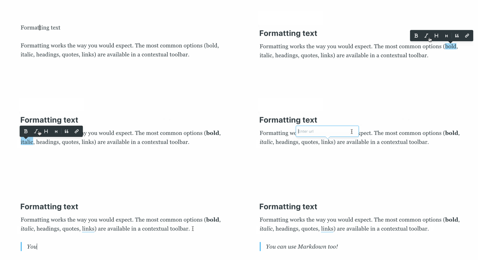
There are so many ways you can modify text:
- Bold specific words or sentences to draw readers towards the main idea
- Italicize titles, foreign words, or proper names
- Use header tags to divide sections and organize your reader’s journey
- Add block quotes from interesting figures to support your writing
You can also use markdown to highlight, strikethrough, insert code, and more.
It’s best practice to use these sparingly. Bolding everything defeats the purpose.
Draw the eye with lists
Lists are the cornerstone of scannable content.
To this day, listicles are still one of the most popular forms of content because of their user-friendliness.
Lists come in two customary forms:
- Bullet points
- like
- this.
- Numbered lists
- Like this.
Use bullet points when the order of the list doesn’t particularly matter. Use numbered lists either when the order does matter or when the list is longer than five items.
Keep sentences and paragraphs short
“Most sentences can be cut in half.” — Josh Spector
A blog post doesn’t need huge blocks of text to communicate depth.
Let the value of your content speak for itself.
By keeping your sentences (2-12 words) and paragraphs (2-4 sentences) short, you gift the reader with more whitespace.
Additional whitespace has been shown to increase reading speed and comprehension.
Help readers get more from your writing by giving them less.
#3 Incorporate media intentionally
Some things are best explained visually.
That’s not a knock on blogs or newsletters. It's an invitation to learn how to combine different media types to give your readers the best experience possible.
Use images and gifs to explain complicated topics
If a picture is worth a thousand words, then using images, diagrams, and graphs can significantly cut down your word counts.
On the Ghost blog, gifs are frequently used to visually explain how to use the tool.
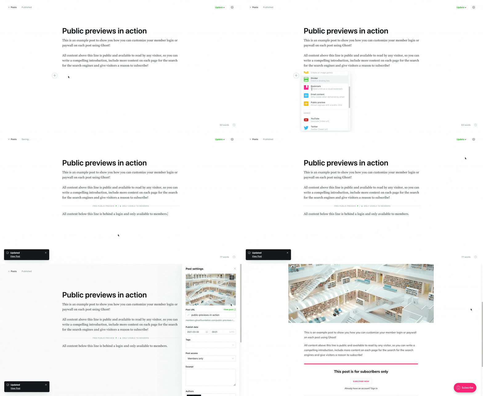
Here’s a quick list to keep in mind for when and how to use images effectively:
- Ask does this image serve a purpose? If it does, use it. Otherwise, it’s simply taking up space.
- When explaining a technical subject, combine short paragraphs with images so that readers must scroll. The task of scrolling will help them feel like they are making progress and keep them engaged.
- Ensure that images are high quality and relevant. Poor images give the impression of weak content. When appropriate, create your own images such as screenshots, drawings, or otherwise.
Embed videos and podcasts to support readers
Readers have high expectations when it comes to blogs.
They want valuable content as well as a guide to what to do or consume next.
Offering readers an embedded video to watch or podcast to listen to can immediately satisfy this desire and keep visitors engaged for longer than a simple text article could.
The Ghost editor allows users to embed videos (YouTube, Vimeo) and audio (Spotify, SoundCloud) directly within your blog posts.
#4 Match the reader’s intent
If you want to improve your content dramatically, ask this question every time you publish: what is a reader expecting to see when they click on this blog post?
Every piece of formatting you include should help you answer that question while fulfilling your reader’s intent.
Feature templates, formulas, and graphs when needed
Every reader that clicks on a blog post is expecting to leave with something, whether it be an answer, a resource, or a next step.
Your goal as a publisher should be to give them what they're looking for in the most direct way possible.
Downloadable templates, formulas (or embedded calculators), and graphs (interactive or static) are some of the best tools to accomplish this while exceeding a reader’s expectations.
Keep your blog post the appropriate length
Not every question requires a long-form article to answer.
Some of the best blog posts accomplish their purpose in only a few hundred words.
Everything comes back to the reader.
What do they need? And what is the most efficient way to give them what they’re looking for?
#5 Experiment to get noticed
Some rules are made to be broken. Which ones those are is up to you.
Great content is as much an art as it is a science.
If you ever feel pigeon-holed by a formatting convention, take a step back, ask yourself what purpose that rule serves, then see if there's another route to accomplishing it.
Many of the best practices blogs now follow were once experiments themselves that caught on because they worked. The future of blogging will be shaped through the same process.
Be obvious
This can be done by creating sections with distinct headers, modifying text elements, and splicing in pictures and media, all in an effort to draw the reader's attention toward what's most important.
But formatting is merely a collection of tactics. Obviousness is the strategy.
If you can be obvious in a way that no one has before, go for it.
Conclusion
Purposeful formatting brought you to this point, and it will carry readers through your articles as well.
Great formatting prioritizes the human reader by providing them with organized, scannable, media-rich, intent-driven content. All of these are now in your toolbox after reading this article.
Remember, getting people to click on your article is only half the battle. The other half is getting them to this point.


