Conversion strategy: Turn more readers into paid members
Convert more free subscribers into paid ones by communicating what you offer clearly.
In the early stages of building your business, you must focus on crafting a great offer that is abundantly clear in the value it presents to customers.
In this article we're going to look at the next step in the process: communicating that offer to your audience in a way that makes them want to buy.
The following conversion tips will help you position, polish, and present your offer in the most effective way possible.
Mention your offer often
The "rule of 7" says a customer needs to see or hear an advertisement at least seven times before they take action. A similar statistic argues that the majority of sales only close after the 5th follow-up call.
The actual number is less important than the guiding principle: conversions don't happen at first contact. They take time to nurture. It takes time for the customer to recognize that your offer exists and internalize how it might be valuable to them.
Josh Spector does a great job of repeating their offers without damaging the content or annoying the audience.
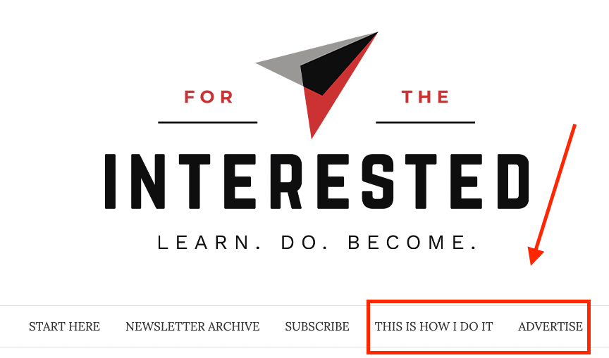
In Spector's newsletter, For The Interested, they highlight their paid offering, a separate newsletter called This Is How I Do It, in a few places. First, a link can be seen directly on the homepage of the free newsletter.
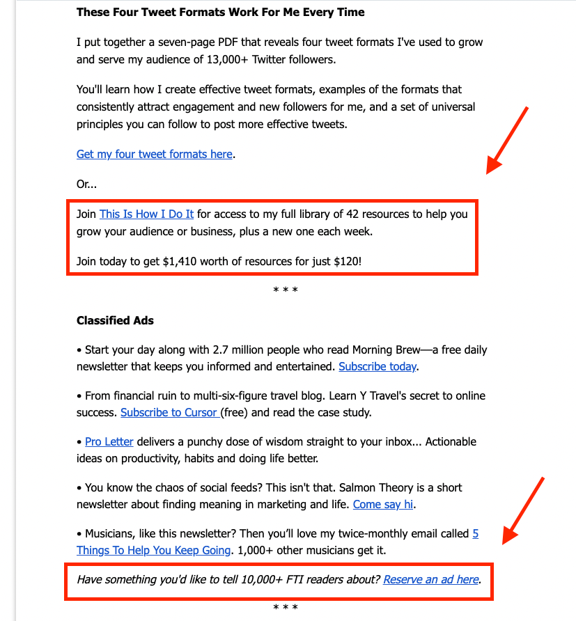
Second, every free newsletter contains a callout near the end, drawing attention to the paid offer, as well as the opportunity to purchase ads (another paid offer).
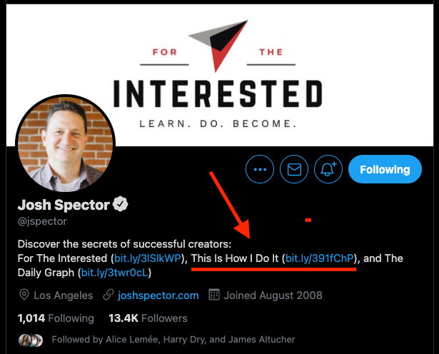
Third, Spector includes a link in their social media profile.
Whenever a customer interacts with For The Interested or its author, they see the offer multiple times. Even in the short amount of time it takes to discover Spector's newsletter and signup, the customer would have already seen the offer at least twice. Afterward, they will continue to see it every week they read a new edition.
One of the simplest conversion tactics you can implement right away is to make your offer more visible. How difficult is it to find on your website for a new visitor? How often do you mention in your free content? Are there mentions on social media?
The frequency of exposure is one of the conversion elements within your control. Of course, this can be misused when taken to the extreme. But most creatives stray on the side of under-communicating their offer, not over-communicating it.
Create a dedicated landing page
One mistake many new creators make is they don't give their offer their own home base. A great offer needs a dedicated sales page where customers only have two options: buy the offer or leave.
You're encouraged to mention your offer in multiple places regularly, but all of those mentions must point back to where your offer lives full time.
Take the Exploding Topics newsletter, for example. If you scroll through their homepage, their paid offer, Pro, is mentioned no less than ten times. But all ten of those callouts point back to the same place: a conversion-optimized landing page.
Here's a 1,000-foot view of the page in action.
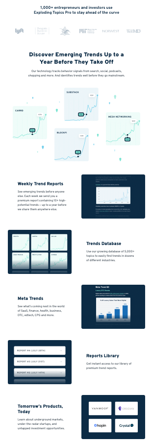
There is an entire science behind crafting effective landing pages. However, you don't need to become a professional marketer to make one that works for you. Find a few examples you like, borrow the portions that align with your offer, and see how your audience responds.
That said, here are a few elements you'll most likely want to include:
- A bold title that communicates the value.
- Wording identifying who this offer is for (e.g., new mothers, retired lawyers, aspiring authors, etc.).
- Pictures showing how your value works or your value in action.
- Social proof to build trust with visitors (e.g., reviews, comments, numbers).
- A single CTA (call to action, like a "buy now" button) repeating multiple times throughout the page.
Additional sections, such as FAQs and money-back guarantees, can also strengthen the page's success rate. This landing page guide can help you get your first landing page up and ready in just a couple of hours.
Use "trigger words" to drive action
Trigger words are an element of copywriting that incite action in readers. They're effective because of the emotions and thoughts they elicit.
By strategically incorporating trigger words into your sales page, you can encourage a higher percentage of your audience to take action.
Here are a few of the most popular ones:
- proven
- new
- easy
- secret
- instant
- because
- stop
- limited
Trigger words work because they communicate an understanding of who your customer is and what they want. This leads to them feeling in control, hopeful, and like they belong.
One recommended resource to help with this tactic is copywriter Neville Medhora's giant list of trigger word examples that will show you several of the words mentioned above in practice.
Make your offer time-sensitive
Urgency is one of the most powerful conversion tools. If you've ever purchased something because a sale was going to expire or because the number available was shrinking, you responded to urgency.
While fake urgency can feel pushy and manipulative, genuine urgency is a great tool to drive action while offering customers an attractive offer.
One way to accomplish this is by using event-driven coupon codes. When Steph Smith launched the book Doing Content Right on Product Hunt, they included a coupon code to encourage conversions.

The code was tied to the book's launch, making it a time-sensitive offer and allowing people to take advantage of a great deal.
Another strategy is to include urgency language in your offer's description. Rediverge utilizes this tactic by offering a discount to new subscribers in the form of "early adopter pricing." Additionally, annual subscribers can take advantage of "1 quick payment instead of 12."
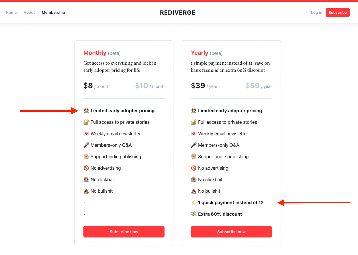
Urgency is a powerful tool best used sparingly. A little can go a long way, especially when done from a place of honesty and goodwill.
Build trust through social proof
Social proof is the practice of proving trustworthiness to customers by displaying evidence that others already trust you. There are a few ways to accomplish this.
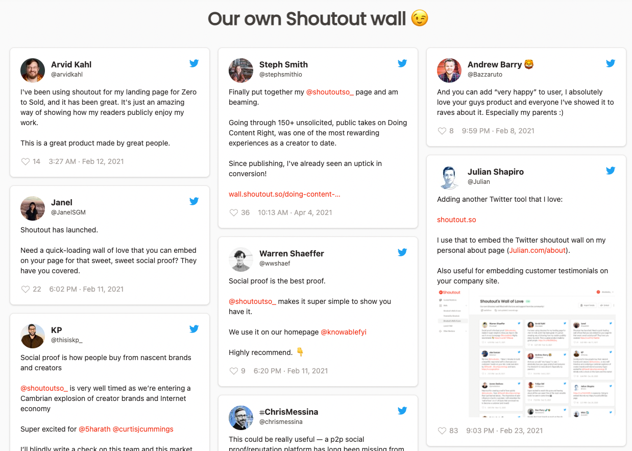
First, you can publicly share reviews of your product or service with potential customers. This can be accomplished in the form of pictures, video testimonials, or social media mentions.
Another popular way of communicating social proof is by displaying numbers that support your case. For instance, The Hustle emphasizes how many readers they have as an encouragement for others to sign up.
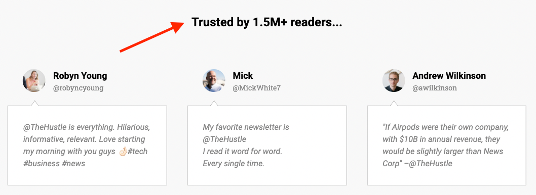
Numbers and reviews are two of the most effective forms of social proof. Although, they can be challenging to gather and ineffective when just beginning with a small subscriber base.
Another way to communicate social proof is to share important accomplishments, such as college degrees attained, professional positions held, or other relevant achievements. The point of social proof is to build trust with your audience. These alternative methods also indirectly build trust and help fuel number- and review-driven evidence in the future.
Use visuals to increase conversion
Language is the foundation of a great, converting offer. What you say and how you say it can be the difference between making one sale or a hundred.
Visuals can supercharge this process.
Three of the most important visual elements to consider when crafting your communication on a landing page or offer banner are:
- contrast
- color
- and sizing.
The Browser's weekly call to action is an excellent example of all three.
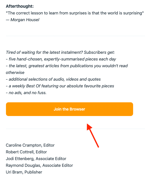
- First, the orange button with white text contrasts against the white and black color scheme present throughout the email. This immediately makes it jump out once a reader scrolls down.
- Second, the color is carefully chosen to match the branding on The Browser's main site. This small detail builds trust through consistency.
- Third, the button is proportionately sized. Not too small that it ends up overlooked and not too big that it disrupts the flow of content.
Similar to the urgency principle, less is more when it comes to using visuals.
If you have a strong brand color, use it to compliment your messaging instead of overwhelming it. If you want to include images, make sure each accomplishes a clear purpose (such as showing your product in use) and isn't simply taking up space.
Experiment with your pricing
A great price is one part of the total conversion strategy and is frequently the product of many experiments. Instead of getting hung up on choosing the absolute best price for your offer right away, price in a way that gets the momentum started.
This could mean pricing very low to reduce the barrier of entry and encourage sales. Or, it could mean pricing high to test your profit margins.
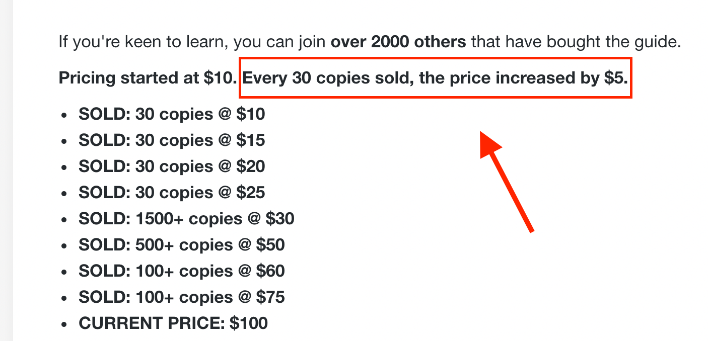
Steph Smith tested the pricing of their book Doing Content Right. Smith initially priced the book at $10 and raised the price by $5 increments.
Create a clear onboarding process
Presenting your free readers, subscribers, and fans with a great onboarding process will strongly influence their likelihood of converting into paying customers down the road.
For example, Dan Oshinsky, author of Not A Newsletter, sends an automatic welcome email to every new subscriber with two questions for them to answer.
What's special about this case is that Oshinsky replies to every single email response. This step enables ongoing conversations with the audience, which is vital since the author does consulting work and the newsletter helps to bring in new clients.
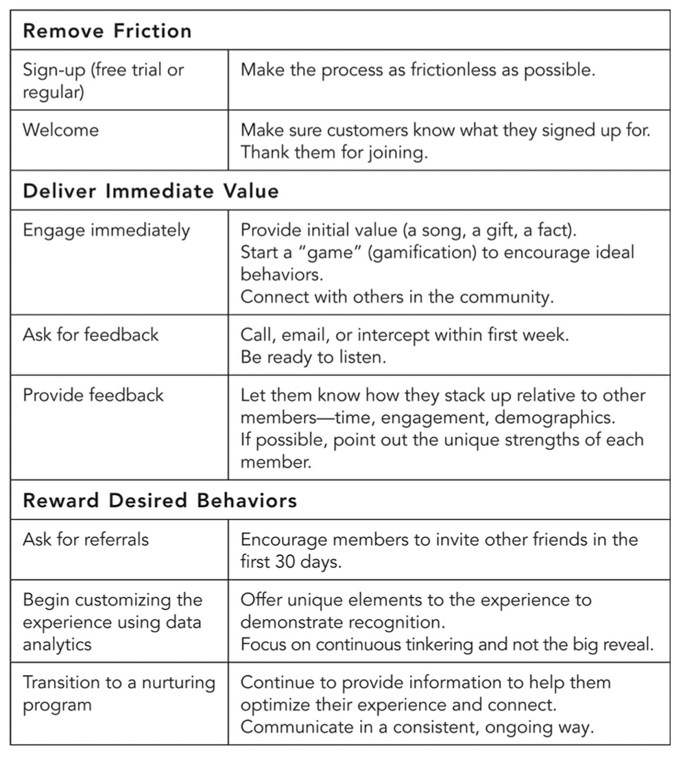
The author of The Membership Economy offers assistance with this tactic by detailing what a good onboarding process should include.
"A successful onboarding process has three key steps: remove friction, deliver immediate value, and reward desired behaviors." — Robbie Kellman Baxter
Onboarding is another area ripe for experimentation and iterative thinking. If you want to avoid the feeling of overwhelm when coming up with your initial onboarding sequence, focus on creating a single email or welcome page that (1) introduces who you are and (2) delivers one solid piece of value. If you can do that, then you're on the right track.
The art of conversion
Conversion can be a stressful topic because it's tied so closely to the success of your project. But if you take away anything, remember this: conversion is as much an art as it is a science.
You, your audience, and your offer are all unique. Success will require you to combine the proven (great strategy, smart tactics) with the new (your creativity).
Apply these conversion tips and start turning the idea in your head into money in your pocket.


