Newsletter landing pages: How to get more paid subscribers
Find out how to convert more free subscribers to paid, and an increase ARR for your business.
To recap part one of this paid-for newsletter landing page series, the journey a user takes to convert into a paying subscriber is usually:
- Email sign up to your free or limited-trial newsletter
- You deliver what you say while upselling the premium offering
- Them upgrading with a subscription payment
If you missed part one, catch up on what makes a good newsletter landing page.
Part two will move on to:
💳 The newsletter upgrade landing page
Your newsletter upgrade landing page can be the difference between a free newsletter subscriber and an increase in ARR for your business.
A lot of the components are the same as the sign up landing page except we swap out the sign up form for pricing table, while handpicking the absolute best social proof and time-saving reminders.
Here are 7 tips to help you create a high-conversion newsletter upgrade landing page:
1. Remind them of the compounding value
One of the biggest attractions to starting a paid-for newsletter is the compounding value of your efforts over time. Let's remind them how it benefits them too.
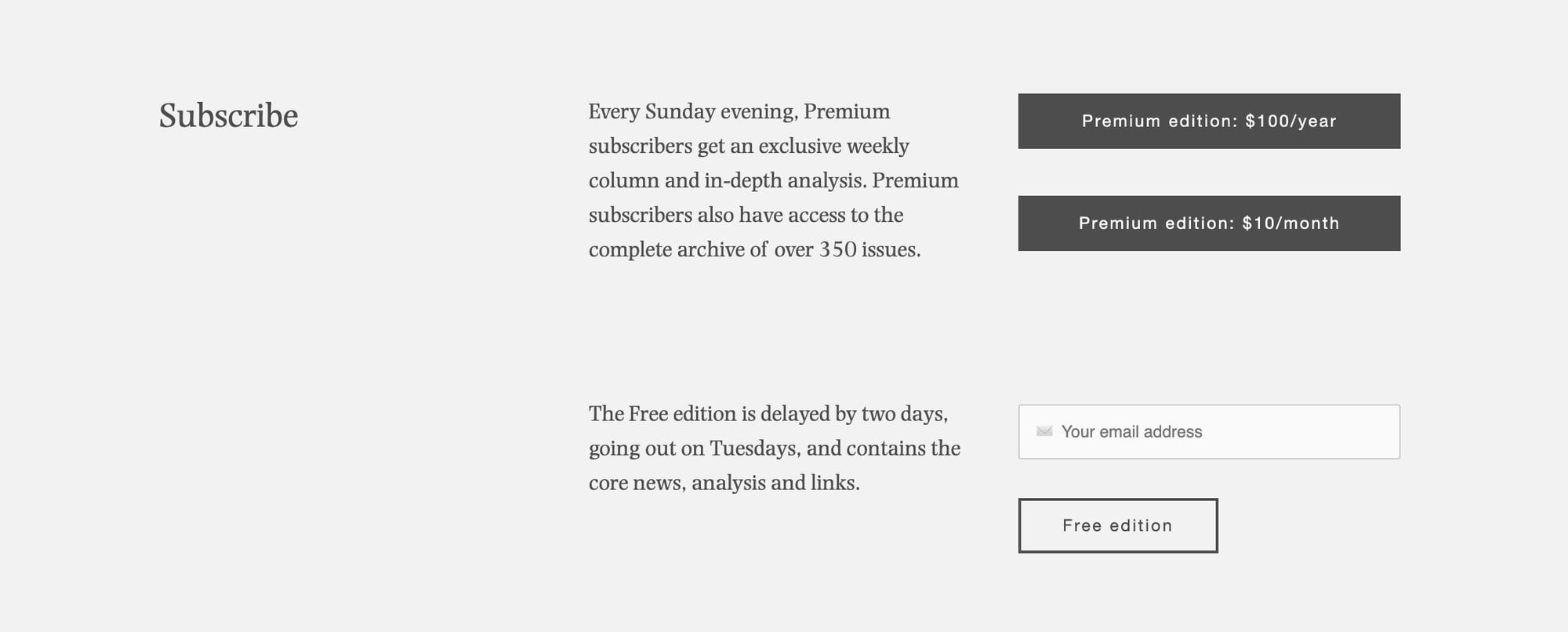
✅ "Access to the complete archive of over 350 issues"
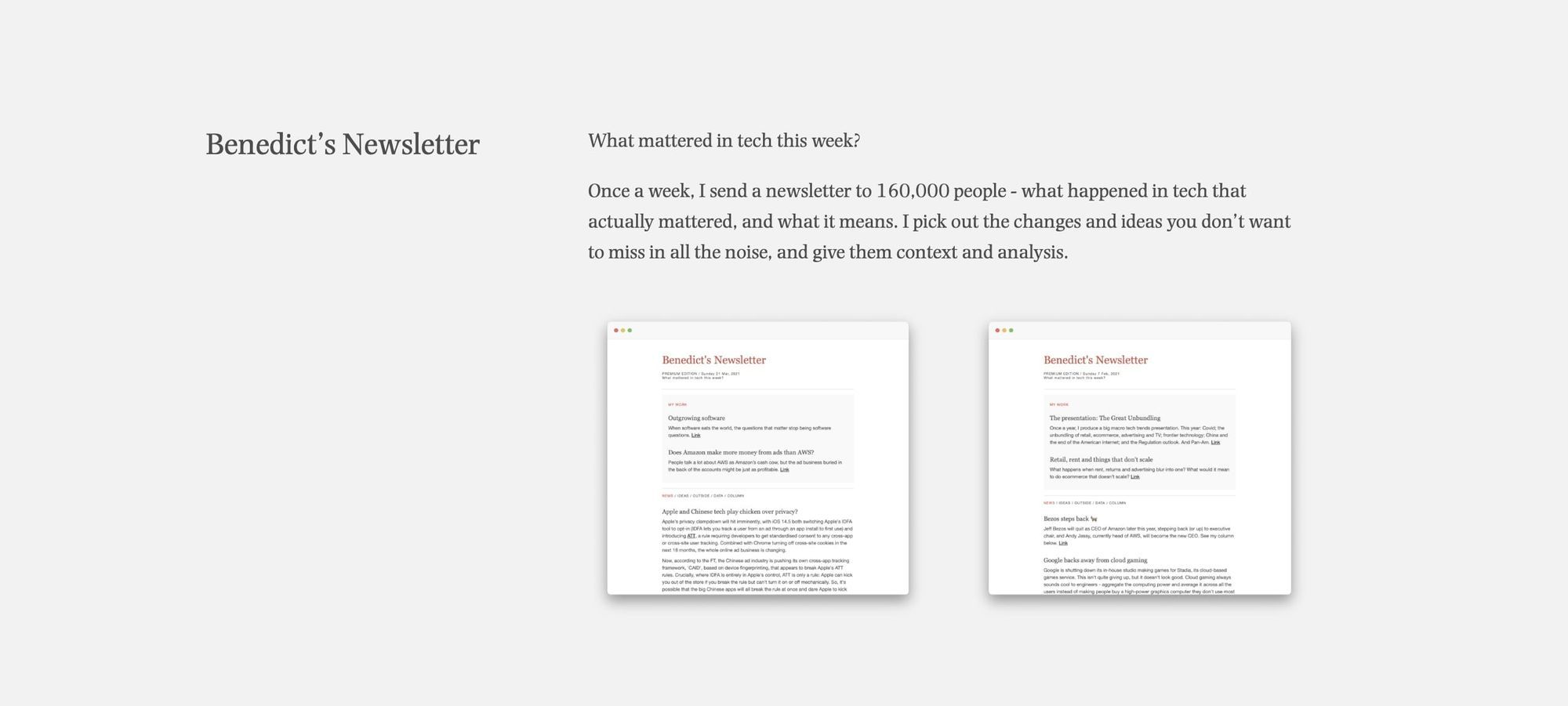
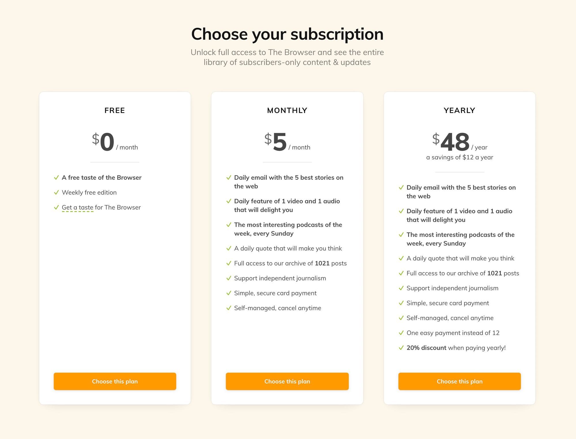
✅ "Full access to our archive of 1021 posts"

✅ "Access to our data library"
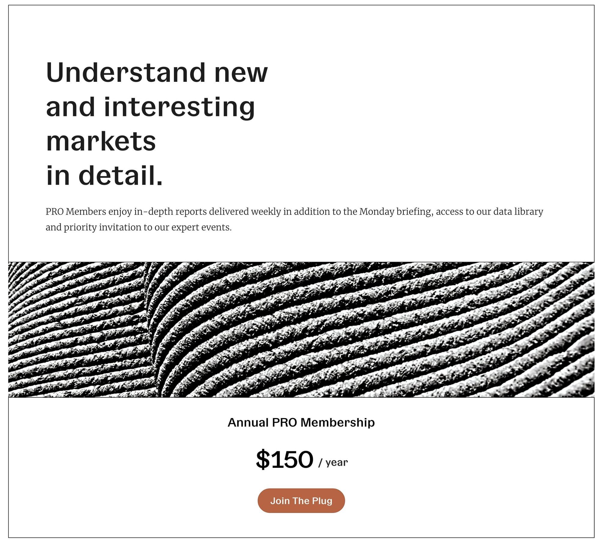
2. Repeat on time-saving
Paying is justified when further time is saved.
✅ "Save 2,000+ Hours of Market Research"

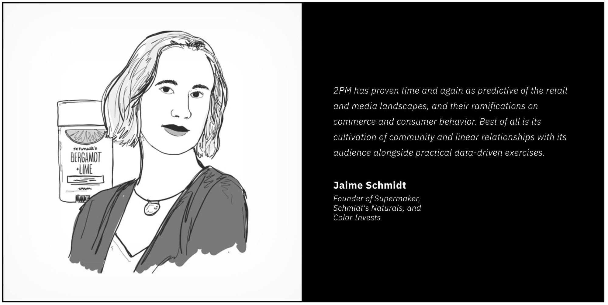
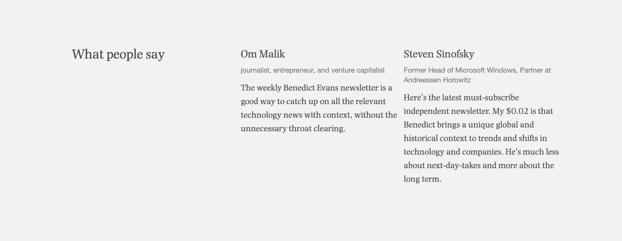
3. Add an "opinion leader" testimonial
Unlike part one where the testimonials should highlight what the newsletter delivers, we now want to spotlight only the most famous person in our niche.
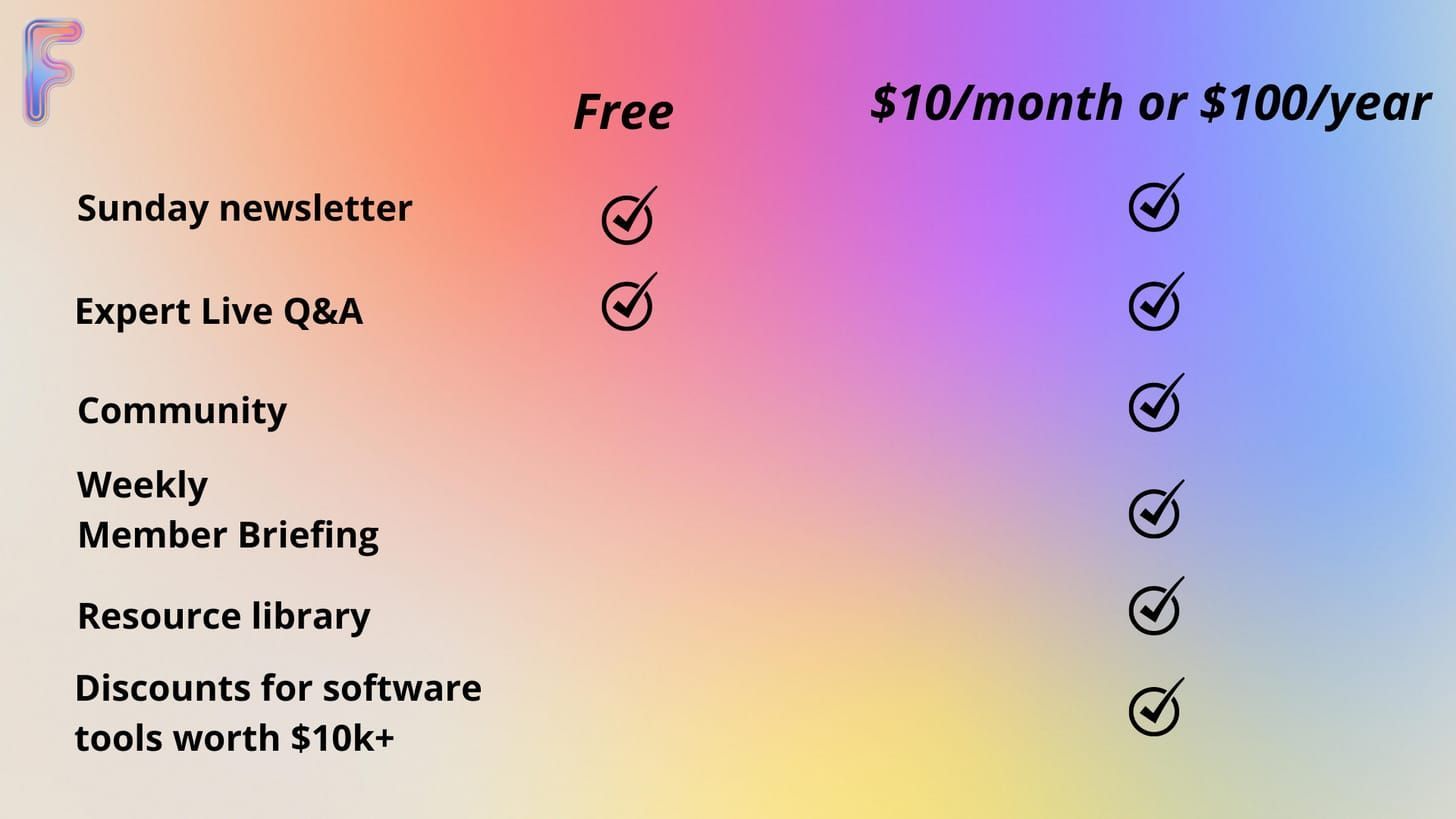
4. Show paid-for benefits vs free limits
Your pricing table should clearly position your paid-for offering against the free they are currently consuming.
5. Offer annual pricing
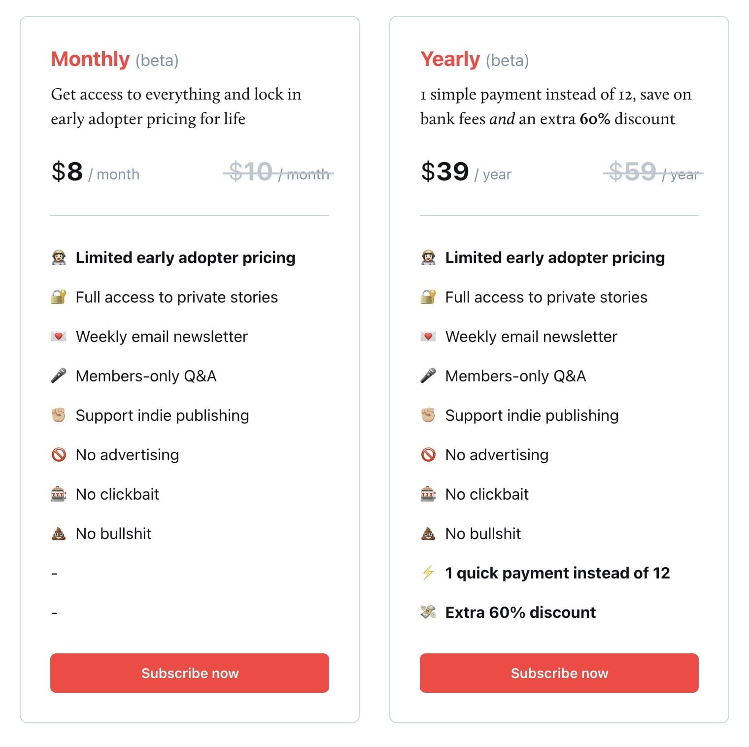
It's easier for a lot of people and great for cash flow.
✅ "1 quick payment instead of 12"
✅ "A saving of $12 a year"
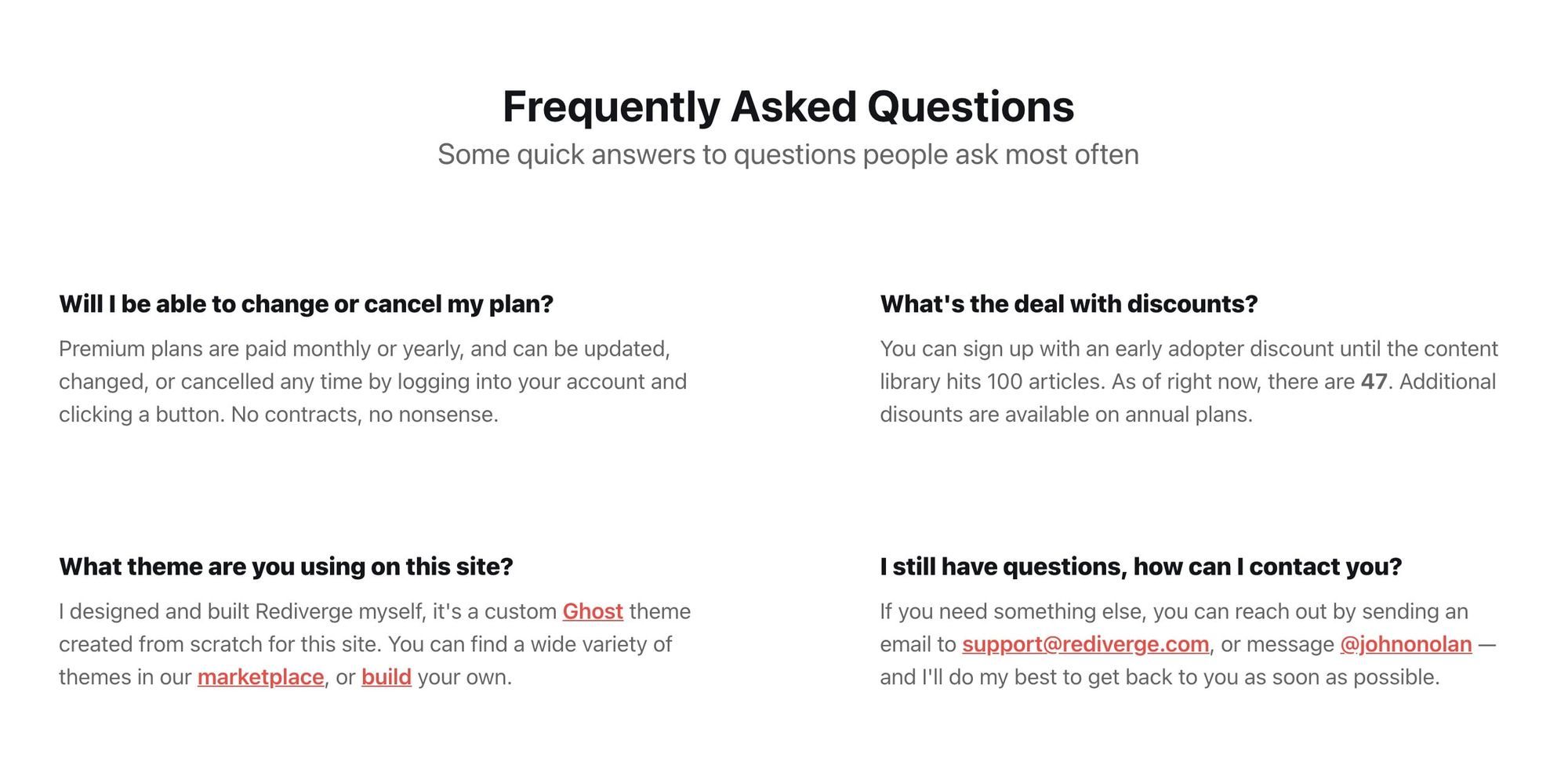
6. FAQs can prevent a closed browser tab
Use your newsletter upgrade landing page footer area for pre-sale support.
If your visitor has not committed by the end of the scroll, they still have doubts. Insert your FAQs, along with your support details:
✅ Curated to most common questions related to membership:
✅ Add an email address:
7. Consider Community
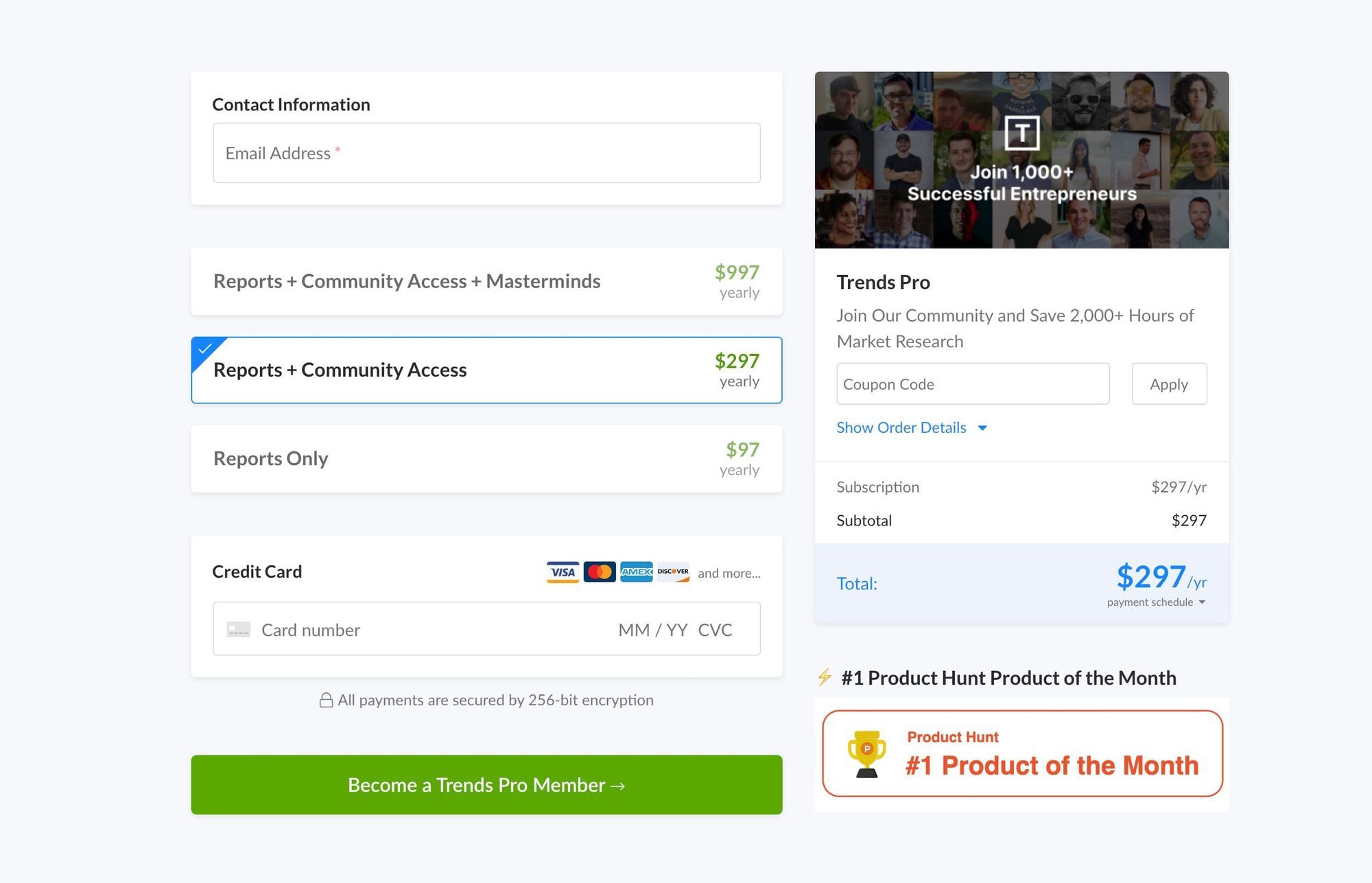
And the final tip, one to seriously consider, is offering access to a community of like-minded folk has huge value to people.
✅ "Reports + Community Access"
✅ Join 1000+ Successful Entrepreneurs"
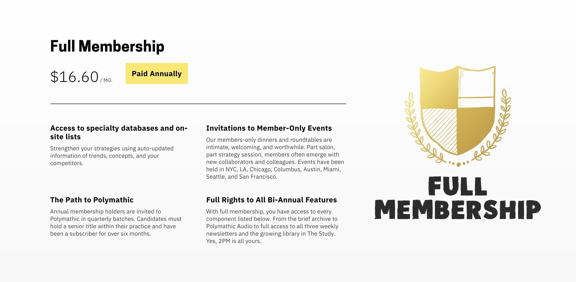
✅ "Our members-only dinners and roundtables are intimate, welcoming, and worthwhile"
The Internet was built to bring people together to access the globe.
You have created a wonderful corner of the Internet where like-minded people can potentially interact and even do business.
There is huge value in this and it's worth a shot!
Well, that's a wrap!
I hope you enjoyed this two-part round-up of tips to help improve your newsletter sign up and upgrade landing pages. For further landing page hot tips, get an exclusive 40% off my Ebook as a Ghost reader using the link below!
