How to increase newsletter subscribers with landing pages
Increase your chances of getting more subscribers with a strong landing page (examples inside).
In recent times, paid-for newsletters have become serious business, and rightly so.
Their authors have identified readers who are sitting with oversaturated inboxes and are willing to pay for clear content actually contributing value to their interests.
However, turning a reader into a paying customer is no easy feat.
Their journey normally involved 3 steps:
- Email sign up to your free or limited-trial newsletter
- You deliver what you say while upselling the premium offering
- Them upgrading with a subscription payment
Two of these (1 & 3) involve landing pages.
In this two-part series, I break down the key ingredients needed in these two landing pages ultimately leading to a new paid-for newsletter subscriber and more ARR (annual recurring revenue) for your business.
It all starts with:
📬 The newsletter sign up landing page
A good landing page has one objective and in this use case, it's for the visitor to enter their email and hit subscribe. The marketing nerds call this a conversion.
After inspecting and reviewing dozens of newsletter landing pages, I've shortlisted these seven tips to help improve your sign up conversions.
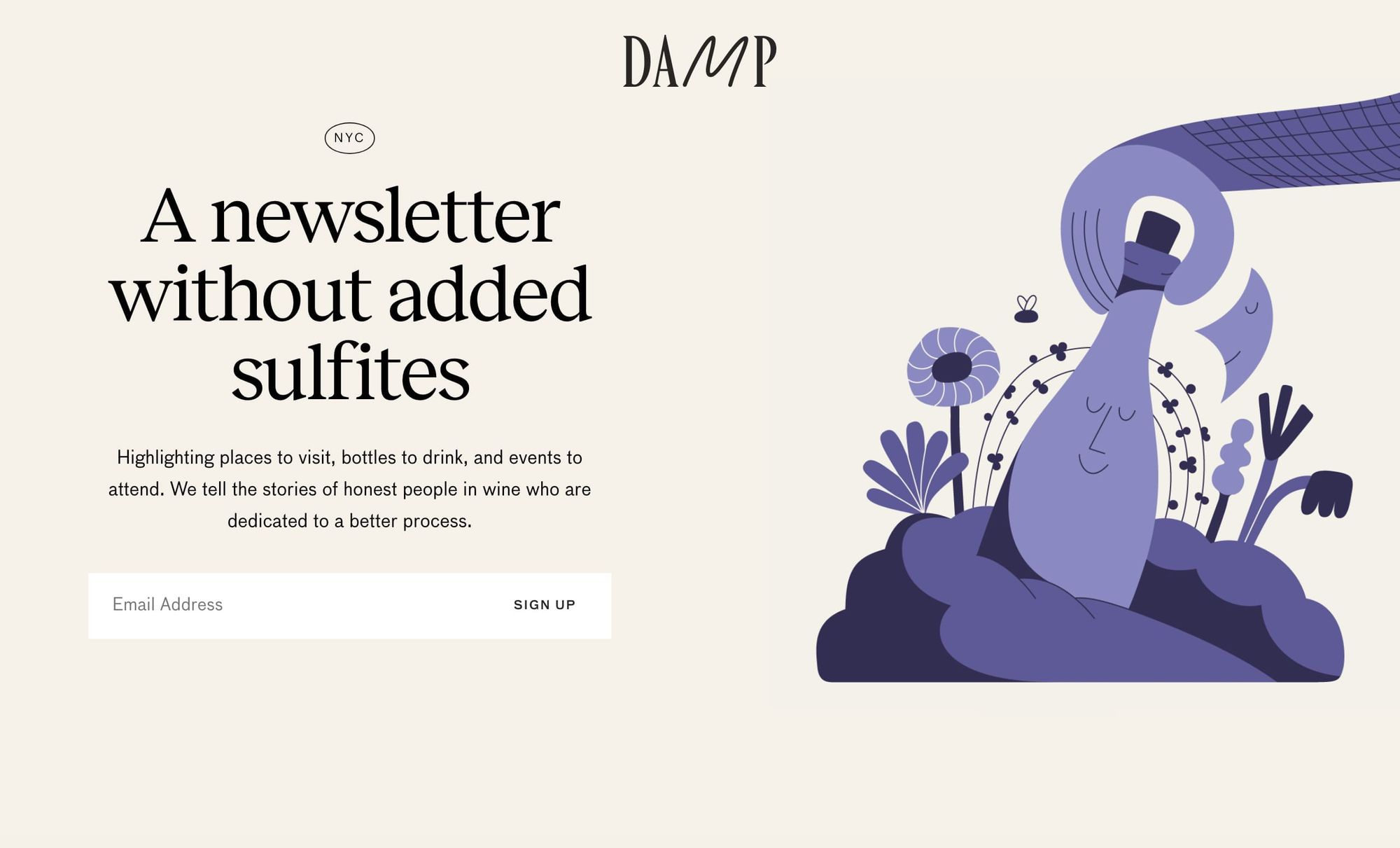
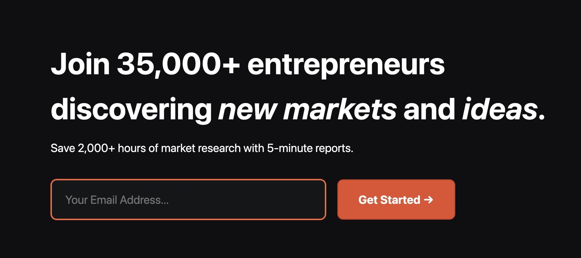
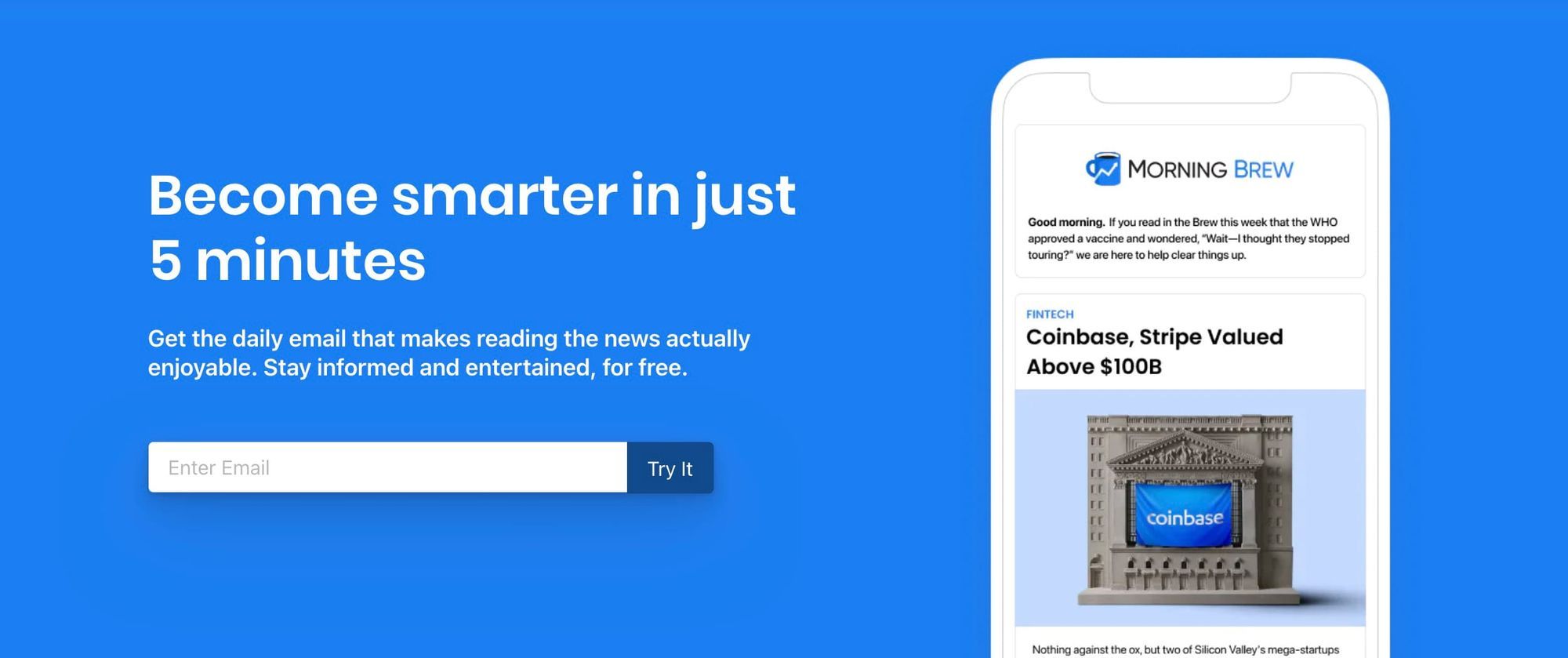
1. Embed the sign up form and position it above the fold
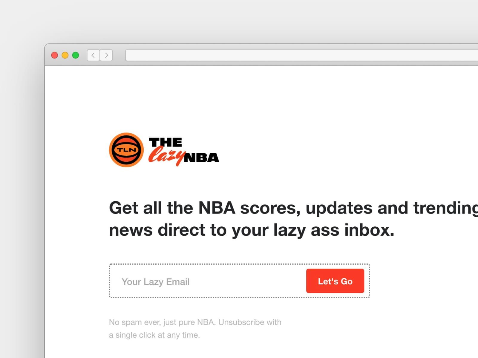
Aligned with our one objective (signing up), when arriving for the first time these next two landing pages make it abundantly clear I must enter my email address and nothing else:


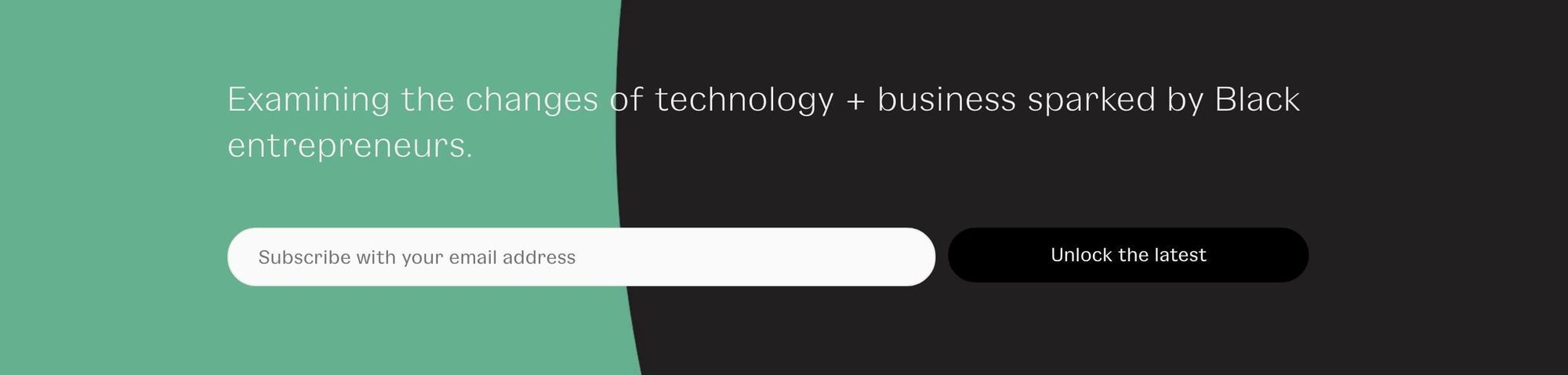
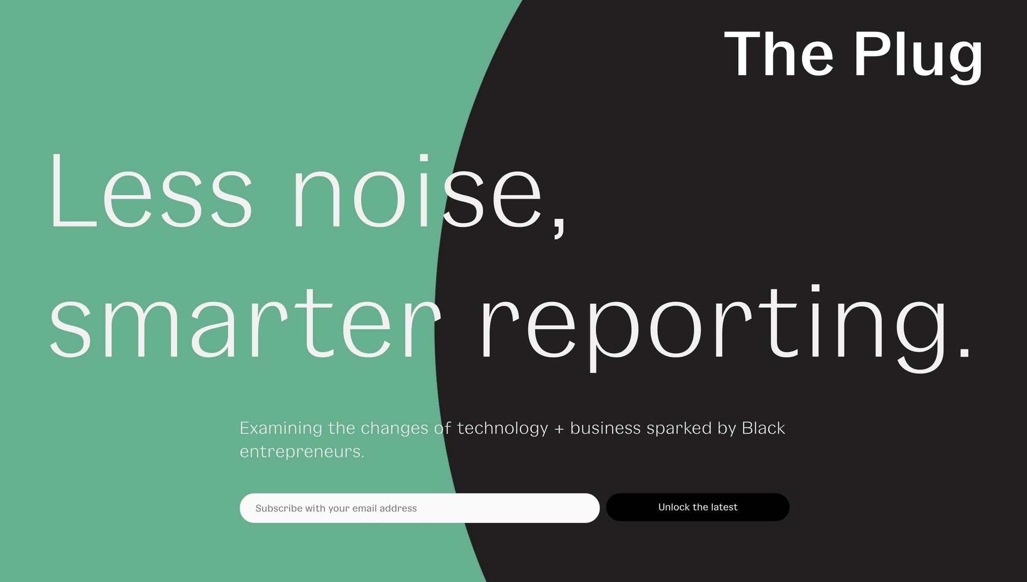
2. Spice up the form call-to-action button:
You’re excited for visitors to discover your newsletter, so why not share that excitement in your form button:
🚫 Subscribe: (meh)

✅ Let's Go:
✅ Unlock the latest:
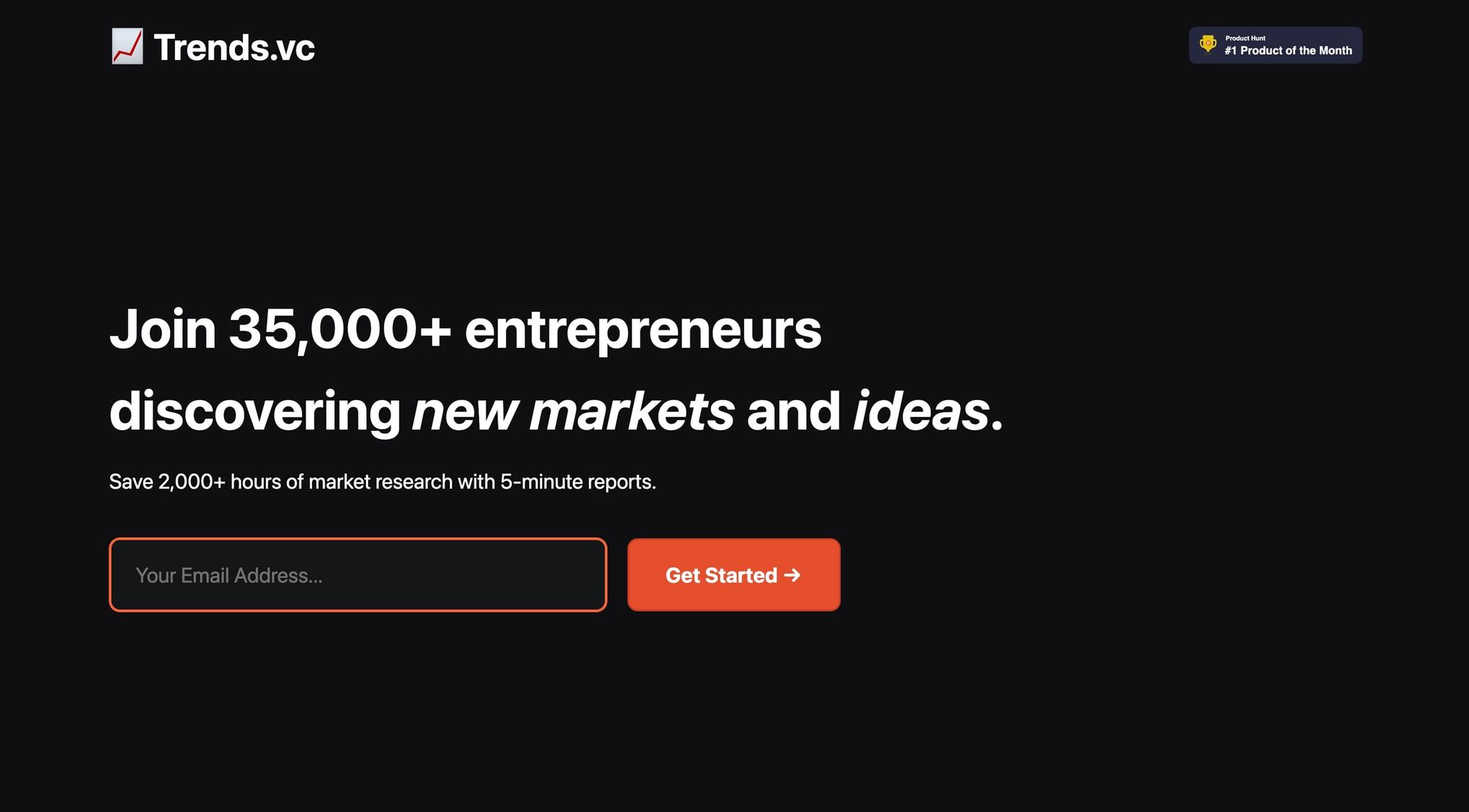
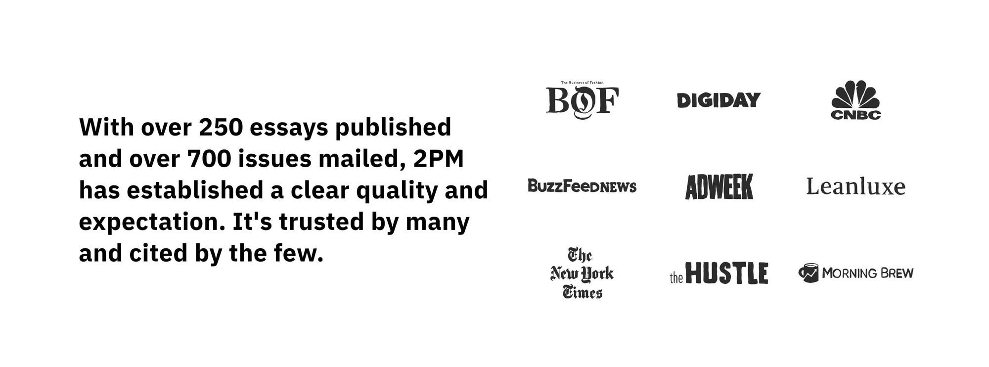
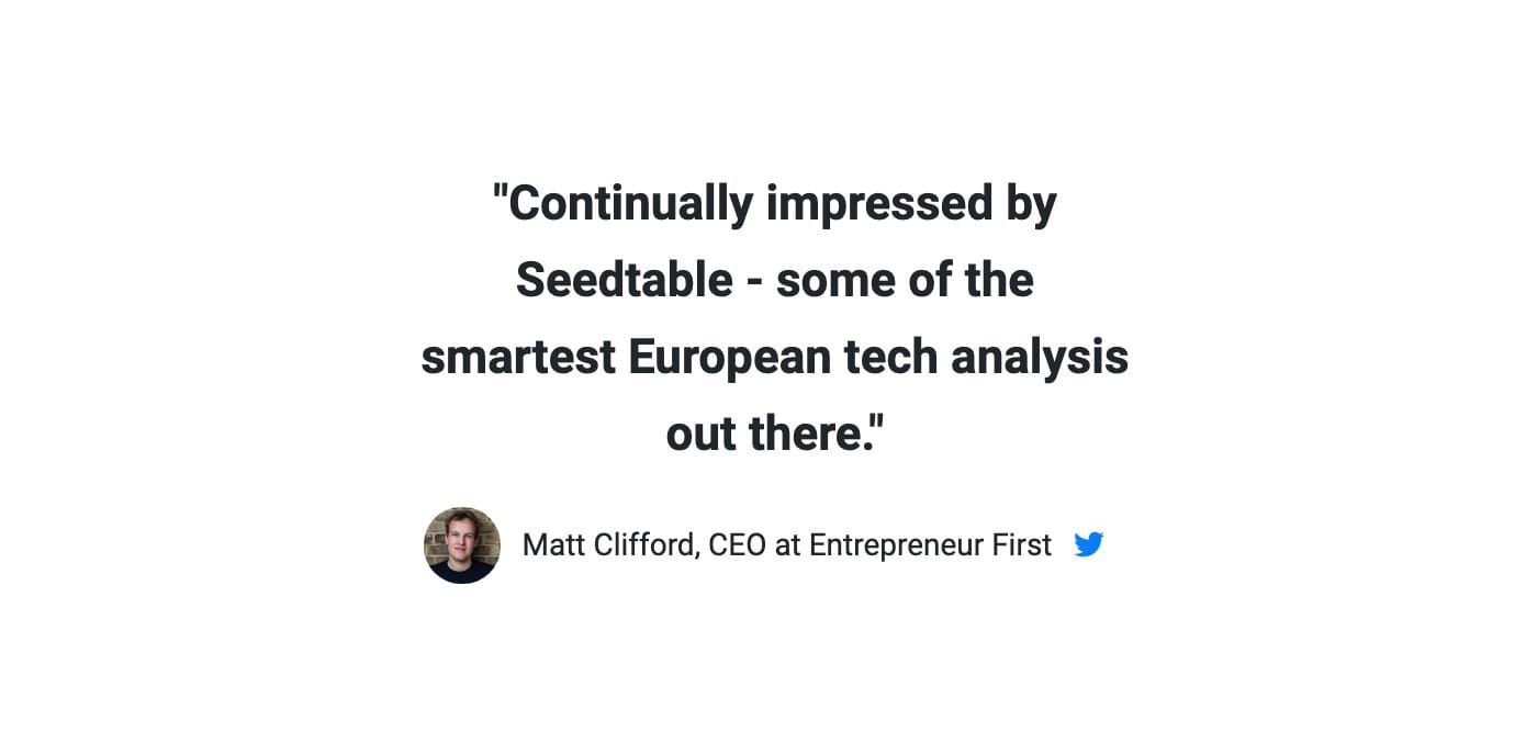
3. Convince with social proof
Think of social proof as herd mentality. We tend to follow bigger herds vs. smaller herds. We are influenced by higher ratings vs. lower ratings. If everyone else is doing it, it must be the best and safest bet.
✅ Add subscriber count:
✅ Add awards: (#1 Product of the Month top-right)
✅ Add Featured-In Press logos:
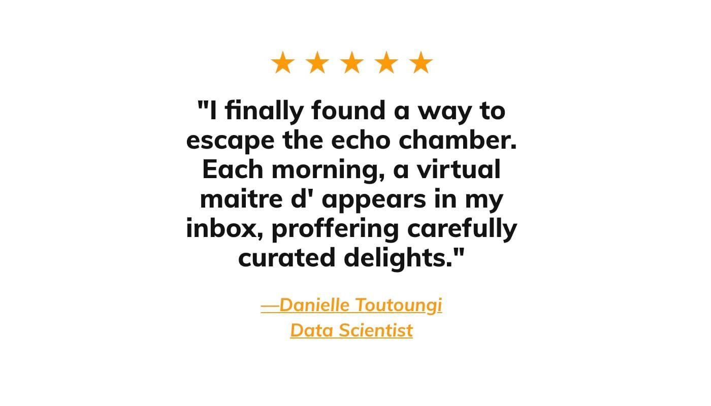
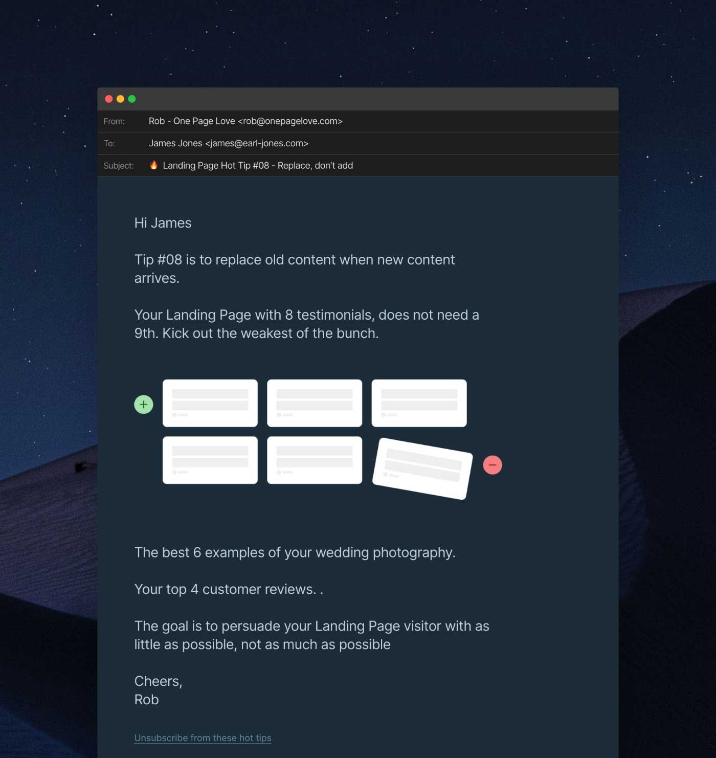
4. Hand-pick testimonials explaining your newsletter
So often I see newsletter landing pages packed with testimonials providing very little value to the potential subscriber.
🚫 "Great newsletter!"
🚫 "I really look forward to this newsletter each week"
✅ Reminder of niche:
✅ Emphasize consistent delivery: (each morning)
✅ Benefit of subscribing: (reduce echo chamber)
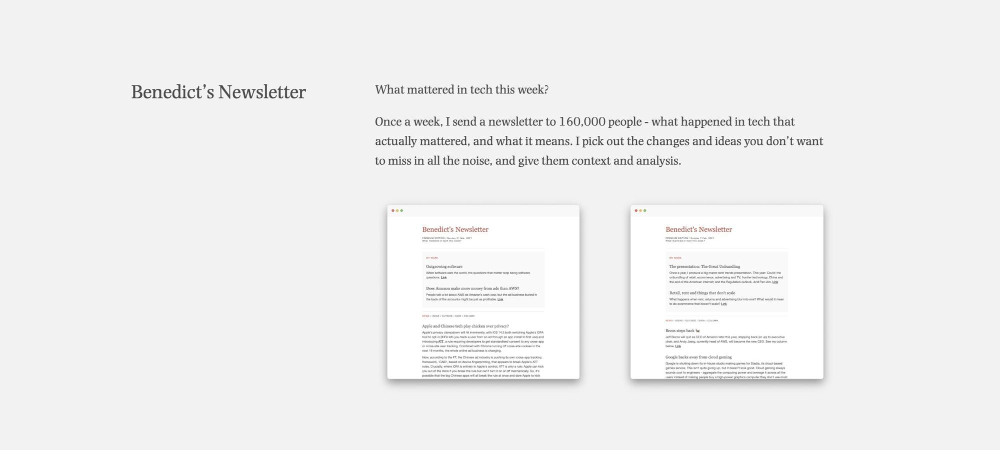
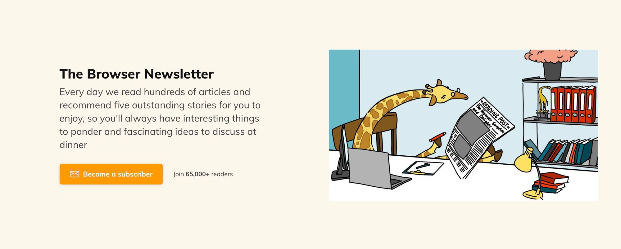
5. Preview a newsletter edition
There is no better way to clear up what your newsletter is going to be above than screenshots or linking to an actual edition hosted online.
✅ Screenshots linked to archived editions:
✅ Embed a coded edition:
✅ Wrap it in a relatable reading experience device:
6. Make the headline copy exclusively yours
How is your newsletter any different from the dozens sitting in my inbox?
✅ Use nuances your niche would only understand:
✅ Be cheeky:

7. Emphasize time-saving
Let's take a moment and try to understand why someone would subscribe to a newsletter:
- Provide useful data or information
- Improve their skills
- Help make them money
- Entertain them
Delivering any of the above, directly to your inbox, will no doubt save them time vs them searching for those resources online. Remind them how you will save them time in your newsletter landing page copy.
✅ How many hours do you save them:
✅ How long will it take to read:
✅ Getting straight to the point:
✅ "We read hundreds, recommend five"
I’d argue time is the most valuable commodity we have. How is your newsletter curation going to save them time?
Creating sign up landing pages in Ghost
There's plenty of flexibility within Ghost to implement all of the tactics I've shared in this post. Here are three pointers for improving your newsletter sign up landing page:
- Install a theme — you can find a wealth of beautiful free and premium themes in the marketplace, some of which have a homepage with
- Use Portal — it's important to provide frequent opportunities for people to sign up, and portal allows you to do that by placing a subscribe button on every page of your Ghost site.
- Use the Ghost Editor — It's now possible to remove the title and feature image from any page you're building in Ghost, so you can make your pages look radically different, no coding required. Once that's done, you can use a combination of dynamic cards in the editor to make your landing page look the part, with headers, calls-to-action to attract new signups, images, toggles, copy, and more!
Look out for part two...
I hope you enjoyed this visual round-up of seven tips to help improve sign ups on your newsletter landing page. What are your go-to tips not included here? Hit me up on @robhope on Twitter with your favorites.
Check out part two of this edition, which explains how to turn more of your subscribers into customers by strengthening your newsletter upgrade landing page:
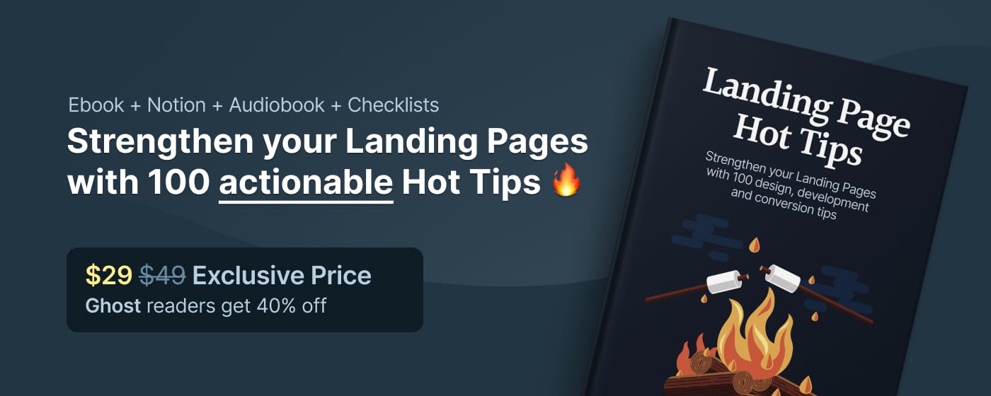
For further landing page hot tips, get an exclusive 40% off my Ebook as a Ghost reader using the link below!