How we Figured Out What Makes People Love Ghost 1,000% More
That can’t be right… - I muttered.
+1,000% conversion
How could that possibly be right? A 4-digit increase?
I checked and re-checked the data; but there were no mistakes. Having read countless books and blog posts, I’d heard about the paradigm from other startup case-studies. This was the first time I was seeing it in person.
A unicorn!
What We’ve Learned from Onboarding Our Ghost Users
It all started with a very basic premise: Some of our users have a better initial experience than others and - as a result - they are more likely to convert into paying Ghost(Pro) subscribers.
The question was, how to quantify which parts of the experience were contributing to (or detracting from) the eventual outcome.
I enjoy reading case studies about how other companies give their users a good first impression. The general advice is always the same: You have to get users to the “aha!” moment. The point at which they start to get value from the product. For an accounting app, that might be when the user creates and sends their first invoice.
And you see - that’s the problem with most software books and blogs. They always make the same vague statement and give the same tired example about an accounting app and an invoice. What seems to be lacking, so often, is information on how to apply these lessons to what you’re doing.
The catastrophic assumption here is thinking you actually know what your software’s “aha!” moment even is. Or, perhaps even more fatally, that you think that there’s only 1 of them.
In reality, there are lots of little “aha!” moments throughout the onboarding experience - and one of the most important things you can do is learn what they are.
The 3 Key Moments which Matter
Had you asked me what the “Aha!” moment for a blogging platform would be a few months ago, I would’ve said “publishing a post”. That’s when you’ve set everything up, used the product, and completed your first piece of work.
After a couple of months of tracking various user actions, publishing a post did turn out to have some impact - but it was actually the lowest of all, compared to the other things we found.
Using events which are recorded in real-time on Ghost.org I was able to start comparing events and looking for correlation and causation. Do users who signed up today convert better than users who signed up a month ago? Are you more likely to subscribe for a Pro account if you’ve been contacted by our support team? Do people who publish more posts get more value? These were some of the questions we wanted to answer.
I looked at the baseline data from users starting a 14 day trial on Ghost(Pro), to signing up for a paid account. Next, I tested adding steps in between those two points, and re-evaluated the conversion data based on behaviour.
That’s roughly the moment at which I stopped in my tracks as the funnel in front of me showed a conversion increase of more than 1,000% for one particular group.
I wasn’t expecting such a massive result from this comparison.
Users who added a custom theme to their blog converted at just over 10% - more than 10x the rate of users who simply stayed with the default theme.
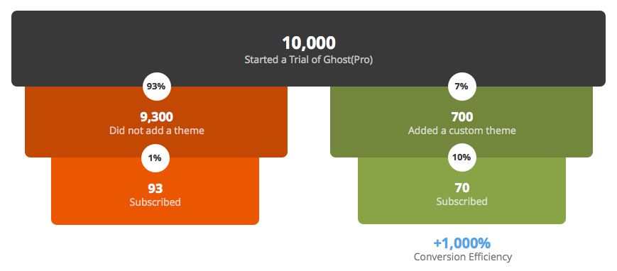
Very clearly, our users were experiencing a significant “Aha!” moment as they personalised Ghost and turned it into their own, custom space on the internet.
There were 3 events which affected the eventual subscription conversion rate most significantly:
- Publishing a first post: 5% conversion
- Uploading a custom theme: 10% conversion
- Adding a custom domain: 8% conversion
Users who had not completed any of the above events converted at a vastly unimpressive 0.9%.
This is about as disparate as you will ever see a set of statistics for user onboarding, so we knew that we had a lot of work to do in order to make this better.
Creating a More Successful Onboarding Experience
Armed with this new data, we set out to create a better onboarding experience, focusing on improving the areas were we could see clear correlation in success rates.
The important thing to understand about user onboarding is that each step contains a bucket of users. Once you figure out what the buckets are, you can focus on improving each one individually and it will cascade down to the others.
We knew we had events which were affecting conversion the most. So how could we get more people to complete those events?
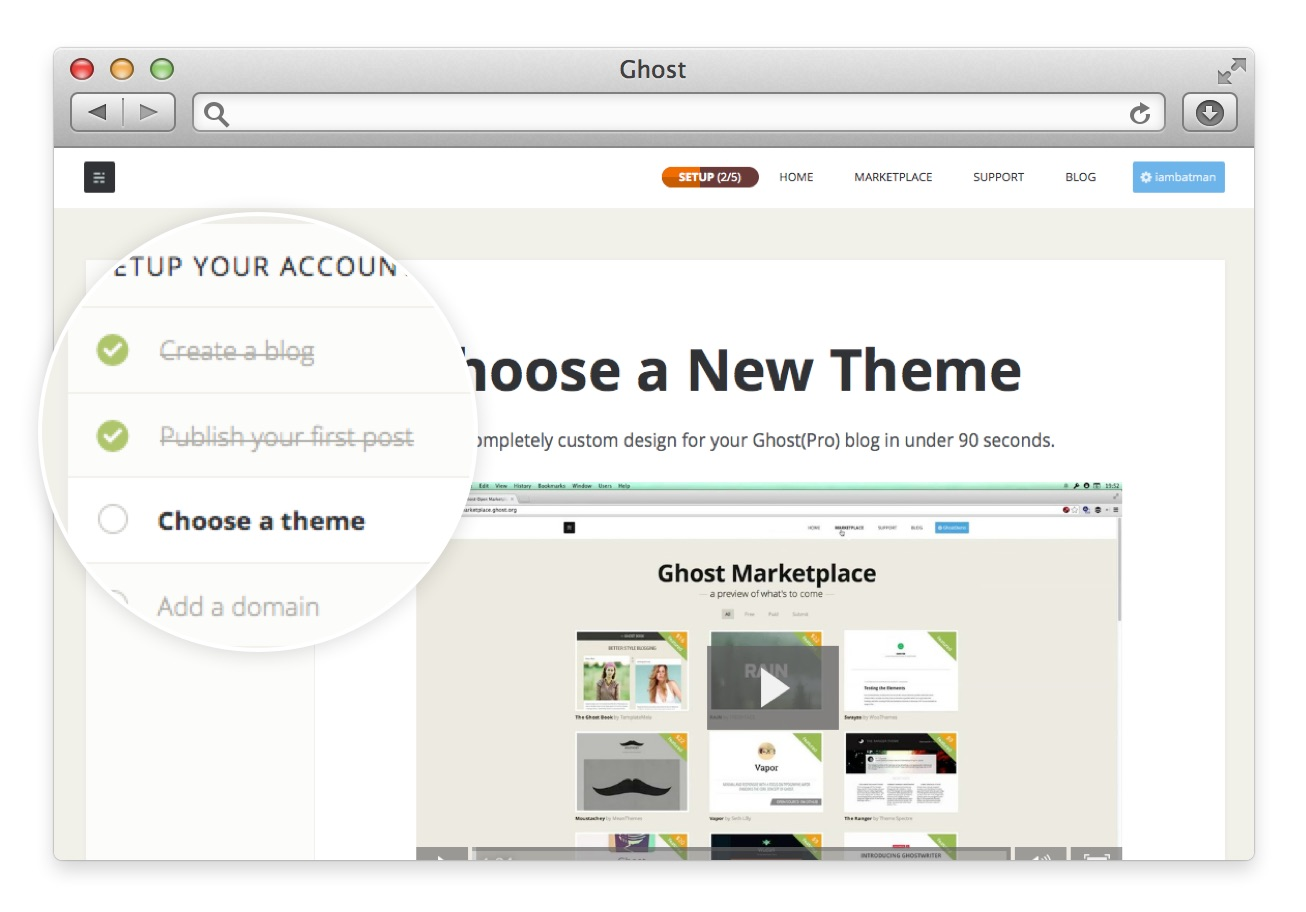
Taking a little gamification inspiration partially from LinkedIn but mainly from Intercom.io - we set out to create a “blog setup” progress meter. This would be a simple 5 step process to guide the user through the most important tasks to complete, including the ones which we knew would make them more likely to get value out of Ghost. Each step has a simple text or video user tutorial on how to complete it, and each step takes you closer to 100% on the red progress meter - which sticks in your Ghost.org navbar until you get there.
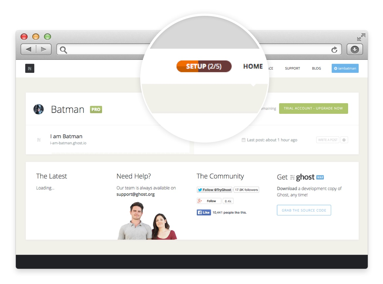
The only flaw with this process is that it relies on the user being present on the site for them to know what the next step is. What happens if the user sets up a blog and then closes the window because they have to go out - forgetting to come back and do the next thing?
To tackle this problem, we used Intercom.io to send conditional emails depending on where in the chain you are.
This is set up to try to be as helpful as possible without being annoying.
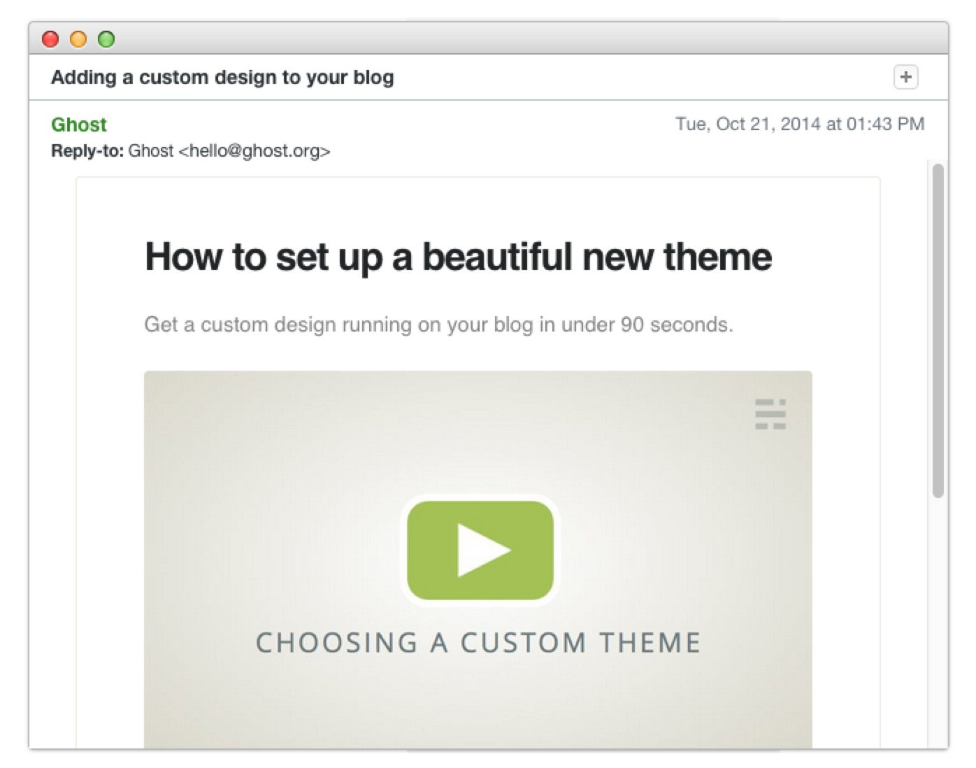
If a user has published their first post but we haven’t seen them in a couple of days, we send a 90 second instructional video on how to install a theme. If they’ve already done that step, we send instructions on how to set up a custom domain. Most importantly, we only ever send these emails if they haven’t been contacted in the last few days and if they haven’t opted out of any previous emails.
The results have been incredible to watch. While on average just 7% of users who start a trial will add a custom theme or domain name, that number jumps to 26% if they watch one of our tutorial videos and go through the onboarding progress steps.
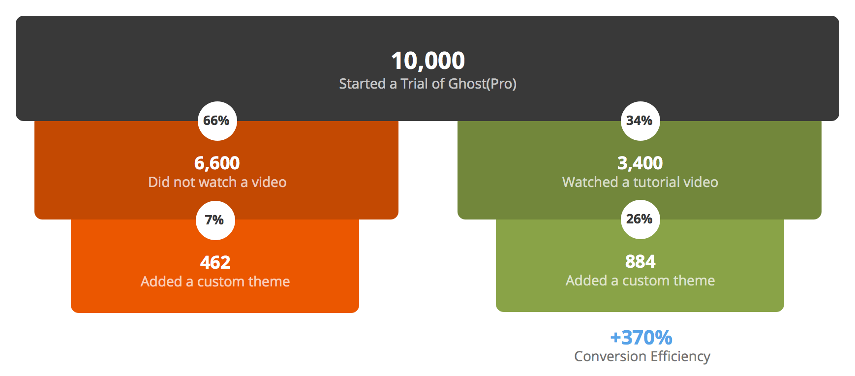
Quadruple the users entering this point of the conversion funnel, means a trickle-down effect as users with custom themes continue to convert better at the end of the funnel.
By helping users have a better initial experience, we’re able to show them why this is something worth their time and energy. This, in turn, leads to a greater positive emotional investment when it comes time to decide whether Ghost(Pro) is worth paying for.
From observing this in action and actively talking to our customers, we understand that customising the look and feel of Ghost is a major part of its appeal. The degree of control and independence which Ghost gives here is something that closed platforms simply aren’t able to match.
Where We Go From Here
Any good experiment generally leaves you with just as many questions as answers, and this one is no exception. From the lessons we’ve learned in figuring out what affects users most as they get familiar with Ghost for the first time - we now have many more things to test and think about:
- How can we make discovering new themes easier?
- How can we make installing and customising themes easier?
- Can we reduce the steps needed to add a custom domain?
- Is there a correlation between the number of posts a user publishes, and the average length of their subscription?
- What events lead to an increase in publication frequency?
- What events correlate with abandonment of the setup process?
- What other moments are there that we are not yet measuring?
Perhaps the most significant piece of data that came to light throughout this process had nothing to with conversion to a Ghost(Pro). I was interested to see if these “Aha!” moments were purely a good onboarding experience, or if - in fact - they had a longer term effect on how much value people were getting from the software in general.
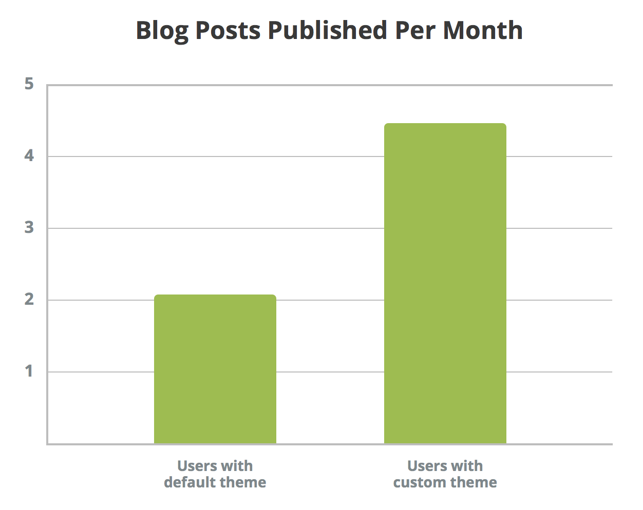
The data, once again, was fascinating: Users with the default theme published an average of 2 posts per month, while users who had customised Ghost with their own design published an average of 4.4 posts per month. Usage more than doubled.
We don’t know the order of causation at this point. Does having a custom theme make you publish more posts? Or does publishing more posts make you want a custom theme? But we can say with relative certainty that the two are clearly correlated. People who are getting value from Ghost have a custom theme, and people who have a custom theme are getting value from Ghost.
This is important.
By understanding the impact of features on usage, we can filter this data back into the design and production of Ghost itself. We can create a tool which isn’t just satisfactory in its utility - but rather one which generates a real sense of pride and attachment to that which it is used to create. And that’s what we want to do; we want to make a tool which writers love to use.
While cookie-cutter advice about “aha!” moments is interesting - it doesn’t really mean anything until you apply it to your own users. Until you figure out what things are happening, what moments are taking place and which are significant.
Figure that out and - I believe - there’s no limit to the amount you can learn. We still have a long way to go, but we're enjoying the journey immensely.
Update: 13 Apr 2015
We spent 30 minutes on a single change to our onboarding after this which increased revenue by $60,000 a year. Check it out: The 30 Minute Change That Made 25% More People Try Ghost: Telling Them what To Click
