Responsive image sizes

Optimise your site performance with responsive images and display image content at the best size across your publication
Using bold feature images is a common technique in modern publishing that makes online content more engaging. Feature images are uploaded at a larger size to ensure they look good, which is great until you start using large image files as thumbnails across the rest of the site and performance takes a hit!
This is exactly why we just shipped a new dynamic image feature in Ghost themes to solve this. This is one of our most requested features that allows the use of scaled down images or responsive srcsets.
Improved site performance
Site speed is a critical metric in publishing - it impacts your site's discoverability in search engines and user experience for readers. Ghost themes are already great for site performance, and this new feature makes them even better.

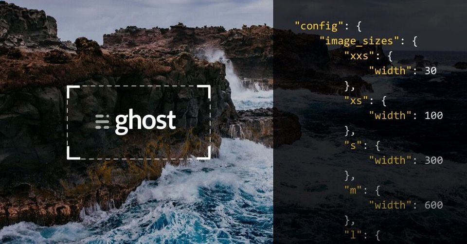
Now all images uploaded to Ghost are automatically generated at a set of preconfigured sizes for use in your theme. This ensures that pages containing a lot of images or thumbnails load at lightening speed and gives developers more fine-grained control over site performance.
Configuring responsive images
Unlike other platforms, management of image sizes is fully automated and will regenerate whenever needed. To find out more about implementing responsive image sizes in your theme, check out the documentation for this feature.
Ghost(Pro) users have already been updated and have access to responsive image sizes. Self hosted developers can use Ghost-CLI to get this feature by running $ ghost update to install the latest release.

