New design, better mobile support, admin search and more!
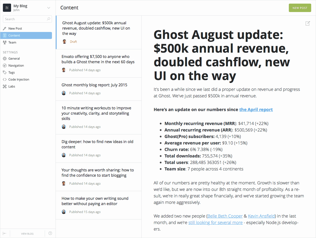
Today is an exciting day! After about two years and three hundred thousand users, we've learned a tremendous amount about how people have been using Ghost. As a result, we've just shipped our first major user interface update.
Here it is:

This project has been a work in progress since the end of last year, and we're very excited to see it being used out in the wild.
The biggest change has been to the main structure and navigation within Ghost's admin. We were fast hitting the limits on the old top-nav placement. The new side-menu placement should provide some familiarity to most desktop applications, works better on mobile and, significantly, gives us a lot more space and flexibility to introduce upcoming new features. Winky face.
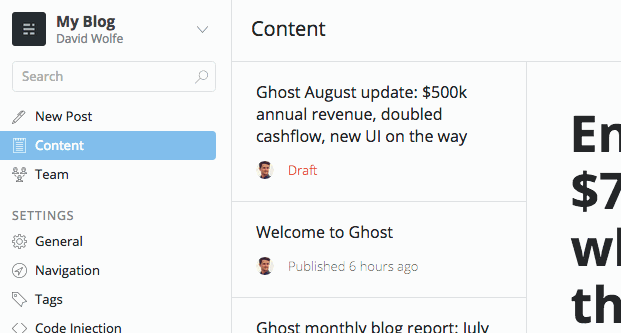
BTW it's also easier to find old posts now
After talking to hundreds of you recently, one of the most common frustrations mentioned in the old admin was that finding old posts was a real pain. To remedy this, we've added a magical new search box which will help you find any post in your archive in a matter of seconds.

Oh also, ProTip: If you're reading a post on your blog some time and you're all like "damn there's a typo!" – try throwing /edit on the end of the URL. Yep, that works.
Ghost(Pro) users already have access to all of this right now, log in to your blog and have a look! Users running Ghost on their own servers can grab this feature by upgrading to Ghost 0.7.

