The 30 Minute Change That Made 25% More People Try Ghost: Telling Them what To Click
Sometimes little things have a disproportionately large impact. I’m not sure why this seems to surprise me, at this point, but it never fails. Every time one of these rolls around I’m left going “Really? THAT did it?” - weird.
The last big measured improvement in Ghost’s onboarding process that we talked about was detecting events which improved conversion process the most - and then using targeted emails to drive more people to those “aha” moments. We found one event in particular which improved conversion rate by 1,000%.
Today’s change isn’t nearly as dramatic - but it’s also not nearly as complex. While the last test took a good 40-50 hours of design, development and extensive testing. This time we spent 30 minutes on adding one <div> to one page, and it gave us 25% bump in how many people try Ghost every day.
The Little Change That Could
Hannah and I sat down a couple of weeks ago to have a look at any quick wins we could make in helping new Ghost users get up to speed faster. We’ve played with various points in the conversion funnel, but on this occasion there was one which was bothering Hannah in particular.
97% of people who sign up on Ghost.org start a Ghost(Pro) trial, but only 60% of those people are then logging into their blog. This makes no sense.
I agreed with her.
We have a technical issue here which makes things extra complicated. Every Ghost blog on Ghost(Pro) is an individual install of Ghost. On the plus side, this gives you tons of freedom and control over how your blog runs. On the down side, it makes things a little more complex for the user.
One of the biggest challenges we have is guiding users through this process without - to be frank - confusing the shit out of them.
The Onboarding Steps
Here’s how the process looks:
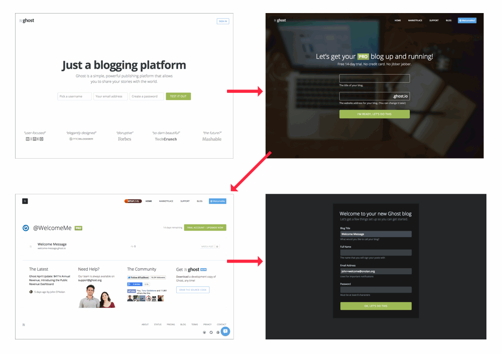
- Visit Ghost.org
- Sign up
- Create a blog
- Set up that blog
Down to the 3rd screen, the conversion rate is 97%. Pretty good. However, only 60% of people ever made it to the 4th screen. A clear indication of a problem, and one which had been bothering Hannah for a long while.
Now, the “proper” solution to this problem is quite clear: Use Single-Sign-On between Ghost.org and Ghost blogs, so that you can authenticate between the two without the need for these extra screens in the middle. A totally seamless experience. This is the right way to do it. The only problem with that is that it’s a lot of work that needs to happen in Ghost, Ghost.org and Ghost(Pro) to make all the different pieces talk to each other. It's not a small piece of work.
We wanted to do something now to try and improve it, so we decided to do the most obvious thing possible: Tell people what to do next.
The Old Ghost(Pro) Manager

This was the old blog management screen on Ghost.org. Once you understand it, it makes sense: It’s a list of all your blogs, and this is the place where you can setup/shutdown and manage them. But when you’ve just started a new trial and all you see is one little list item… it’s not really clear what this is or what you’re supposed to do with it.
So, in the space of 30 minutes Hannah coded up a re-usable welcome message component for new users, while I designed and marked up the welcome message itself.
The New Ghost(Pro) Manager
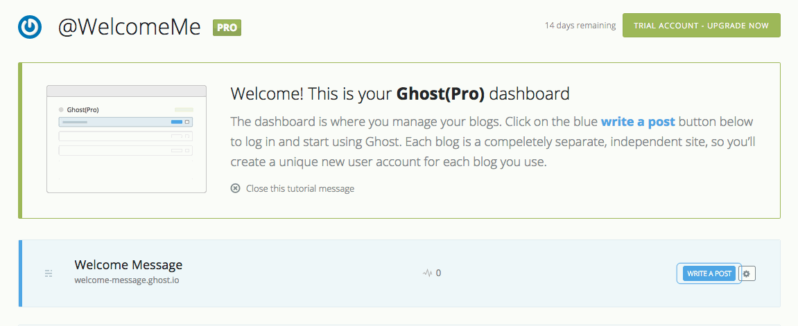
Now, when you visit the dashboard for the first time, it looks like this. There’s a message telling you what’s going on, the blog is highlighted, and the next action we want you to take is literally throbbing in anticipation.
No A/B Testing - JFDI
At the beginning of the year I read a post by David Kadavy which systematically destroyed my faith in A/B testing in the space of about 900 words.
A/A Testing: How I increased conversions 300% by doing absolutely nothing
It’s a great read, and it made me question the statistical significance a lot of the A/B tests we’ve run. As a result, I’ve started thinking differently about how we run our conversion experiments.
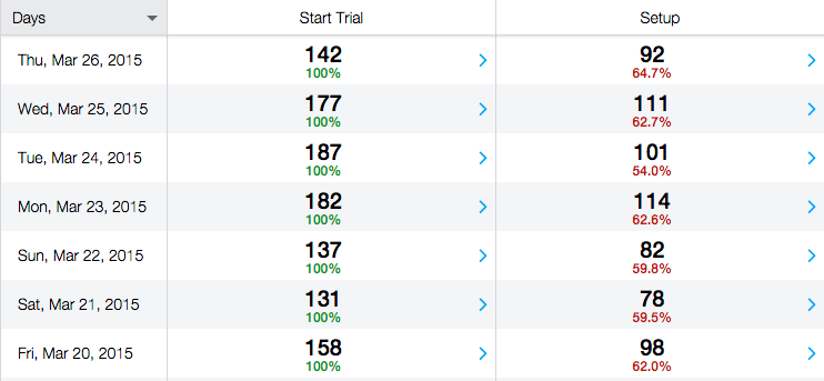
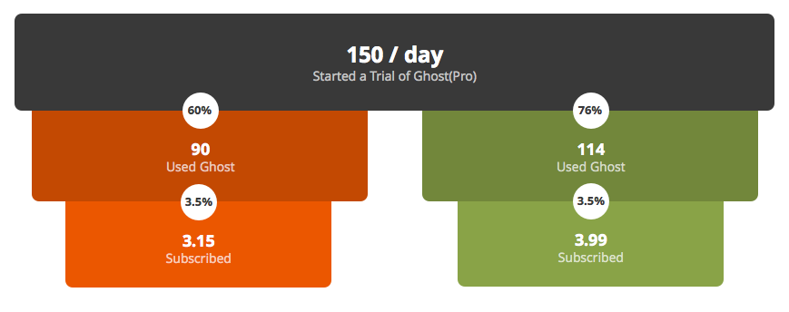
In this instance, we had months worth of data showing consistent conversion at a rate of about 60% between starting a trial and setting up a blog. Here’s the week before we tried out the new welcome message, which is consistent with the overall historical rates:
There was really no point in running a side-by-side A/B sample. We already had A, so we just went ahead and shipped B to see what would happen.
Hypothesis: To establish statistical significance, we would want to see the conversion rate be at least 10% higher than the previous average, consistently (every single day).
The week after adding the new welcome message:
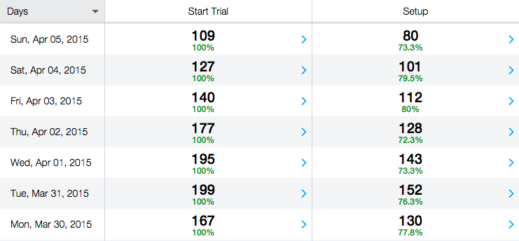
The first week showed 7 consecutive days of improvement at an average of 76%, some 25% higher than the original average. This streak has continued to 20 days now, and is showing no signs of changing.
If you think 25% doesn’t sound like anything to get excited about, let’s look at how a small change compounds over time with some projected numbers:
This improvement gets us an extra 0.84 customers per day, and our average Ghost(Pro) customer Lifetime Value is currently about $200. Basic napkin maths – 365 days * ($200 * 0.84) – says that this change will be worth $61,000 in additional customers each year.
Not bad, for 30 minutes work.
For a non-profit organisation like Ghost, 100% of that extra revenue goes back into the business and makes a massive difference to how much good we’re able to do.
Dat Low Hanging Fruit
When people talk about making better software, they often mention “low hanging fruit”. Do the easy things first! They say. Find the small changes which will have the most impact, and save the complicated stuff until later.
The problem with this advice is that it’s really not always obvious what the low hanging fruit is. Much like I mentioned in the last onboarding post: If you don’t know what the “aha” moments are, you can’t optimise for them.
So the biggest lesson from this post, I think, is simple: When it comes the UX of completing a task; test the most basic thing. Spell out (use your words!) what you want the user to do next.
Compounding returns mean that a small change can make a very significant difference over time.

